| Android Adventures - Building The UI Constraint Layout In Android Studio 2.3 |
| Written by Mike James | |||||||
| Tuesday, 07 March 2017 | |||||||
Page 5 of 6
A First App - A CalculatorAs an example of building a simple app using layout and the Designer let's build a calculator. Some of the techniques used in this app are a little beyond what we have covered so far but you should be able to follow and it is time to show what something more than a single button app looks like. This is a very simple calculator - it has just nine numeric buttons and a display. It takes the values on each of the buttons and adds them to a running total. There are no operator buttons, add, subtract or clear - but you could add them. This is probably one of the most difficult layouts you will encounter - simple in practice but hard to get right. Putting nine buttons into a grid is difficult but it is a good example of how to work with constraint layout. Start a new Basic Activity project called ICalc or whatever you want to call it. Accept all of the defaults, except of course for selecting Basic Activity. The principle of operation is that we are going to set up a grid of ten buttons. Set each button to 0 through 9 as a text label. We are then going to assign the same onClick handler to each of the buttons. All it is going to do is retrieve the text caption showing on the button, convert it to an integer, add it to the running sum and then store it back in the TextView after converting it back to a String. Put simply when a button is clicked the event handler is called which retrieves the button's label as a digit and adds it to the running total on display. The CodeSo the code is fairly easy. We need a private field to keep the running total in:
Next we need an onButtonClick function which is going to be used to handle the onClick event for all of the buttons. See chapter 2 if you don't know about simple event handling. The button that the user clicked is passed as a View object as the only argument to the function and we can use this to get its text caption:
Of course when you enter this you will see warning messages about Button "cannot resolve symbol". Remember to place the cursor on the word shown in read and press Alt enter to get Android Studio to help you add the appropriate import statement. Do this every time it is needed. Now that we have the button's caption e.g. 0, 1, 2 and so on we can convert it to an integer and add it to the running total:
Finally we get the TextView using its id (see Chapter 2) and set its text to the total converted to a String:
The complete event handler is:
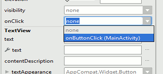
Put this code within the MainActivity class as one of its methods. Remember to use Alt-Enter to deal with any imports needed. The LayoutNow we turn our attention to the layout. Open the layout file, delete the default text and place a single button on the design surface. Double click on it, this is a shortcut to the Text and id properties, and enter 7 as its Text property. Place the button at the top right of the screen with a little space. Next go to the Properties window and find the onClick property. Set this to onButtonClick, the event handler you have just written:
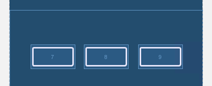
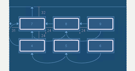
To create a grid of buttons you have to repeat this process nine more times. You could do this by dragging each button onto the design surface and manually set the constraints needed to locate each one relative to the buttons already placed. However we can use the one Button we have already created to make the rest using copy and paste. Select the button and use the copy command and then paste two more Buttons onto the design surface. The copies will be places on top of the first Button so drag them to form a rough line of three Buttons. Don't worry at this stage about exact positioning we only need to do this after the constraints are in place. Change the text property of each button to read 7, 8 and 9 respectively.
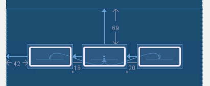
If you try to use Infer Constraints you will discover that it works but the constraints applied are not necessarily as logical as you might wish for. In this case the constraints are reasonable but notice that the vertical position of the row is set by the middle butto and the horizontal position by the first button.
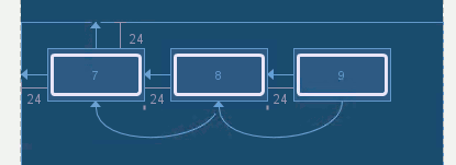
There are many ways to set the constraints but it is convenient to be able to position the entire array of buttons using the top lefthand button. So position it with constraints to the top and left of the screen. The second button in its row can have a constraint set to position it to the right of the first button and align its bottom with the bottom of the fist button. The third button in the row has the same constrains to the button on its left.
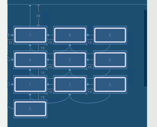
Now is also a good time to position the buttons accurately either by dragging or by using the Properties window. If at any time you find you cannot drag the buttons or any component to a new location because it simply springs back to its original position use the Properties window to zero either start or end in Layout_Margin. Continue this pattern with the next row, don't try and copy and paste an entire row because the constraints become complicated. Copy and paste three more buttons. Apply constraints as for the first row but in this case position the first button in the row relative to the top left button:
Change the text in the buttons to 4, 5 and 6 as shown. The final row is the same but its first button is position relative to the first button in the second row. Finally add the lone zero button and position it relative to the first button in the third row:
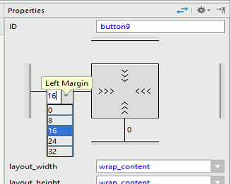
Make sure that you change the text of the last four buttons to 1, 2, 3 and 0 respectively. Check the constraints carefully it is very easy to make a mistake. The principle is that the first button in each row is positioned vertically by the button above and the other buttons in the row are positioned relative to the first button. This is a lot of work! Now we need to make the grid more regular. Select each button in turn and make sure its caption is correct and that it has the onclick event handler set. Then for each button set the horizontal margins using the Properties window to 16 horizontal and to 0 vertically. The only exception to this is the first button in each row that needs to be set to 0 horizontally and 16 vertically - if you think about it then it should make logical and fairly simple sense.
|
|||||||
| Last Updated ( Tuesday, 28 March 2017 ) |

