| Android Adventures - Building The UI Constraint Layout In Android Studio 2.3 |
| Written by Mike James | |||||||
| Tuesday, 07 March 2017 | |||||||
Page 3 of 6
To see all of the properties you have to click on the view all properties icon at the top right of the properties window - the double arrow. All layout properties start with layout_name where the name gives the positioning effected. For example, if you look in the Properties window you will see:
which gives the distance from the righthand edge. It is also worth understanding that in allowing you to set the position of a component by simply dragging it to the location you want the Designer is working out how to set multiple properties correctly. You could do this manually to get the same effect but the Designer does it simply from where you have positioned a component. This is why it is easier to let the designer set the properties for you. However it means you can build sets of components all aligned to one that is aligned to the container so that they all move together as a group. It means you can place one component with an offset from another no matter what the size of the first component is. You can also set components to align with the left and right side of the screen and allow for rotation from portrait to landscape. You can also set constraints which divide the available space up by percentages - more of this in chapter 5. The constraint layout is the prefered layout component. The reason is that it is fast and efficient compared to the usual alternative of putting one layout inside another. Unless you have a good reason it is the one to use. However all this said it is very easy to get into a complete mess with the layout in the Designer. If components go missing then chances are they are on top of each other. The easiest way to sort this problem out is to go to the Properties window and manually reset one of the positioning properties. It is helpful to notice the following:
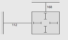
The Constraint Layout component is used by default but you can change this for any of the other layout components - Relative, Linear, Table, Grid and Frame. There are also other container components which can be used in place of these standard layout components. More of this later. One thing worth knowing at this early stage is that components have layout properties that are provided by their container so the set of properties that we have looked at in connection with the Constraint layout component are unique to it. That is if you use another Layout then you have to learn its layout properties from scratch. Again this is another topic we have to return to. SizingIn comparison to positioning sizing a component is almost trivial. All components have a Height and Width property and these correspond to the drawn height and width when the component is actually rendered on the screen. You may have noticed that there are what look like sizing handles in the corners of the components that you place in the Designer. If you drag any of these the component will change its size. However the components content will not be resized. All that happens is that the content has some space around it. If the content gets bigger or smaller the component stays the same size. If the content it too big then it wont fit in the component. You can see the space is fixed in the properties window. The lines shown inside the component relate to the size of the component and its relation to its content. Straight lines indicate a fixed size:
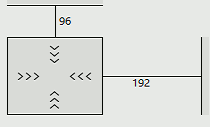
An alternative to fixed size components is to allow them to automatically resize to fit or wrap their contents. To set this all you have to do is click on the inner straight lines which change to <<< to suggest springs which allow the component to change its size:
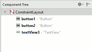
This auto-sizing behaviour is set by the layout_width and layout_height properties. You can modify this by typing in an exact size e.g. 100dp into the value box next to the property. Also notice that you can set a maximum and a minimum size for most components. Setting a maximum will result it the content being truncated if it doesn't fit. Setting a minimum is often the best plan because then the component will increase in size when necessary. The Component TreeIf you look to the top right corner of Android Studio in layout mode you will see a window called Component Tree. This is almost self explanatory and hardly needs much other than to draw your attention to it. However notice that you can see the tree structure of the layout starting at the Layout container. You can see that the default layout is ConstraintLayout and you can see the all of the other components correctly nested within their parent containers.
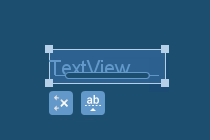
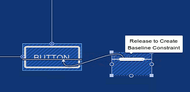
Notice that you can select and delete layout elements directly in the tree. This is useful when you have a complex layout that has gone so wrong that you are finding it hard to select components reliably. You can also move elements around in the tree to change the way that they are nested. A Simple Button Example - Baseline AlignmentAs a simple demonstration let's first place a Button on the Designer and use the infer constraints button to apply some constraints. If you find it difficult get a rough position and then enter the exact margins then always remember that you can move to the properties window and enter them directly. Next place a TextView widget on the Designer. In this case the alignment we want is for the text to be on the same line as the text in the Button. This is a baseline alignment and one of the more sophisticated alignments but if you have the Designer zoomed so that you can see the full area of the screen the chances are all you will be able to do is align to the top or bottom of the Button. If you look at the TextView's representation in the designer you will see that there are two small icons below it. The first removes all of the constraints from the component and the second makes the text baseline, a small elliptical box, appear inside it.
This represents the text in the TextView and you can use it to setup a baseline constraint. All you have to do is select the TextView and hover the cursor over the elliptical box until is highlights and a message about dragging to create a baseline constraint appears - as in the screen dump. Next drag from the elliptical box to the baseline of the text in the button, or any component that you want to align the baseline with. That's all you have to do. After this the text in the button and the text in the TextView will share a common baseline. If you move the Button then the TextView will move with it. If you want to remove the baseline alignment then all you have to do is select the TextView, hover over the elliptical box and click when the remove baseline constraint appears.
|
|||||||
| Last Updated ( Tuesday, 28 March 2017 ) |