| Android Adventures - Building The UI Constraint Layout In Android Studio 2.3 |
| Written by Mike James | |||||||
| Tuesday, 07 March 2017 | |||||||
Page 2 of 6
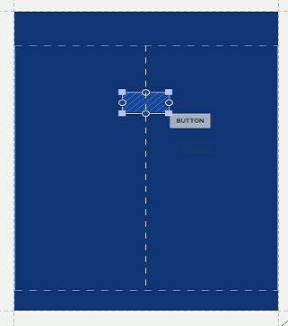
Positioning - The Constraint LayoutBefore you continue with the project select and delete the default "hello world" text - it makes trying things out easier to have a clean design surface. There are two views of your layout you can opt for - design and blueprint. The design view looks like your UI when it runs on a real device. It is useful for getting an overall feel and impression of what the UI really looks like. The blueprint view shows you the UI in skeleton form. This makes it quicker and easier to work with when you are positioning things. You can view both at the same time but this is mostly a waste of screen space. In most cases it is easier to work with the blueprint and then switch to the design view when you want to confirm that things are looking good. So select the blueprint view. Next click on the Button in the palette drag it onto the layout. Notice the way the layout information changes as you move the button around the design surface.
It is important to realize that this positioning information is only to help you locate UI components relative to the existing layout. With the new constraint layout where you drop a component has no effect on where is will show when the app is run. In fact if you simply drop a UI component on the design surface without applying any constraints then when you run the app the component will drift up to the top left hand corner. Using the constraint layout the only thing that affects where a component displays are the constraints you apply. So how do you apply a constraint? You can have the designer suggest them for you automatically or you can apply them manually. Automatic constraints are the easiest to use and there are two ways to get the editor to apply constraints dynamically - the autoconnect mode and for the entire layout - infer constraints. They do slightly different things and you need to learn to make them work together. The autoconnect mode seems the most useful when you first meet it but in practice it can be confusing and error prone. However it is worth trying out. To turn autoconnect on simply click the autoconnect icon on at the top of the designer:
With autoconnect on when you place a component on the design surface the editor works out suitable constraints based on where you dropped the component. It will take notice of how close to other components it is and the edge of the screen. If the component it too far away from anything then no constraint is added. You have to use it to get the feel for how this works. Once the constraints have been added they are obeyed as you move the component around the screen. If the place that you first dropped the component wasn't right or if the constraints that were applied were wrong you might well find this a frustrating experience. The infer constraints option is actually easier to use but not as much fun to watch in action. All you have to do is position the components where you want it and then click the infer constraints button:
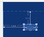
When you do this constraints will be calculated based on where each component is. This gives you more time to position the components and you can always delete all the constraints and click the infer constraints again to recompute them. Only constraints that are necessary to fix the position of a component are added - existing constraint are not modified. This means you can use infer constraints to make sure that your layout has enough constraints to make it work - if none are added it was ok. At the time of writing there is a bug that makes Infer Constraints difficult to use. The designer changes the left and right properties as you drag a control to a new position. The Infer Constraints button sets left and right but also start and end which are the same as left and right if the directionality is left-to-right but reversed if it is right-to-left see later. The problem is that start and end take precedence over left and right and once Infer Constraints sets either one you cannot change the horizontal position by dragging and dropping. The fix is to go to the Properties window and zero start or end. A good strategy is to switch off the auto connect and use the infer constraints option every time you place a new component on the design surface. This allows you to build up a layout one component at a time and check each new set of constraints. You can then modify the newly added constraints and move on to the next component. Where things get difficult is when you have a multi component layout and need to make radical changes. Often it is easier in this case to delete all of the constraints and start again. For a component that has been placed on its own close to the top and lefthand edge of the screen then constraints will be added that fixes its distance from the left and top:
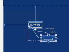
From now on when the button is displayed it will position itself at 144 from the left and 113 from the top. These constraints are applied no matter what the size of the physical screen is. This is the sense in which they are constraints rather than absolute positioning. It is worth knowing that the actually positioning is achieved by setting the button's margin properties to 144 and 113. The constraint layout may be the most sophisticated of the layout components but is positions other components using properties that have been in use from the start of Android. You can see that things aren't quite as simple as positioning relative to the edge of the screen if you place a second button on the surface and move it close to the first. Now if you click the infer constraints button the constraints that are applied are taken relative to the first button:
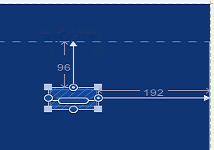
You can see that in this case the second button is positioned 77 from the left edge of the first button and 46 below it. Once again these constraints will be obeyed no matter how larger or small the physical screen the UI is displayed on. What is more if you move the first button the second button will keep its position relative to the first. In fact if you click and drag the first button the second will move with it. If you play with the positioning in the Designer you will quickly get the idea. The big problem with inferring constraints is that the system sometimes gets it wrong. You can place constraints on positioning manually. All you have to do is drag a line from the constraint circles on the component to the edge you want to use as a reference point. For example to position the button relative to the right side of the screen simply drag the circle on the right of the button to the right side of the screen and then move the button where you want it.
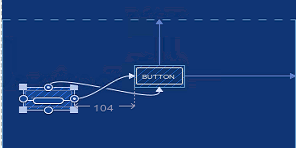
There are quite a few different types of constraints that you can apply and we will go into these in detail in chapter 5 where we examine layouts in depth. For the moment this almost all you need to know. Constraints can be applied automatically or manually and they often set the distance from some point on the component to a point on some other component. For example if you want to place a component relative to another then simply drag the constraint point on the first to and edge of the second. In the case shown below manual constraints have been applied because constraint inference would have placed constraints on the left hand edge of the screen.
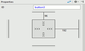
It is also worth knowing at this early stage that the properties window can help you in a number of ways. The first is that it has a diagram that shows you the currently applied constraints and lets you modify them and set distances exactly:
If you click on one of the constraint lines then you can enter a value for the distance. You can also click on the X that appears and delete the constraint completely. As you might guess, there are properties which let you set the location and margins for each position using the properties editor. |
|||||||
| Last Updated ( Tuesday, 28 March 2017 ) |

