| Android Adventures - Building The UI Constraint Layout In Android Studio 2.3 |
| Written by Mike James | |||||||
| Tuesday, 07 March 2017 | |||||||
Page 4 of 6
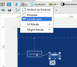
Orientation And ResolutionOne of the biggest challenges in creating apps for Android is allowing for the range of screen sizes and orientations. Mobile app development is distinctly different from desktop development because of this need to deal with differing screen sizes. Even when your app is running on a fixed device the user can still turn it though 90 degrees and change the screen dimensions in a moment and then turn it back again and your app has to respond to these changes. Fortunately Android makes is easier for you by providing facilities that specifically deal with resolution and orientation changes but you need to come to terms with this situation as early as possible in your progress to master Android programming. Android Studio has lots of tools to help you with the problem of variable layout. For example lets you see your layout in a range of devices, orientations and resolutions. This makes it so much easier. We can test our layout in landscape mode by simply selecting the landscape option:
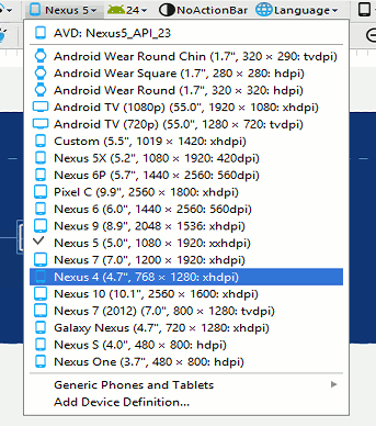
The constraints that you set in portrait mode are applied in landscape mode without modification and so it is important that you work on there specification so that the UI looks good in either orientation. If this isn't possible then you can provide a separate layout for each orientation - see later. You can also see what your UI looks like on the range of supported screen sizes by selecting from the list of devices that appears when you click on the Device In Editor button:
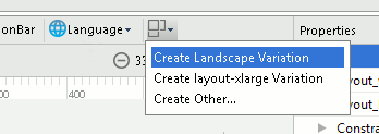
For simple layouts this is probably enough but Android has more up its sleeve to help you work with different sized screens. In particular you can make use of "fragments" and you can create a separate layout for each screen orientation and resolution. Fragments are advanced and the subject of Android Adventures - Fragments. On the other hand using different layouts for each orientation and resolution is fundamental to Android UI design and you need to at least know it exists at this early stage. The idea is quite simple - provide a layout resource for each orientation and resolution you want to support. The system will automatically select the resource layout needed when the app is run on a real device. How this works is very simple but Android Studio has some helpful features that shield you from the underlying implementation. It is helpful to first discover how it works and then move on to see how Android Studio does it for you. For example if you create a new layout file called activity_main.xml i.e. exactly the same as the portrait layout file you have already created but in the folder layout-land. You can now edit your landscape layout and it will be used automatically when the user rotates the device into landscape mode. What happens is that when your app starts the system picks the best available layout file for the screen according to what has been stored in the resource folders i.e. layout for portrait and layout-land for landscape.. When the device is rotated the system restarts your app and loads the best layout. If you only have a portrait layout then it is used for all orientations but if you have a landscape layout file then it will be used for landscape mode. What has just been described is exactly what happens - there are folders for each resolution and orientation and you can create multiple versions of layout resources all with the same name. The system automatically picks the folder to use to load the layout appropriate to the hardware at run time. However Android Studio tries to present this to you in a simpler way. The project view hides the fact that different folders are used and simply shows you the different versions of the resource files with a qualifier appended - (land) for a landscape file etc. Let's see how this works. To add a landscape layout to the button and text layout given above simply use the Create Landscape Variation menu option.
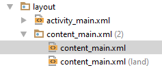
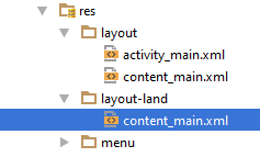
Then initially the portrait layout is used as the template for the landscape layout. Make sure you are editing the content_main.xml file before you do this. This ensures that this is the file that is used as the template for the landscape version of the file. The landscape version of the file will contain all of the UI components that the template file does. This means that your code can interact with it in the usual way without known that it is working with a different layout. All the code cares about is that there is a button or there is a textView - not where they are place or what orientation is in use. If you look at the project window you will see the new layout file listed:
You can see that there are now two content_main.xml files and one has (land) added after its name. As already explained this is a simplification that Android Studio offers you. If you switch to the Project Files view you will see that in fact the new layout resource is in a new directory layout-land
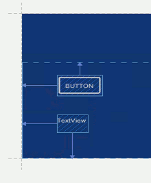
Android Studio's view is simpler but sometimes you need to know where files are really stored. At first the new landscape layout is the same as the portrait layout but you can edit it to make it more suitable for the orientation. For example we might want to place the text under the button in landscape mode:
Now if you run the app using the simulator you will initially see the portrait screen. If you rotate the simulator to landscape mode use the menu to the right, you will see a pause where the portrait layout is visible and then it will change to the landscape layout. If you also view the app on a range of devices you can rotate to landscape and see your custom landscape layout. In general the best plan is to create a complete portrait layout and generate a landscape layout as late as possible in the development so you don't have to repeat UI tweaks. Also notice that the auto-switching of layouts causes a potential problem. When the layout is switched your app is restarted and this means that it can lose its current state - it is as if your app has just been started by the user. We need to look into the app lifecycle and how to preserve state to solve this problem in a later chapter. You can also use the same approach to supporting different screen resolutions. The idea is the same - multiple layout xml files are provided one for each resolution and the system automatically picks which one to use. This is slightly more complicated than dealing with orientation because you might well have to provide different resolution images to make the layout look good - more on this after we have looked at resources and resource management. This is just our first look at a particular aspect of app development that makes Android more complicated than developing for a fixed screen size - it turns out not to be so difficult as it might first appear. |
|||||||
| Last Updated ( Tuesday, 28 March 2017 ) |

