|
Page 4 of 4
A Simple Layout Example
You might be surprised to discover how much you can do with what little has already been explained. For example, you can use a Row and a Column layout to create a numeric keypad. To create the grid you simply nest a number of rows of buttons within a single column:
import androidx.compose.foundation.layout.*
import androidx.compose.material.Button
import androidx.compose.material.Text
import androidx.compose.ui.window.Window
import androidx.compose.ui.window.application
import androidx.compose.ui.Modifier
import androidx.compose.ui.unit.dp
 main() = application {
    Window(onCloseRequest = ::exitApplication,
                                title = "MyDemo") {
         Column(verticalArrangement = Arrangement.
                                       SpaceEvenly) {
            Row(horizontalArrangement = Arrangement.
                                        SpaceEvenly) {
                Button(modifier = Modifier.padding(5.dp),
                                         onClick = {})
                                            { Text("7") }
                Button(modifier = Modifier.padding(5.dp),
                                         onClick = {})
                                            { Text("8") }
                Button(modifier = Modifier.padding(5.dp),
                                         onClick = {})
                                            { Text("9") }
            }
            Row(horizontalArrangement = Arrangement.
                                           SpaceEvenly) {
                Button(modifier = Modifier.padding(5.dp),
                                         onClick = {})
                                            { Text("4") }
                Button(modifier = Modifier.padding(5.dp),
                                         onClick = {})
                                            { Text("5") }
                Button(modifier = Modifier.padding(5.dp),
                                         onClick = {})
                                            { Text("6") }
            }
            Row(horizontalArrangement = Arrangement.
                                         SpaceEvenly) {
                Button(modifier = Modifier.padding(5.dp),
                                         onClick = {})
                                            { Text("1") }
                Button(modifier = Modifier.padding(5.dp),
                                         onClick = {})
                                            { Text("2") }
                Button(modifier = Modifier.padding(5.dp),
                                         onClick = {})
                                            { Text("3") }
            }
            Button(modifier = Modifier.width(150.dp).
                            padding(5.dp), onClick = {})
                                            { Text("0") }
        }
    }
}
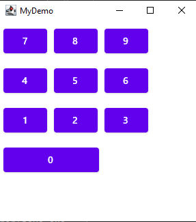
If you run this program the result is a grid of buttons:

You should have no problem seeing how it works. The spacing of the buttons is achieved by adding padding to each side. The zero button is on its own in the column layout and has its width set using a modifier. This is a nested layout in that the rows are nested within the column and can be inefficient but Compose is organized to make nesting fast.
In chapter, but not in this extract
- State and Events
- Remember
- Example – A Calculator
- Composable Functions as Widgets
- Content Context
- Keypad with Hoisting
- The Structure of a Multiplatform App
- Where Next?
Summary
-
Compose Multiplatform is a cross-platform UI framework that makes good use of Kotlin’s facilities.
-
It supports Android, iOS, Desktop (Windows, Linux and MacOS JVM) and web (JavaScript)
-
Composable functions are coroutines that are called by the framework to render UI widgets.
-
The supplied widgets have parameters that let you customize their look.
-
The Modifier object hosts a set of parameters that apply to most widgets.
-
The first time the UI is rendered all of the composable function are called in the order specified by the program.
-
After the first composition the UI can only be modified by triggering a recomposition and in this case only the composables that have changed are called.
-
The only way to trigger a recomposition is to create a mutableState object which is used by the system to react to changes. If a mutableState object changes then only the composables that make use of it are recalled during recomposition.
-
During recomposition a composable is run unmodified and this means any variables created and initialized are created and initialized again. Any variables that don’t need to be recreated and initialized can be remembered by the remember function.
-
Rather than passing mutableState objects around the UI, an alternative is to hoist the state to parent composables using event handlers.
-
If you want to create multiplatform apps, keep all of the platform-independent code together in a single function which is then called by a platform-specific function to implement it.
-
Use the Multiplatform Wizard, an interactive web app, to generate a project that supports the platforms you want to work with.
This article is an extract from:
{loadposition kotlinContents}
{loadposition signup}
{loadposition moreNEWS}
{loadposition moreNEWSlist}
{loadposition comment}
|
