| The Programmers Guide To Kotlin - Compose Layout |
| Written by Mike James | |||||
| Tuesday, 02 July 2024 | |||||
Page 2 of 4
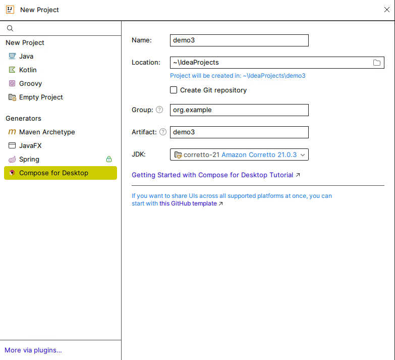
Getting StartedTo use Compose you need either to use Android Studio to develop for Android or make sure you have the Kotlin Multiplatform plugin installed in IntelliJ, full or Community edition. If it isn’t installed, search the Marketplace for it and install it. As a first example, we will create a simple “Hello World” desktop app. This is particularly easy if you are using IntelliJ as it is already available as a standard project type. All you need to do is use File,New,Project and then select Compose Desktop as the project type:
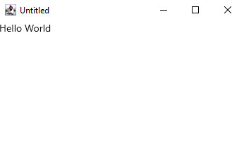
This creates a project with all of the dependencies set correctly that will work correctly with Windows, Linux or MacOS. Notice that in all three operating systems implement the Compose UI using calls to the Swing library. That is, the actual UI created on each of the three platforms is based on Swing and as such you could call it “Compose Desktop Compose Swing”. The project comes complete with a working demo main program, but to understand Compose it is better to delete it and replace it with something simpler: import androidx.compose.material.Text
import androidx.compose.ui.window.Window
import androidx.compose.ui.window.application
fun main() = application {
    Window(onCloseRequest = ::exitApplication) {
        Text(text="Hello World")
    }
}
The UI is constructed by making calls to composable functions. What “composable” means will become clear as we progress. Each platform has its own way of getting the UI started. For the desktop you have to call application. This is the top-level coroutine which hosts the UI and it contains all of the composables that make up the UI. application is not a composable, all it does is to provide a scope for the composables that it runs. It is largely equivalent to: fun application(
exitProcessOnExit: Boolean = true,
content: @Composable ApplicationScope.() -> Unit)
{
runBlocking {
awaitApplication {
content()
}
}
…
When the call to content completes, the application exits. The application function is specific to the desktop implementation of Compose. Notice that in common with all composable functions content, a function parameter, is the final parameter and so you can write the lambda argument outside of the function parameter list – see Chapter 11 DSLs. The content function is a composable that creates the UI, but for a desktop application the top-level UI component has to be a window or a dialog box. A window can be created using the Window function which is also specific to the desktop platform. The Window function has a content property which is set to another composable function which generates the UI that the window contains. In our example, this is just a single UI widget, Text, which is a composable function that displays a string within the window: Window(onCloseRequest = ::exitApplication) {
Text(text="Hello World")
}
The call to Window also demonstrates how event handlers are setup in Compose. The onCloseRequest function is called when the user clicks on the window’s close icon and in this case it is set to call exitApplication provided by the application’s scope.
You can set many of the attributes of the UI widget by setting parameters. For example the Window function supports the title parameter which sets the window’s title: Window(onCloseRequest = ::exitApplication, |
|||||
| Last Updated ( Tuesday, 02 July 2024 ) |