| The Programmers Guide To Kotlin - Compose Layout |
| Written by Mike James | |||||
| Tuesday, 02 July 2024 | |||||
Page 3 of 4
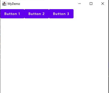
Content and LayoutThe key idea is that the entire UI is defined by composable functions that form the content property of the Window. For example: import androidx.compose.material.Button import androidx.compose.material.Text import androidx.compose.ui.window.Window import androidx.compose.ui.window.application import androidx.compose.foundation.layout.Row fun main() = application { Window(onCloseRequest = ::exitApplication, displays three buttons, each with their own text content. A Button can host text or image content in its own right as a composable. If you try this out you will discover that Compose renders each Button on top of the last. They all display at the same location. If you want to separate the Buttons then you need to use a layout container and the three most commonly used are Row, Column and Box. For example the Row will place its contents spaced in a row: import androidx.compose.material.Button
import androidx.compose.material.Text
import androidx.compose.ui.window.Window
import androidx.compose.ui.window.application
import androidx.compose.foundation.layout.Row
fun main() = application {
Window(onCloseRequest = ::exitApplication, title = "MyDemo") {
Row {
Button(onClick = {}) { Text("Button 1") }
Button(onClick = {}) { Text("Button 2") }
Button(onClick = {}) { Text("Button 3") }
}
}
}
If you want to control the spacing on the items there are a number of different ways to achieve this depending on what you regard as fixed. For example, if you simply use horizontalArrangement parameter in the call to Row you can select an Arrangement. For example: horizontalArrangement = Arrangement.SpaceEvenly
will space the items evenly through the available space. To set the amount of space that is to be divided up we can use the Modifier object to specify the size of the Row object. Most UI components accept a Modifier object as a parameter and it is used to set a range of display attributes such as size, color and font. For example: Row(horizontalArrangement = Arrangement.SpaceEvenly, The Modifier.size function accepts a range of different units including dp, density-independent pixels. This is a measure used in Android programming and they are scaled so that objects are always the same linear size independent of screen pixel density. Modifier calls can be chained to set multiple attributes. For example, you can specify a background color using: Row(horizontalArrangement = Arrangement.SpaceEvenly, You can chain as many Modifier calls as you need to set display attributes. The only problem is finding which call sets what attributes and what to import. The good news is that once you have learned how to set an attribute using the Modifier object it generalizes. For example, to set the size of a Button you can use the same Modifier object: Button(modifier = Modifier.size(150.dp,50.dp), |
|||||
| Last Updated ( Tuesday, 02 July 2024 ) |