| A CMS ASP .NET website in ten minutes |
| Written by Mike James | ||||
| Tuesday, 27 July 2010 | ||||
Page 2 of 3
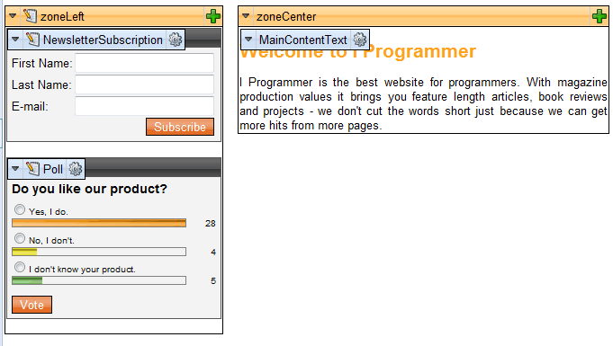
On the home page you can't edit the area at the top including the Company Logo and menu but you can change most of the other elements on the page. If you scroll down to the Main text box you can use the online editor to enter text, create tables, insert links and pictures and so on. If you click the Select option on any picture then you are given a chance to select the graphic file to be displayed. This is all fairly obvious. As long as you are familiar with ASP .NET web parts then much of the rest of the editing should be equally obvious. Many of the areas on the page have large green crosses. If you click on this you can add additional widgets into the area. If you hover over one of the existing widgets then an edit menu appears and you can move it, delete it or customise its properties. In many cases all that will be needed from a content creator is to enter text and images into the appropriate area of the page - the page furniture provided by the template and the widgets are usually left as is. If you click the Design mode tab you can see the areas or zones that the page is divided into and the web parts that occupy the zones by default. In this mode you can move widgets to other zones and generally modify the page. You can't however edit content within the widgets.
Design mode lets you edit the Webparts and page zones Before you move on to consider the next important topic - the structure of the site - you need to explore the range of widgets/web parts that are available for almost instant use. For example, if you want to add a map to a page then you are spoilt for choice - should it be a Bing, Google or Yahoo! map? It's up to you but whichever you choose it's easy and instant. It is also worth noting that many of the widgets have data sources which can be linked to areas of your website. The Latest news widget is worth studying to find out how this all works. Site StructureSite structure is really all about navigation. In the example site provided by Virtual Lab navigation is provided by the menu bar at the top of the page. This in turn is provided by the page template. You can modify the look of the menu by editing the CSS and you can modify the menu's position by editing the template. To edit the CSS you switch to the Site Manager, select Edit corresponding to the site CSS you want to modify and then edit the Top menu styles - Horizontal style. You can aslo modify the menu's behavior e.g. create a tab menu by modifying the web part used.
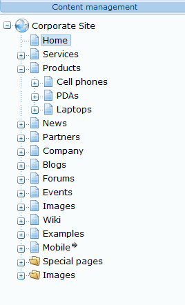
Customise the menu using CSS So you can modify the menu and have complete control over it but where do the menu's items and sub-items come from? The answer is to be seen in the Content management panel to the far left. This shows the hierarchical structure of the website and it is this structure which controls the menu.
The site structure gives the menu its content Each top level page creates a top level menu item. To create sub-items you simply create pages as children of the appropriate top level page. Deeper levels of nesting appear as menus on the sub-pages. How all this works is much easier to follow by doing it than by reading an explanation. <ASIN:1430226080><ASIN:0470502215> <ASIN:1847199844> <ASIN:0735627010> <ASIN:0596521855> <ASIN:0735627142> <ASIN:1934356530> |
||||
| Last Updated ( Saturday, 30 October 2010 ) |


