| Android Adventures - Basic Controls 2.2 |
| Written by Mike James | ||||
| Tuesday, 03 March 2015 | ||||
Page 3 of 3
The EditorAction EventReturning to the EditText control let's add a handler for the Send button. This provides another opportunity for an example of the general process of adding an event handler. First place an EditText for an email on the design surface and use the properties as described in the last section to add a Send button to the IME that pops up when the user enters text - find imeOptions and select actionSend. Before you can handle any new event you have to discover the name of the event listener interface and the setOn method for that event. For the EditorAction event the documentation reveals that the listener interface is called OnEditorActionListener and the setOn method is setOnEditorActionListerner. So using this information we can proceed as before and an anonymous class to implement the event handler. In this case we might as well do the job within the setOnEditorActionListener as the event handler will only be needed by this one control:
As before you don't have to type all of this in. Android Studio will generate it for you if you type new OnEd.. and select the correct option. Now all that remains is to write the event handler - onEditorAction. You can lookup the details of the event handler in the documentation, but the generated stub for the handler function is often enough to let you know what the parameters are:
In this case textView is the control that the event is associated with, i is the action id and keyEvent is null unless the enter key was used. If the action has been consumed then the routine should return true when no other handlers will get a chance to process it. In general Java events can be passed on to other controls that contain the source of the event. For a simple example let's add a TextView and transfer the text that the user entered when they select the send button - imagine that this is sending an email or sms or something more exciting. All we have to do is get cast the v parameter to an EditText and find the TextView that we added to the UI. Then we test to see if the user selected the send button or some other button and if they did we transfer the text:
Notice the use of the EditorInfo static class to obtain the integer id corresponding to the send action. The EditorInfo class has lots of useful constants and methods. If you run the app you will discover that you can enter an email address into the EditText with the help of the keyboard and when you press the Send button the address is transferred to the TextView.
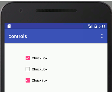
CheckboxesA Checkbox is a fairly obvious UI element. It displays a small label, controlled by the text property and a tick or no tick. The user can select or deselect as many checkboxes as desired. In most cases you don't bother to deal with the state of a Checkbox until the user presses some other control - usually a big button marked Done or similar. Then you can discover the Checkbox's state by simply using the isChecked method which returns true or false.
For example, if you have a Checkbox with id checkBox then you can discover its state when a button somewhere on the view is clicked using:
The Checkbox also supports the onClick event and this can be used to process changes to its state and you can setup the onClick event handler using the Properties window as in the case of a Button. So to handle the checkBox change of state all you have to do is set its onClick event handler to:
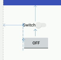
If you need to modify a CheckBox value then use the setChecked or the toggle methods. Switches and Toggle ButtonsSwitches and Toggle buttons are just CheckBoxes in another format. The store one of two states and they change state when the user clicks on them - just like a CheckBox.
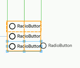
In Android Studio 2.0 a Toggle button causes an error when you place it on the design surface. You can still work with it however. You can check the state of a Switch/Toggle button using the isChecked method and you can use its onClick event to monitor when its state changes. The only real difference is that you can use the textOn and textOff to set what is displayed when the switch/toggle is on or off. Radio ButtonsThe final member of the "simple" input controls is the RadioButton. This works exactly like a CheckBox in that it can be in one of two states but the big difference is that a set of RadioButtons works in a group and only one of them can be selected at a time. The reason for the term "radio button" is that in the early days of electronics car radios had mechanical tuning buttons arranged in a line which let the driver quickly select one station by pressing a button. When you pressed a new button the current button popped up so that only one button was pressed at any given moment - making sure that you only listened to one station at a time. The only complication in using RadioButtons is making sure you group them together correctly. To do this we have to make use of a RadioGroup container which is used to hold all of the buttons that work together. There are a number of other types of container used to group other controls but the most basic of these is the RadioGroup. Using Android Studio you can create a group of RadioButtons by first placing a RadioGroup container on the design surface and then placing as many RadioButtons inside the container as you require. You will see the RadioGroup outlined in orange when you hover the cursor over it ready to drop a RadioButton into it. At the moment the designer doesn't work very well with RadioButtons and it is better to simply drop each RadioButton into the top left of the RadioGroup and let the RadioGroup organize positioning. If a group of RadioButtons don't work as you expect then the chances are you don't have all of the buttons within the RadioGroup.
All of the RadioButtons within a RadioGroup automatically work so that only one button can be selected at a time - you don't have to do any extra work to implement this behaviour. To find out which button is selected you can use the isChecked method as in the case of the CheckBox - in fact you can work with a set of RadioButtons in exactly the same way as a set of CheckBoxes with the only differences being the use of the RadioGroup and only one button can be selected at any one time. You can use the onClick event to detect when any button has been modified and the setChecked or the toggle methods to modify the state of a button. Summary
Buttons
 |
||||
| Last Updated ( Sunday, 23 October 2016 ) |