| Android Adventures - Building The UI 2.2 |
| Written by Mike James | |||||||
| Friday, 30 September 2016 | |||||||
Page 3 of 6
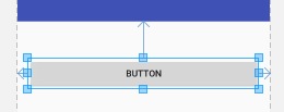
SizingIn comparison to positioning sizing a component is almost trivial. All components have a Height and Width property and these correspond to the drawn height and width when the component is actually rendered on the screen. You may have noticed that there are what look like sizing handles on the components that you place in the Designer. However if you try to drag these to change the size of say a button you will notice that often nothing much happens. For this reason sizing using the designer can seem initially frustrating as it simply ignores your attempts to change the size of a control. The reason is that most components resize to accommodate their contents. This auto-sizing behaviour is set by the layout:width and layout:height properties. You can modify this by typing in an exact size e.g. 100dp into the value box next to the property. You can also set a size in the RelativeLayout by aligning the right and left sides of a control or the top and bottom.
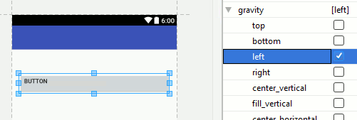
Also notice that you can set a maximum and a minimum size for most components. Setting a maximum will result it the content being truncated if it doesn't fit. Setting a minimum is often the best plan because then the component will increase in size when necessary. GravityNow we come to a property that isn't all that important but it needs to be discussed because it sounds important. Gravity is basically just another name for alignment. If you have a Button and you set its gravity property to Top then the text it contains will align to the top of the inside of the Button. There are a lot of alignment possibilities you can set Gravity to but the majority are fairly obvious. The confusing part is that many components have a text alignment property which can be used to override the Gravity setting.
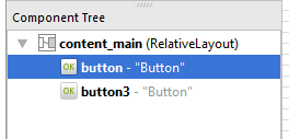
Gravity is more important when used with a different Layout component - the Linear layout when the layout_gravity property sets how the component should align inside the Linear layout - more of this later. Also notice that setting gravity on a component modifies how its contents display. This might not show in blueprint mode. The Component TreeIf you look to the bottom left corner of Android Studio in layout mode you will see a window called Component Tree. This is almost self explanatory and hardly needs much other than to draw your attention to it. However notice that you can see the tree structure of the layout starting at the Layout container. You can see that the default layout is RelativeLayout and you can see the all of the other components correctly nested within their parent containers.
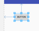
Notice that you can select and delete layout elements directly in the tree. This is useful when you have a complex layout that has gone so wrong that you are finding it hard to select components reliably. You can also move elements around in the tree to change the way that they are nested. A Simple Button ExampleAs a simple demonstration let's first place a Button on the Designer. Align it with the parent at the top left-hand corner as shown:
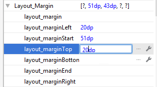
If you find it difficult get a rough position and then enter the exact margins then always remember that you can move to the properties window and enter them directly:
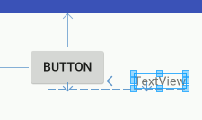
The big problem with this approach is that if you select the component and move it even a little the chances are it will snap to the edge and you will have to enter the property values again. Next place a TextView on the Designer. In this case the alignment we want is for the text to be on the same line as the text in the Button. This is a baseline alignment but if you have the Designer zoomed so that you can see the full area of the screen the chances are all you will be able to do is align to the top or bottom of the Button:
To achieve the baseline alignment you have to use a higher zoom so that you can position the TextView more accurately. Use the zoom tools at the top right of the Designer.
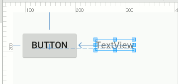
In many cases if you can't get the alignment you want then increasing the zoom to maximum is often the way to achieve what you are trying to do. In this case you can move the TextView near the correct location and it will snap to the baseline alignment:
You can see that the text baselines are aligned by the dotted line drawn under the text in the button and the TextView. Working at higher zooms means you can't see the entire layout and this makes things difficult. So what should you do? You could buy a bigger monitor so that you can work interactively at 100% zoom all the time. You could undock the design window that that it has the full area of the screen to work with. Finally you could use the fact that you know what you are doing to set the layout_alignBaseline to the id of the Button object using the property window. in practice zooming in and out is usually the easiest option.
|
|||||||
| Last Updated ( Friday, 21 October 2016 ) |
