| Android Adventures - Building The UI 2.2 |
| Written by Mike James | |||||||
| Friday, 30 September 2016 | |||||||
Page 2 of 6
The Button An ExampleWhere else should we start - the Button is almost the "Hello World" of UI construction. If you know how to work with a Button you are well on your way to understanding all of the possible components. The good news is that we have already met and used the Button in Chapter 2 and discovered how to work with it in code. However there is still a lot to find out. Generally there are three things you need to discover about using any component.
Setting properties sounds easy but there are different types of properties and these have different appropriate ways of allowing you to interact with them. The first thing we have to find out about is how to position a component.
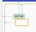
Relative Positioning To The Parent Before you continue with the project select and delete the default "hello world" text - it makes trying things out easier to have a clean design surface. Next click on the Button in the palette and drag-it to the design surface and notice the way the layout information changes as you move the button around the design surface. You can see arrows drawn to show you what the button is positioned relative to. As you move the button the arrows are drawn to the closest other UI component - in the case shown below the edge of the screen.
This is how components are positioned using the default RelativeLayout - more of which later in this chapter. It is worth saying that the RelativeLayout is the most sophisticated of the "classic" Layouts. In Android Studio 2.2 the Constraint Layout was introduced with the idea of replacing the RelativeLayout. More about this in a later chapter but for now we will stay with the RelativeLayout because it is still useful. There are other simpler Layout controls and we will return to this wider topic in a later chapter. In the RelativeLayout components are positioned relative to other components. When you start the only other component is the layout itself and so you are essentially positioning relative to the layout container - i.e. the whole screen. The RelativeLayout only supports nine different positions for a component:
All components are positioned at one of these nine locations and you can see the arrows drawn to the left, right, top or bottom as you move the component about. To provide a finer positioning you can specify an offset in terms of a margin which you can see as the size of the arrows. In other words you are positioning components at say the top left of the screen but then by setting a left margin of 20 and a top margin of 30 you can move the component to the exact position you want i.e. 20,30. This combination of one of the nine fixed positions in the layout plus continuously variable margins work together to allow you to place a component anywhere on the design surface. If you play with the positioning in the Designer you will quickly get the idea. As you might guess, there are properties which let you set the location and margins for each position manually. All layout properties start with layout_name where the name gives the positioning effected. For example, if you look in the Properties window, you will have to click View all properties to see the full list, you will see:
and
You can see that a combination of these plus
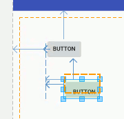
gives you all of the positioning possibilities we have seen in the Designer. Each property can be set to true or false. If you don't include the property in the XML file then it is assumed to be false. You can can set the properties using the property window - a tick sets the property to true, a blank is false and a minus removes the property from the XML file. Notice that not all settings of these properties make sense - e.g. saying you want the component at the top and centered vertically doesn't make sense. Some do make sense if you interpret them correctly. For example setting alignParentLeft and alignParentRight alighns the left side of the control with the leftside of the container and the rightside of the control with the rightside of the container i.e. it changes the controls width. It is also worth understanding that in allowing you to set the position of a component by simply dragging it to the location you want the Designer is working out how to set multiple properties correctly. You could do this manually to get the same effect but the Designer does it simply from where you have positioned a component. This is why it is easier to let the designer set the properties for you. Relative To Another ControlSo positioning in a relative layout is with respect to the container - this is just the first option. Things get a little more complicated as soon as we have more than one Button, or in general any component, in the layout. If you click to place a second Button and then move the location around the screen again you will notice that now alignments are shown for the first Button as well as the parent. In a relative layout you can set the position of a component relative to the parent container or to any of the other components in the container. The Designer positions the component you are using relative to the nearest component or the parent container.
What this means is that if you position a second button relative to the first then the second button moves if you reposition the first - try it to see how this works. The two buttons move together if you move the first button. What is less obvious, but logical, is any relatively positioned components will move if the aspect of the component they are positioned against move. For example, if a component is positioned relative to the right side of another component then making the component wider moves the component that is positioned relatively to it. As you might guess there are a set of properties that you can use to position one component relative to another layout_alignLeft and layout_alignTop set the alignment of the left and top of the control with the left and top of the specified control. Each of these properties are set by specifying the id of the control you want to align with. So for example setting layout_alignTop to @id/button aligns the top of the control with the top of the control with id button.
This all sounds very complicated and it might leave you thinking that it is all unnecessary. However it means you can build sets of components all aligned to one that is aligned to the container so that they all move together as a group. It means you can place one component with an offset from another no matter what the size of the first component is. You can also set components to align with the left and right side of the screen and allow for rotation from portrait to landscape. However all this said it is very easy to get into a complete mess with relative layout in the Designer. If components go missing then chances are they are on top of each other. The easiest way to sort this problem out is to go to the Properties window and manually reset one of the positioning properties. It is helpful to notice the following:
It is also worth noting that there are other layout components and you are not restricted to the RelativeLayout component. The RelativeLayout component is used by default but you can change this for any of the other layout components - Constraint, Linear, Table, Grid and Frame. There are also other container components which can be used in place of these standard layout components. More of this later. One thing worth knowing at this early stage is that components have layout properties that are provided by their container so the set of properties that we have looked at in connection with the RelativeLayout component are unique to it. That is if you use another Layout then you have to learn its layout properties from scratch. Again this is another topic we have to return to. For most apps the RelativeLayout component is a good choice for a mix of Buttons, Text, Checkboxes and so on. |
|||||||
| Last Updated ( Friday, 21 October 2016 ) |

