| Windows 8 Release Preview - Marriage of Inconvenience |
| Written by Mike James | ||||||
| Friday, 01 June 2012 | ||||||
Page 2 of 2
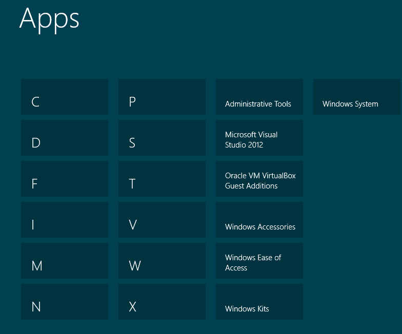
Unification of the Metro and desktop is important as the biggest problem with Windows 8 is that you have two completely separate application spaces - Metro and the Desktop. Now consider the following scenario. You are working with an app on the desktop, Visual Studio Express say, and you can see the taskbar. You can now click on another application that happens to be pinned to the taskbar - but how do you get an app pinned to the taskbar? No good looking for the Start menu as there isn't one. You can switch to Metro if you have discovered the "charms" which pop-up if you point at the bottom right of the screen. There you can use the App bar (right click or sweep up) to show all of the apps on the machine - Metro and Desktop. The app bar shows a pin to Start for Metro apps and a pin to taskbar option for desktop apps. There is no clear distinction between the two types of app displayed in the Start screen - you just have to know or guess. If you don't pin a desktop app to the taskbar then trying to run it is a silly procedure which involves getting to the Start screen and no longer being able to see anything on the desktop. If you have to swap between desktop app and Metro app then the disjoint feeling of the system becomes even worse. Why else would Microsoft remove the Start button? If the Start button was to remain in the desktop, users would stay with the desktop the first time they landed there. Microsoft has to stomp on the Start button if they want to see Metro successful but there are lots of tasks that are made much more difficult by having to swap between the desktop and the start screen. It would have been all a lot easier if the start screen was just another window on the desktop. Rather than pretending that the desktop was just another Metro app complete with tiles, having Metro as a floating window on a desktop and a full screen window on a mobile would make more sense from the users' point of view. The final straw is that the start screen isn't even particularly useful. Yes, you do get live tiles which can show you new information presented by Metro apps, but you don't get something that makes apps easier to manage. You can pin apps to the Start screen and un-pin them. You can group apps and give the groups names, but when you switch to the All Apps view you see everything and can't modify the single level groups. Zoom out and it all looks horrible.
Using the Start screen to organize lots of apps is so difficult that most won't bother. If you do the result is still overwhelming - but not in a good way. I've said that from a programmer's point of view Windows 8 feels like a Frankenstein monster with a Metro head sown onto a desktop body, but this is also how it feels from a user's point of view. There is no logic in keeping these two environments together in this way. The Windows desktop is a liability from the tablet point of view and Metro is a millstone around the desktops neck. There is an argument that Microsoft really doesn't expect anyone to use Windows 8 for anything other than consumer machines. After all, it is only recently that businesses started to move from XP to Windows 7. Perhaps Microsoft really does see Window 8 as an attempt to get the consumer market back from Apple, but even consumers use desktop machines and for this form factor Windows 7 is simpler and makes better use of the power available. So it isn't really the business vote that Microsoft is giving up - it's the desktop. If this is true it makes it all the more insane. Metro drags the desktop around with it like a rotting corpse at the end of a long chain. At the end of the analysis you have to come to the conclusion that this marriage is not even one of convenience. What drives it is a complete mystery. It seems that the old and the new have been forced to live together for no very good technical reasons and neither side of the arrangement is able to live up to its role. More InformationWindows 8 Release Preview Download Related ArticlesWindows 8: A Frankenstein Monster Three Windows 8 Editions Clarify the WinRT Position How Microsoft Could Have Done Metro Dumping .NET - Microsoft's Madness
To be informed about new articles on I Programmer, install the I Programmer Toolbar, subscribe to the RSS feed, follow us on, Twitter, Facebook, Google+ or Linkedin, or sign up for our weekly newsletter.
Comments
or email your comment to: comments@i-programmer.info
|
||||||
| Last Updated ( Saturday, 02 June 2012 ) |


