| MSDN site gets Metro treatment |
| Written by Ian Elliot |
| Friday, 22 July 2011 |
|
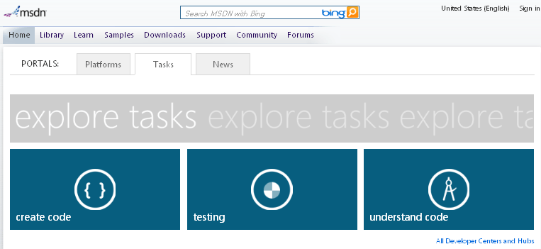
Microsoft's MSDN website is sporting a new look - and if you are a Windows Phone 7 user you'll instantly recognise it. Since introducing the Metro interface with its distinctive tiles, Microsoft has been busy applying it to its websites. The latest site to get a makeover is MSDN.
It's not just the look that is different. There are now two Portals tabs: Platforms and Tasks. The Tasks tab has three tiles - create code, testing and understand code - each of which leads to an overview, access to resources and learning material. The Platforms tab has four tiles - Desktop, Web, Cloud and Phone and again there's a common format to the subsequent pages.
Navigate deeper in, or click the tabs in the menu bar above the new Portals tabs and you'll get away from the Metro style and back to the traditional MSDN look.
|


