|
Page 1 of 5 If you've been reading Android Adventures, at this point you understand how the Activity and the View fit together to create a simple application, but the Android UI is more complicated than most because of its need to cope with a range of very different screen sizes and orientations. In this chapter, now updated to Android Studio Version 2.0, we look at the problem of layout and working with the UI framework. On the way we build a calculator app.
There is a newer version of this chapter that makes use of Android Studio 2.2.
Android Adventures - Building The UI 2.2

Starting With an App
Third Edition
Is now available in paperback and ebook.
Available from Amazon.
- Getting Started With Android Studio 3
- The Activity And The UI
- Building The UI and a Calculator App
- Android Events
Extract: Using Lambdas
- Basic Controls
- Layout Containers
- The ConstraintLayout
Extract: Guidelines and Barriers
- UI Graphics A Deep Dive
Extract: Programming the UI ***NEW
- Menus & The Action Bar
- Menus, Context & Popup
- Resources
- Beginning Bitmap Graphics
Extract: Simple Animation
- Staying Alive! Lifecycle & State
- Spinners
- Pickers
- ListView And Adapters
If you are interested in creating custom template also see:
Custom Projects In Android Studio
When building an Android app you will spend far more time than you could possibly imagine on perfecting the User Interface - UI. So it is important that you master the basics so that you can move on to code that does more interesting things.
The learning curve with any UI framework is more or less the same.
First you have to find out what constitutes an application that you can run i.e. where is the code?
In Android's case this is an Activity.
Next you have to work out how UI components are represented, how you can create them and how to hook up the UI with the code.
In Android's case this is a matter of a hierarchy of View objects and hooking up with the code is a matter of finding the objects representing each UI component and adding event handlers.
Once you have the basics you have to start exploring what components you have been provided with to build a UI.
In general this vary from the extremely simple - the Button for example - to almost complete applications in themselves - the Listview for example. It would take a long time to master all of them but what most programmers do is make sure that they can use the basic components and then find out about the bigger more sophisticated components when needed.
The good news is that once you know how one component, even the simplest, works then most of it generalized to bigger more complicated things.
We also have to worry about how to layout the UI - how to size and position and sets of components.
Android is particularly sophisticated in this respect because being a mobile operating system it has to contend with a wide range of screen sizes and even orientation changes while an app is running.
This is not a simple topics and we will have to consider it in more detail later but for the moment let's just take a look at the easier aspects of screen layout.
If you are using Android Studio then using the Designer is the simplest and most productive way to work so let's continue to concentrate on this method of creating a UI.
A simple UI - What's In The Palette
Start Android Studio and create a new simple basic activity project called UItest - this is going to be our UI playground for the rest of the chapter.
Accept all the defaults and wait while the project is created.
If you now open the file content_main.xml in the app/res/layout folder then the Designer will open and you will see the familiar rendering of the default layout.
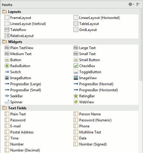
Now it is time to look at the Palette in more detail.
The top three sections of the Palette hold the most important UI components.
- The Layouts are containers for other components that provide different layout rules. Layouts are something you use once per Activity so they probably shouldn't be at the top of the list.
- The Widgets section contains the most frequently used components - Buttons, TextViews, Checkboxes and so on. This is the set of components you need to learn to use first.
- The third section - Text Fields are a set of text input components which all work in more or less the same way.
The Button An Example
Where else should we start - the Button is almost the "Hello World" of UI construction.
If you know how to work with a Button you are well on your way to understanding all of the possible components.
The good news is that we have already met and used the Button in Chapter 2 and discovered how to work with it in code.
However there is still a lot to find out.
Generally there are three things you need to discover about using any component.
- How to make it initially look like you want it to. This is a matter of discovering and setting properties using the Designer.
- How to modify the way a component looks at run time. This is a matter of finding out how to work with properties in code.
and finally
- How to hook up the events generated by the component to the code.
Setting properties sounds easy but there are different types of properties and these have different appropriate ways of allowing you to interact with them.
The first thing we have to find out about is how to position a component.
Relative Positioning
Before you continue with the project select and delete the default "hello world" text - it makes trying things out easier to have a clean design surface.
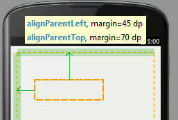
Next click on the Button in the palette and notice the way the layout information changes as you move the button around the design surface.
As you move the Button around you will see various AlignParent messages and a measurement of the padding applied by setting the margin property.
This is how components are positioned using the default RelativeLayout - more of which later in this chapter. It is worth saying that the RelativeLayout is the most sophisticated of the Layouts and not the one that you want to use for simple layouts. In most cases there are better, simpler and easier to control Layouts than the RelativeLayout.
It is however the Layout you get by default and in many cases it is more efficient than the alternatives.
In this layout components are positioned relative to other components. When you start the only other component is the layout itself and so you are essentially positioning relative to its - i.e. the whole screen.
The RelativeLayout only supports nine different positions for a component:
- Top - left, center and right
- Center - left, center and right
- Bottom - left ,center and right
All components are positioned at one of these nine locations but to provide a finer positioning you can specify an offset in terms of a margin which you can see as the green arrows.
In other words you are positioning components at say the top left of the screen but then by setting a margin you can move the component to the exact position you want. This combination of one of the nine fixed positions in the layout plus continuously variable margins work together to allow you to place a component anywhere on the design surface.
If you play with the positioning in the Designer you will quickly get the idea.
As you might guess, there are properties which let you set the location and margins for each position manually.
All layout properties start with layout:name where the name gives the positioning effected.
For example, if you look in the Properties window you will see:
layout:alignParent
which could be top, left, bottom or right.
and
layout:centerInParent
which could be horizontal, vertical or both
You can see that a combination of these plus
layout:margin
gives you all of the positioning possibilities we have seen in the Designer.
Notice that not all settings of these properties make sense - e.g. saying you want the component at the top and centered vertically doesn't make sense.
It is also worth understanding that in allowing you to set the position of a component by simply dragging it to the location you want the Designer is working out how to set multiple properties correctly. You could do this manually to get the same effect but the Designer does it simply from where you have positioned a component.
This is why it is easier to let the designer set the properties for you.
|