| Fitness success with a spreadsheet |
| Written by Janet Swift | ||||
| Friday, 07 May 2010 | ||||
Page 2 of 3
Stamina improves with practice
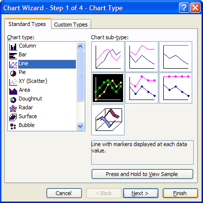
First let's create a line chart of the increase in repetitions achieved correlated with the number of minutes devoted to exercise each week. Select B1:D13 as the range to chart and click on the icon to open the Chart Wizard. Choose Line as the Chart Type from the left menu and the sub-type with markers shown for each value.
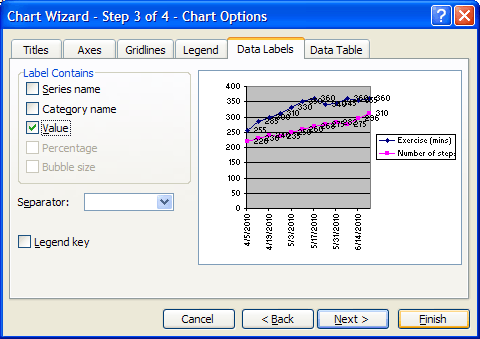
Clicking Finish after Step 1 would produce a reasonable chart but to make it more informative let's add the with the actual values shown for each plotted point. To do this press Next twice to get to Step 3 and here choose the Data Labels tab and place a tick against Value as the Label Contains option.
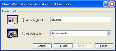
While in Step 3 you can also go to the titles tab to add a chart title such as "Improving Stamina. Click Next and at Sep 4 select the option As new sheet. Type "Stamina - Steps" to replace Chart 1. Then click Finish.
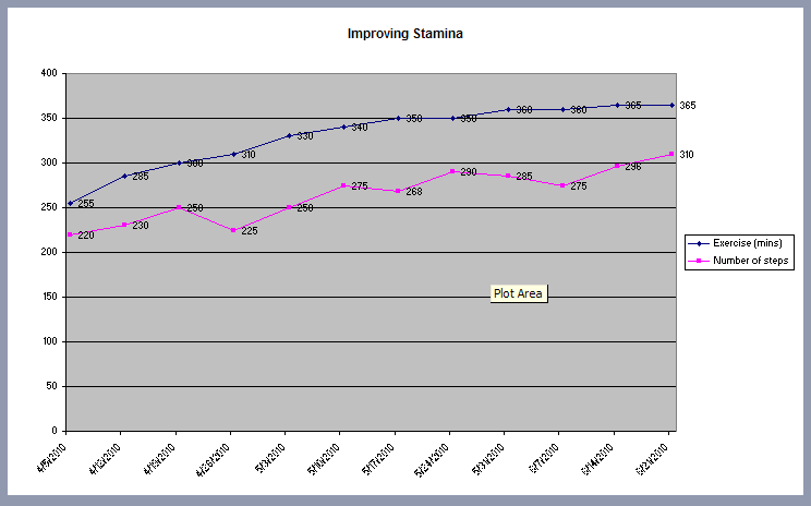
You'll see this chart in a new sheet with the name Stamina - Steps already in the sheet tab. Try moving the mouse cursor around slowly in and around the chart and notice the tip boxes that appear for each component - here we have the Plot Area tip on display.
At the moment chart looks a bit top heavy and rather it has a lot of "empty space". To remedy this let's reduce the y-axis. To do this hover the mouse over the y-axis so that the Vertical Axis tip box appears then right-click and choose Format Axis (or use Ctrl+1). In the dialog box that opens click on the Scale tab. Then type 200 into the Minimum box - notice that this removes the tick in the Auto box. Leave the other values as the Auto settings.
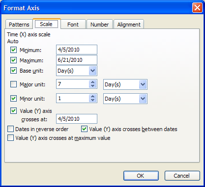
When you click OK the graph will be redrawn so with the shorter axis. You may find the something unexpected happens to the X-axis as a result of giving the graph its own sheet with extra tick marks appearing. This is both untidy and misleading as the "unit" for this axis is a week rather than a day. The remedy is to hover the mouse over the x-axis to see the Category axis tip box, open the Format axis dialog and change the Major Unit to 7 days.

|
||||
| Last Updated ( Sunday, 09 May 2010 ) |