| Skinning Windows Media Player |
| Written by David Conrad | |||||
| Tuesday, 02 March 2010 | |||||
Page 2 of 4
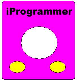
The graphics fileThe file primary.bmp is going to determine the overall look of our custom media player including any controls that it might have. Open a copy of Paint and paint a design of your choice. The only rule is that white will be transparent and you need to paint two buttons – one will be used for play and the other for stop. You can copy the design shown in the figure if you want to or you can do a lot better! (The purpose here is not to impress but to explain how things work.) Make sure that you save your effort in the same directory as the skin definition file as a .BMP file called primary.bmp.
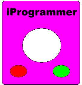
If you now rename the skin definition file to Skin.WMS and double click on it you will be pleased to see that it works but you might not be so pleased to see your custom WMP complete with holes and buttons as these don’t work – a problem we now turn to. MappingWe have already seen how a colour can be used to indicate something special in the way that the clipping colour is used to define the shape of the WMP’s window. The same idea is used to specify areas of the primary image that act as controls. Each control, a play button say, is assigned a colour all of its own using the same hex RGB colour specification. A second graphics file – the map file – is used to show where the button is by where the colour occurs. For example, if the play button is assigned pure red i.e. #FF0000 then anywhere that pure red occurs in the mapping image is regarded as part of the play button. Notice that the mapping image isn’t actually displayed – it just acts as a “map” of which parts of the primary image corresponds to which control. Of course if you are trying to create a “sane” user interface you want the mapping image to designate regions of the primary graphic that actually look like controls to the user i.e. the yellow blobs in our example. This is the reason that the examples included in the WMP SDK make use of graphics packages that support “layers” which makes it easy to draw two images that are synchronised. However, you can do the same job by opening the primary graphic using Paint, and re-colouring the controls to unique colours (the “fill with colour” tool makes this easy). After you have coloured the left “button” pure red and the right “button” pure green make sure that you remember to save the file as “map.bmp”. In practice a map file will have a lot more colours in it than in our example – one for each control – but the basic idea is the same.
The map marks out buttons using colour ButtonsNow we have a map of where the controls are we have to define what they actually do when the user clicks on them. This is achieved using the BUTTONGROUP tag and any number of BUTTONELEMENT tags. In general you can link any button to an event handler written in a scripting language. We can avoid writing any code at this stage because there are a number of predefined buttons that have built-in event handlers. For example, there is the <PLAYELEMENT> which is a button complete with event handler that calls the play method. There are standard buttons for all of the usual play functions – pause, rewind etc. With the mapping file and the additional XML we can now activate the yellow blobs on the primary image as play and stop controls. Enter the following and save as skin2.wms: <THEME> The <BUTTONGROUP> tag specifies the mapping image to be used for all of the button elements it contains. Notice that you can have multiple button groups within a skin. In fact you can even have multiple views within a skin and these, together with suitable button groups, can be used to produce detached control pads. Each button element defined within the button group has to specify the colour that it corresponds to within the mapping image. Now when you open the skin you should see a help message if you hover the mouse over either of the buttons and, as long as the player has a default play list, then you should hear something if you click the play button. You can specify the file to be played by using the <PLAYER> tag. This is a different use of an XML tag in that it doesn’t correspond to a visible control but to an underlying object, i.e. the player. You can use such tags to set object properties. For example if you add the lines anywhere within the <VIEW></VIEW>: <PLAYER then it will load and play the audio file specified. (Make sure that there is a file "tada.wav" in the root of the C: drive. (The code for this skin is in skin3.wms.) <ASIN:0321514696> <ASIN:0321702115> <ASIN:1856176789> <ASIN:0321702115> |
|||||
| Last Updated ( Tuesday, 02 March 2010 ) |