| Getting To Know WPF |
| Written by Mike James | ||||||
| Thursday, 26 September 2019 | ||||||
Page 4 of 5
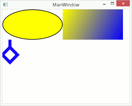
GraphicsWPF is also a full graphics system and you can draw either in XAML or in code almost anything you want. For example to draw a line: <Line An Ellipse is as easy: <Ellipse You can also draw polylines, i.e multiple connected line segments: <Polyline You can also create smooth curves fitted to a set of points using Bezier curves but this is a little more complicated – see the documentation. WPF also supports a wide range of sophisticated fills including gradient and bitmap fills. For example to create a linear gradient fill: <Rectangle Width="200"
WPF is a complete 2D graphics package
Buttons on the edge of a nervous breakdownOne particular feature of WPF that is worth getting to know sooner rather than later is animation. The entire graphics system has been built with animation in mind from the word go. You can even create animations using nothing but XAML. The easiest way to get to grips with this topic is to actually animate something – in this case a button which fades in and out when a user is about to click on it and then jumps some distance when they do. Start a new WPF project and change the layout Panel from Grid to Canvas and add a button: <Canvas> In this case we have positioned the button at (0,0), i.e. the top left-hand corner of the Canvas. Notice the way the Canvas property of the Button is used to position it. This is an example of a dependency property i.e. it is a property that the Canvas supplies and uses to position the button. You will need to master dependency properties. Animations can be created in many ways but in XAML you have to use a Storyboard object/tag. A Storyboard can contain any number of Animation objects, which are all activated when it is. You can think of an Animation object as specifying how a property of the object being animated should change over time. For example: <Storyboard> This defines a single Storyboard with a single animation. It’s a “Double” Animation because the property being animated is a double precision type, not because it is in any sense “two” animations. There are animation objects to animate points, colour and so on. If there isn’t an animation object for the type of property you want to animate you can create one. In this case the animation is applied to Button1’s Opacity property. The “From To” specifies that it should be varied from 1.0 visible to 0 i.e. completely transparent over a Duration of 1 second. This is a very simple type of animation but there are many more sophisticated types, including keyframe and path animations, all working in roughly the same way. Now we come to the difficult problem of exactly when the animation should happen – i.e. what triggers it. We could move to code and write event handlers in the usual way but you can also handle events in XAML and this is worth knowing how to do this. Each control you define in XAML has a Triggers collection. Each Trigger specifies an event that invokes it and an action it performs. For example you can place the Button.Triggers tag straight after the Button tag and start to create a list of Triggers: <Button.Triggers> This defines a single Trigger which will occur when the mouse enters the button. The EventTrigger.Actions property is then used to define a list of actions which are performed in response to the event. In this case we start a Storyboard running: <BeginStoryboard> We could define the Storyboard object as a named resource and start it running by using its name. However in this case it’s easier to define the Storyboard after the BeginStoryboard tag: <Storyboard> If you run the program at this stage of development you will see the button fade out repeatedly when you move the mouse over it.
|
||||||
| Last Updated ( Thursday, 26 September 2019 ) |

