| Windows Phone 7 - using the Pivot control |
| Written by Mike James | ||||
| Monday, 11 October 2010 | ||||
Page 2 of 3
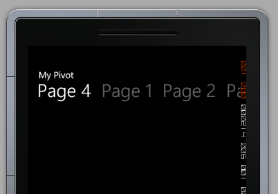
The Header propertyAs the Header property is one of the main differences between the Panorama and pivot controls let's concentrate on how it can be used in more detail. The first question is how to set the font size of the header. At first look it seems impossible as there is no Header font property. As soon as you realise that setting the Header property to a string is the same as: <controls:PivotItem > Then it should be immediately obvious how to set the font. For example, you might choose to reduce the font size and allow more menu items to come into view. If you change the font size of each of the PivotItem Headers the result can be seen below:
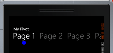
Once you have see this then the idea that you can include other controls within the Header should also be obvious. For example: <controls:PivotItem > Then the result is a blue circle underneath the "Page 1":
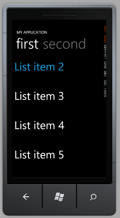
You can include images etc using the same technique the header menu items work in the same overall way no matter what you ask them to display. ContentThere isn't much more to add to how you use the pivot control - the Header property is about the only slightly difficult aspect. You can include any content you want to within the PivotItem. In most cases the content is going to be some variation on a ListBox. At its simplest you can create a ListBox in XAML:
<controls:PivotItem Header="first"> This creates a simple list with six text items. The point of this example is that while you can use data binding and templates to good effect - you don't have to if you have a simpler purpose.
The Generated ProjectThe generated Pivot project imposes rather more structure on the application than just a haphazard use of data binding and this all works in much the same way as the generated Panorama project - so if you know how that all works you can skip the following. The project uses two data objects to generate a view of the data which is presumably intended to be obtained from a Model component - the view approach being on the way to adopting the currently fashionable Model View Controller architecture (or it could be that we are supposed to adopt a Model View ViewModel approach to the design). Here is a brief outline of what is going on. The generated XAML creates a Pivot control with two PivotItems each containing a ListBox which in turn contains a StackPanel and depending on its position some other display objects. Each of the ListBox controls is data bound to the Items property of the collection object. This means that each item in the collection object is bound to one of the ListBoxes. The ListBoxes in the demo code contain two TextBlocks within the StackPanel which are bound to the LineOne, LineTwo and LineThree properties of the Item object that the ListBox is bound to. When the program is run the TextBlocks are automatically generated to display as many items as there are in the collection because it is defined as the ItemTemplate. So basically the Pivot object has been set up to display the items contained in a collection object that it will be bound to later. Each item is displayed using the ItemTemplate so generating a populated ListBox and display page. Notice also that the same data is used for each of the PivotItems - this is just a demo - and hence the two pages show the same data in two slightly different ways. Now to the code. <ASIN:0672335395> <ASIN:1430233745> <ASIN:0735643350> <ASIN:0672332221> <ASIN:1430232161>
|
||||
| Last Updated ( Monday, 11 October 2010 ) |


