| Android Adventures - Building The UI |
| Written by Mike James | ||||||
| Tuesday, 17 February 2015 | ||||||
Page 3 of 5
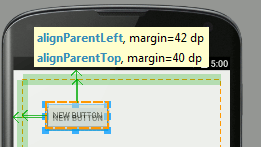
A Simple Button ExampleAs a simple demonstration let's first place a Button on the Designer. Align it with the parent at the top left-hand corner - this should be easy apart from the tendency to snap to the top and left edges.
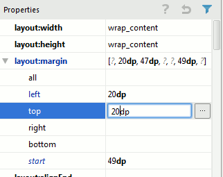
If you find it difficult get a rough position and then enter the exact margins then always remember that you can move to the properties window and enter them directly:
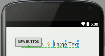
The big problem with this approach is that if you select the component and move it even a little the chances are it will snap to the edge and you will have to enter the property values again. Next place a Large Text widget on the Designer. In this case the alignment we want is for the text to be on the same line as the text in the Button. This is a baseline alignment but if you have the Designer zoomed so that you can see the full area of the screen the chances are all you will be able to do is align to the top or bottom of the Button:
To achieve the baseline alignment you have to use close to 100% zoom. Use the zoom tools at the top right of the Designer.
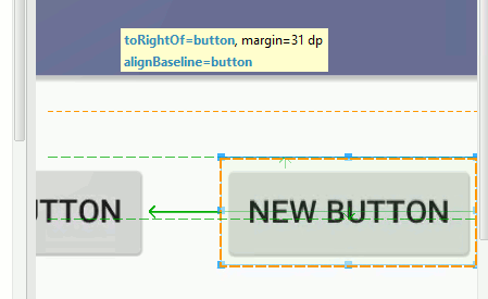
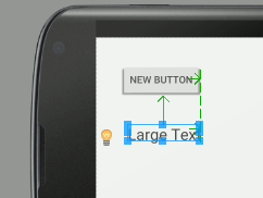
In many cases if you can't get the alignment you want then increasing the zoom to maximum is often the way to achieve what you are trying to do. In this case you can move the Text widget to near the correct location and it will snap to the baseline alignment:
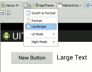
You can see the change in the zoom factor from the size of the Title bar and message. It isn't easy to design the UI layout when you can't see the entire screen area. So what should you do? You could buy a bigger monitor so that you can work interactively at 100% zoom all the time. You could undock the design window that that it has the full area of the screen to work with. Finally you could use the fact that you know what you are doing to set the layout:alignComponent baseline:baseline to the Button object in the property window. in practice zooming in and out is usually the easiest option. Orientation And ResolutionOne of the biggest challenges in creating apps for Android is allowing for the range of screen sizes and orientations. Android Studio lets you see your layout in a range of devices, orientations and resolutions. This makes it so much easier. We can test our layout in landscape mode by simply selecting the landscape option:
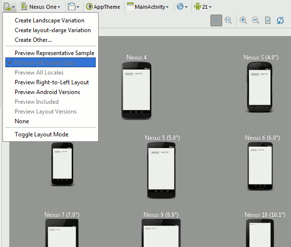
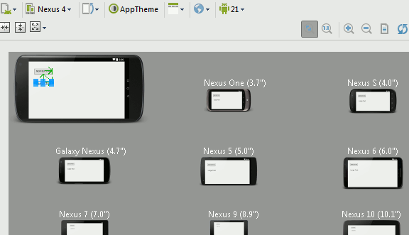
You can also see what your UI looks like on the complete range of supported screen sizes by selecting Preview All Screen Sizes:
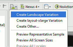
For simple layouts this is probably enough but Android has more up its sleeve to help you work with different sized screens. In particular you can make use of "fragments" and you can create a separate layout for each screen orientation and resolution. Fragments are advanced and the subject of another book. On the other hand using different layouts for each orientation and resolution is fundamental to Android UI design. The idea is quite simple - provide a layout resource for each orientation and resolution you want to support. The system will automatically select the resource layout needed when the app is run on a real device. For example if you create a new layout file called activity_main.xml i.e. exactly the same as the portrait layout file you have already created but in the folder layout-land. You can now edit your landscape layout and it will be used automatically when the user rotates the device into landscape mode. What happens is that when your app starts the system picks the best available layout file for the screen according to what has been stored in the resource folders i.e. layout for portrait and layout-land for landscape.. When the device is rotated the system restarts your app and loads the best layout. If you only have a portrait layout then it is used for all orientations but if you have a landscape layout file then it will be used for landscape mode. What has just been described is exactly what happens - there are folders for each resolution and orientation and you can create multiple versions of layout resources all with the same name. The system automatically picks the folder to use to load the layout appropriate to the hardware at run time. However Android Studio tries to present this to you in a simpler way. The project view hides the fact that different folders are used and simply shows you the different versions of the resource files with a qualifier appended - (land) for a landscape file etc. Let's see how this works. To add a landscape layout to the button and text layout given above simply use the Create Landscape Variation menu option.
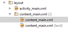
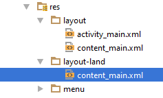
Then initially the portrait layout is used as the template for the landscape layout. Make sure you are editing the content_main.xml file before you do this. This ensures that this is the file that is used as the template for the landscape version of the file. The landscape version of the file will contain all of the UI components that the template file does. This means that your code can interact with it in the usual way without known that it is working with a different layout. All the code cares about is that there is a button or there is a textView - not where they are place or what orientation is in use. If you look at the project window you will see the new layout file listed:
You can see that there are now two content_main.xml files and one has (land) added after its name. As already explained this is a simplification that Android Studio offers you. If you switch to the Project Files view you will see that in fact the new layout resource is in a new directory layout-land
Android Studio's view is simpler but sometimes you need to know where files are really stored. At first the new landscape layout is the same as the portrait layout but you can edit it to make it more suitable for the orientation. For example we might want to place the text under the button in landscape mode:
Now if you run the app using the simulator you will initially see the portrait screen. If you rotate the simulator to landscape mode use the menu to the right, you will see a pause where the portrait layout is visible and then it will change to the landscape layout. If you also view the app on a range of devices you can rotate to landscape and see your custom landscape layout.
In general the best plan is to create a complete portrait layout and generate a landscape layout as late as possible in the development so you don't have to repeat UI tweaks. Also notice that the auto-switching of layouts causes a potential problem. When the layout is switched your app is restarted and this means that it can lose its current state - it is as if your app has just been started by the user. We need to look into the app lifecycle and how to preserve state to solve this problem in a later chapter. You can also use the same approach to supporting different screen resolutions. The idea is the same - multiple layout xml files are provided one for each resolution and the system automatically picks which one to use. This is slightly more complicated than dealing with orientation because you might well have to provide different resolution images to make the layout look good - more on this after we have looked at resources and resource management. This is just our first look at a particular aspect of app development that makes Android more complicated than developing for a fixed screen size - it turns out not to be so difficult as it might first appear. |
||||||
| Last Updated ( Friday, 23 September 2016 ) |
