|
Page 1 of 3 You have to master the basic controls that are used in nearly every UI before you cn move onto something more complicated. Here's how to do it in Kotlin, in an extract from my published book Android Programming in Kotlin: Starting With An App.
Android Programming In Kotlin
Starting with an App
Covers Android Studio 3 and Constraint Layout.
Is now available as a print book:
Buy from: Amazon
Contents
- Getting Started With Android Studio 3
- The Activity And The UI
Extract: Activity & UI
- Building The UI and a Calculator App
Extract: A First App
- Android Events
- Basic Controls
Extract Basic Controls
Extract More Controls ***NEW!
- Layout Containers
Extract Layouts - LinearLayout
- The ConstraintLayout
Extract Bias & Chains
- Programming The UI
Extract Programming the UI
Extract Layouts and Autonaming Components
- Menus & The Action Bar
- Menus, Context & Popup
- Resources
Extract Conditional Resources
- Beginning Bitmap Graphics
Extract Animation
- Staying Alive! Lifecycle & State
Extract State Managment
- Spinners
- Pickers
- ListView And Adapters
-
Android The Kotlin Way
If you are interested in creating custom template also see:
Custom Projects In Android Studio
We have already used some UI controls in previous chapters, but now we have discovered how events work it is time to examine how they work and how you can change the way they look.
Basic Input Controls
The term control comes from the idea that the user "controls" your program using them. Widget or component are also terms that are used to mean the same thing. The Android community seems very sloppy about terminology.
The basic input controls are:
-
Buttons
-
Text Fields
-
Checkboxes
-
Radio Buttons
-
Toggle Buttons
-
Switches
If you have used other UI frameworks many of these will be known to you and you can probably skip to just the ones that interest you.
TextView also has to be included in the full list of basic controls, but unlike the Text Field it cannot be modified by the user, i.e. it is an output control only.
Starting right at the beginning, let's revisit the Button in a little more detail.
Button Styles and Properties
There are two basic types of button, Button and ImageButton. The ImageButton is much the same as the Button but it has a src (source) property which can be set to an image which will be displayed as the button icon and it doesn't display any text.
The main attributes that you work with in the case of a button are things like background, which can be set to a color or a graphic. You can spend a long time changing the way buttons look, but in the main the only important attribute of a button is its onClick handler. A button is in your UI to be clicked.
If you place a Button on the design surface you can use the Attributes window to customize it. There are two distinct ways you can change the way a control looks. You can set a style or modify an attribute.
Setting the style modifies a set of attributes to given standard values. You can set a style and then modify individual attributes to tweak it. Often when you first start work on a UI you will set individual attributes only later to formulate a coherent style to be applied to the entire UI.
Set the background of the Button to dark gray by clicking on the ellipsis at the right of the attribute: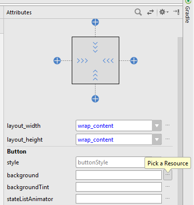
The Resources window that appears gives you access to all of the resources that your program can make use of. Resources are a big part of programming in Android and we cover them in detail in later chapters.
You could enter a color for the background directly by specifying the value of RGB and optionally Alpha, its transparency. Using a resource, however, means that if you change the resource value in the future all of the UI components that make use of it change.
|