| Android Programming In Kotlin: A First App |
| Written by Mike James | ||||
| Monday, 05 August 2019 | ||||
Page 2 of 3
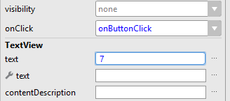
LayoutNow we turn our attention to the layout. Open the layout file, delete the default text and place a single button on the design surface at the top right of the screen with a little space. We need to modify its text attribute and we can use a shortcut to get to it. If you double click on it you will be transferred to the text property window where you can enter 7 as its text attribute. While in the Attributes window find the onClick attribute. Set this to onButtonClick, the event handler you have just written:
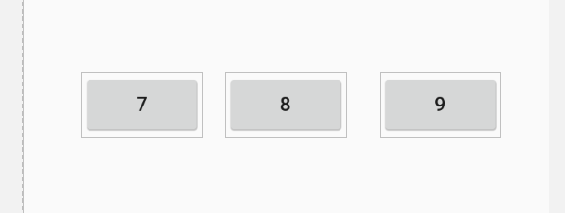
To create a grid of buttons you have to repeat this process nine more times. You could do this by dragging each button onto the design surface and manually set the constraints needed to locate each one relative to the buttons already placed. However, we can use the one Button we have already created to make the rest using copy and paste. Select the button in the Component Tree and use the Copy command and then paste two more Buttons onto the design surface. The copies will be placed on top of the first Button so drag them to form a rough line of three Buttons. Don't worry at this stage about exact positioning, we only need to do this after the constraints are in place. Change the text attribute of each button to read 7, 8 and 9 respectively:
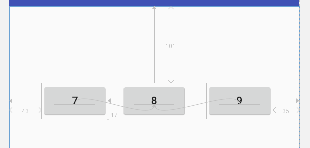
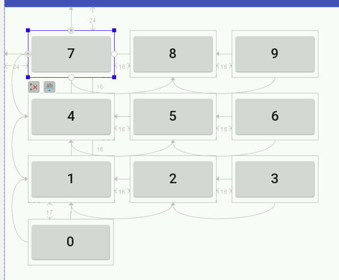
If you try to use Infer Constraints you will discover that it works but the constraints applied are not necessarily as logical as you might wish for. In this case the constraints are reasonable but notice that the vertical position of the row is set by the middle button and the horizontal position by the first button: There are many ways to set the constraints but it is convenient to be able to position the entire array of buttons using the top left-hand button. So position it with constraints to the top and left of the screen. The second button in its row can have a constraint set to position it to the right of the first button and align its bottom with the bottom of the first button. The third button in the row has the same constraints as the button on its left:
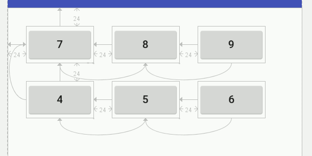
Now is also a good time to position the buttons accurately either by dragging or by using the Attributes window. Continue this pattern with the next row, don't try and copy and paste an entire row because the constraints become complicated. Copy and paste three more buttons. Apply constraints as for the first row, but in this case position the first button in the row relative to the top left button: Change the text in the buttons to 4, 5 and 6 as shown. The final row is the same but its first button is positioned relative to the first button in the second row. Finally add the lone zero button and position it relative to the first button in the third row:
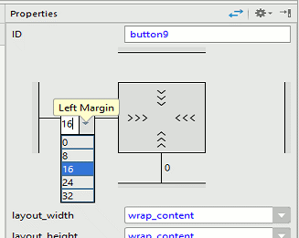
Make sure that you change the text of the last four buttons to 1, 2, 3 and 0 respectively. Check the constraints carefully as it is very easy to make a mistake. The principle is that the first button in each row is positioned vertically by the button above and the other buttons in the row are positioned relative to the first button. This is a lot of work! Now we need to make the grid more regular. Select each button in turn and make sure its caption is correct and that it has the onclick event handler set. Then for each button set the horizontal margins using the Attributes window to 16 horizontally and to 0 vertically. The only exception to this is the first button in each row that needs to be set to 0 horizontally and 16 vertically - if you think about it then it should make logical and fairly simple sense: Now you have a grid of buttons correctly positioned. |
||||
| Last Updated ( Monday, 05 August 2019 ) |
