| Android Adventures - The ConstraintLayout |
| Written by Mike James | ||||||
| Monday, 27 March 2017 | ||||||
Page 4 of 5
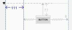
GuidelinesThe final position tool you have at your disposal is the guideline. You can now drag-and-drop a horizontal or vertical guideline on the design surface and use it to position other components. The most important thing about guidelines is that they don’t exist as a View object or anything else in the final layout. A guideline only appears in the Designer and it is used to set constraints on the component that are translated to positioning when the app is run that makes no reference to the guideline. To add a guideline all you have to do is use the Guidelines tool:
Once the guideline has been added you can drag it to the desired location and then you can position components relative to it just as if it was a component in its own right. You can set any constraint that you can use with a component including bias. At the moment the big problem with guidelines is that while the Designer displays the location as you drag there isn’t anyway to enter a value to position it exactly:
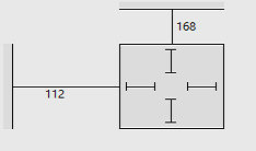
While guidelines are another positioning tool, and you can never have too many, there is nothing you can do with a guideline that you can’t do without one. Also, given that guidelines are positioned absolutely on the screen, they don’t provide any facilities for adjusting the layout as the screen size changes. In fact it is difficult to think up any scenario where they might be useful. SizingIn comparison to positioning, sizing a component is almost trivial but with some interesting twists. You can see how the component is sized in the Properties window. The type of lines shown inside the component indicate the size of the component and its relation to its content. Straight lines indicate a fixed size:
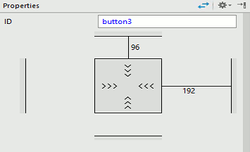
This auto-sizing behavior is set by the layout_width and layout_height properties. You can modify this by typing in an exact size, e.g. 100dp, into the value box next to the property. An alternative to fixed size components is to allow them to automatically resize to fit or wrap their contents. To set this all you have to do is click on the inner straight lines which change to <<< and allow the component to change its size:
This behavior is controlled by layout_width and layout_height properties set to wrap_content and it is the most common sizing behavior used in Android. That is most components adjust their size to suit their contents. There is a third possibility – the size of the component can be set by constraints. If you click one more time on the internal lines they change from <<< to a spring like graphic:
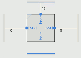
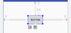
You can set Match Constraints sizing independently in the horizontal or vertical meaning that constraints can be used to set the width or the height of the component. To set the width you have to set a constraint on the left and a constraint on the right and to set a height you set a constraint on the top and one on the bottom. Match Constraints is set by setting a fixed size of 0dp. For example, if you have a Button and manually apply a constraint from the right and one from the left to the parent and have wrap_content set as the horizontal sizing then the Button stays at its original size and bias constraints are added to divide up the available space in the Button’s position:
If you leave the constraints in place and change the horizontal sizing to Match Constraints then the button resizes to use the horizontal space available to it:
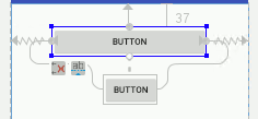
The idea is very simple – do the constraints control the position of the component or the size of the component. You can apply Match Constraints to components that are constrained relative to other components as well as just the parent container. For example, if you have two Buttons and you connect the left side of one to the left side of the other and the same for the right side then the constrained Button will position itself to line up with the middle of the other Button: :
You can set the alignment point using the bias control to make the Buttons have a percentage offset. If you leave the constraints in place and change the horizontal sizing to Match Constraints then the constrained button resizes to be the same size as the other button:
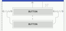
Again the constraints can be used to set either the position or the size. The same principle works for chains of components. If you have a chain set to spread or spread inside but not packed you can set Match Constraints and the components will resize to fill the space. You can set some of the components in the chain to Match Constraints and only those components will resize to fill the space allocated to them. For example, in this chain of three Buttons only the second two Buttons are set to Match Constraints and the first is set to Wrap Content:
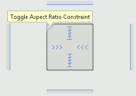
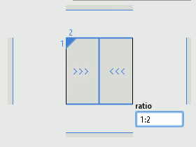
The final sizing option can be used to set the size of one dimension as a ratio of the other. To make this work one of the dimensions must have its size set in some other way – either by a Wrap Content, a fixed size or a constraint. The dimension that is going to be set as a ratio has to be set to Match Constraints and then you click the small triangle in the corner of the Properties display to toggle Aspect Ratio Constraint. For example if you place a Button on the design surface and set its width to Wrap Content and its height to Match Constraint then a small triangle will appear in the top left:
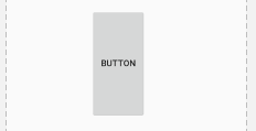
If you click on the triangle you will set a default ratio of width:height of 1:1. If you type in a value of say 1:2 then the height will be set to twice the width which in turn is set by the contents:
The display shows the dimension set as a ratio by a straight line:
You can set one of the dimensions using constraints. For example, if you manually set right and left constraints on the button and then set its horizontal size to Match Constraints the Button will be as wide as the screen. If you now set Match Constants on the height and set the Aspect ratio to 2:1 you will obtain a Button that is as wide as the screen and high as high.
|
||||||
| Last Updated ( Monday, 27 March 2017 ) |

