| HTML5/CSS Layout |
| Written by David Conrad | ||||
| Thursday, 23 February 2017 | ||||
Page 2 of 3
FloatNow we come to the most confusing part of the default vertical layout. You can make blocks behave in a different way by specifying the float attribute, which can take the values left or right depending on which side of the page you want the block to move to. The rules for a float are simple. If you specify a left or right float then the block moves to the vertical position it would have had without the float and then moves as far to the left or right as it can without overlaying any other floated blocks at the same vertical position. The floated block doesn't take part in the default vertical layout with the result that the next block occupies the same vertical position as the floated block. As far as other blocks are concerned the floated block plays no part in the vertical layout - it is as good as not there. This is more complex than you might think because how things behave depend on which blocks have the float attribute. For example, add float:right to just the second block, i.e. the red block,
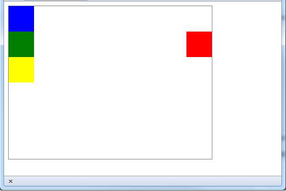
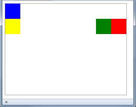
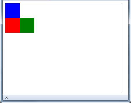
What you get is:
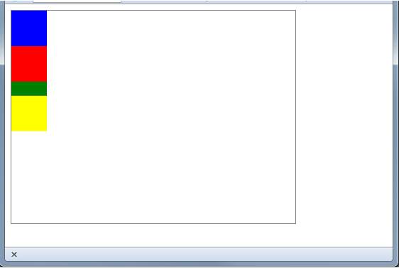
This makes sense but notice that the green block is where the red block used to be - it has simply ignored the red block. To see that this is the case just try changing the red block's float to left. What do you think will happen? You might be surprised to learn that the red block is on top of the green block. The reason is that the float occurs after all of the other non-floated blocks have been rendered. If you think about this makes sense because all the other blocks are laid out using the default rules and then the floated blocks get placed. You can see that this is the case if you increase the height of the green block so that it can be seen underneath the red block:
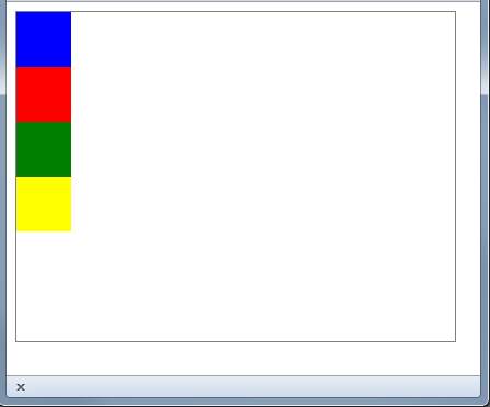
ClearThe behavior of floated blocks covering up non-floated blocks is an even more real problem when it comes ot the interaction of floated blocks with in-line elements, more of which later. But there is a simple solution to the problem - the clear attribute. If you set clear to left then the block will take account of a left-floated block in its layout. If you set clear to right then the block will take account of a right-floated block and if you set it to both it takes account of all floated blocks. In other words, clear makes a block "see" floated blocks and take them into account in the usual default layout. So, for example, if you set clear:both on the green block then is appears in the layout where it would if the red block wasn't floated:
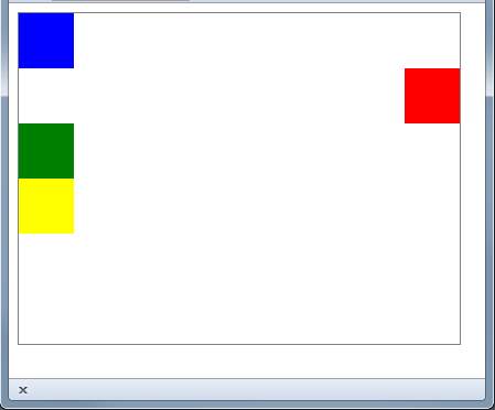
This isn't hugely impressive as we are back to where we were before we started floating things with a column of colors. However, if we float the red block to the right you can see that the description of how float and clear interact is correct:
Even though the space on the left isn't used, the green block avoids it. A floated block can also be cleared to essentially start the layout over again with another set of floated blocks. We all float togetherIn most cases you tend to use float for a set of blocks to make them right and left justify as a set. The rule is that while non-float blocks ignore floated blocks and vice versa floated blocks do take each other into account and floated blocks will not overlap one another. For example if we float the read and the green blocks to the right we get:
This is what you should expect and if we float to the left we get the same overlaying of the next non-floated block:
Now it is the yellow block that is underneath the red. We could stop the overlaying by using a clear but most of the time we simply want to float a complete set of blocks within a container and then we use clear to continue the layout - on the next line so to speak. <ASIN:0321772741> |
||||
| Last Updated ( Thursday, 23 February 2017 ) |
