| JetBrains Mono - A New Programming Font |
| Written by Mike James |
| Saturday, 18 January 2020 |
|
There are two types of people in this world - no it's not "that" joke - those who revel in fonts and all things to do with them and those who hardly notice them. So the news that JetBrains has a new programming font will either excite you or leave you wondering what the fuss is about. Fonts. They hold an almost mystical attraction for some people. Steve Jobs was a font devotee - enough said? For most programmers, fonts are usually some sort of trial by undocumented APIs and vague resources. Which font is usable in any situation can be a pain point as well as a code point. Beyond the details of implementation, however, most programmers are just glad to have a font in any of the font families - Sans, Times etc... Even when it comes to reading code, about the only thing we are agreed on is that mono-spaced fonts are better. Why? Because they allow columns of characters to line up properly. Are we really still back in the days of punched cards? Ah well, at least a mono-spaced font makes lining up indents easy...unless of course you use tabs and I'm not stupid enough to open up that particular war over another iota. But some programmers, and people in general, seem to love fonts. They talk about them. They criticize them and they make fun of people not as well tuned into their aesthetic as they might be - Comic Sans anyone? I have a sneaking feeling that the reason is that it makes the techies sound vaguely arty, or is it that it makes the arties sound vaguely techie? For whatever reason there is a huge one-up-manship to be had in the devotion to fonts.
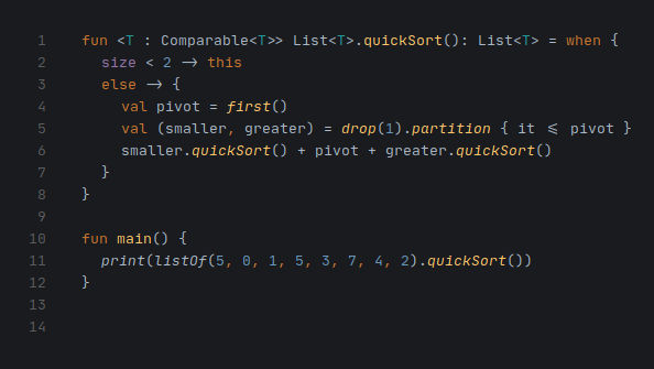
So JetBrains, a company I admire, has joined the club and created an open source font, JetBrains Mono, suitable for programming. It even has a page explaining why it is so good.
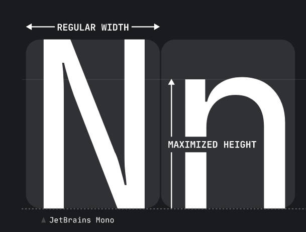
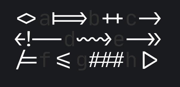
Unfortunately I'm not at all sure that the first claim to fame is valid. The font has increased the height of the lower case characters. The argument is bigger characters equals more pixels. If this is true let's go over to all caps. There is also the small matter that many dyslexics, disclosure I'm one, claim that the shape of a word helps them read it. Yes I can recognize words better if they are lumpy. It is also why CamelCaseWorks - who needs spaces - and I think I've just invented a new compression method. The second idea is much better - ligatures. If you know what ligatures are you are either a font devotee or a surgeon. From the programming point of view a ligature attempts to create a single symbol from a composite of glyphs, and if you know what a glyph is you are either a font nut or an archaeologist, by moving them closer together e.g. not + + but ++, only even closer.
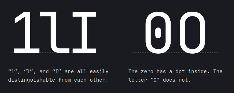
There are other claimed advantages, but can I mention the use of a dot to distinguish between a 0 and a O. This is something I have been using for a while. I think it looks horrible, but it is worth it for the clarity of meaning.
Check out the font. It is easy to download and easy to install; it supports 143 langugages and, of course, it is open source. Personally I think JetBrains made a mistake in naming it JetBrains Mono. A good name for publicity, but not highbrow enough for the font crowd. Something like JetBrains Sans Ko̱dikós might just work, as long as its meaning never becomes clear.
More InformationJetBrains Mono: A typeface for developers Related ArticlesOpen Source Font Designed For Code Tabs Or Spaces - One Billion Files Later An Answer Tabs versus Spaces? Not Just Contentious But Economic To be informed about new articles on I Programmer, sign up for our weekly newsletter, subscribe to the RSS feed and follow us on Twitter, Facebook or Linkedin.
Comments
or email your comment to: comments@i-programmer.info |
| Last Updated ( Saturday, 18 January 2020 ) |


