| Too Good To Miss: Battery UI Changes Users Space And Time |
| Written by Harry Fairhead | |||
| Sunday, 19 January 2020 | |||
|
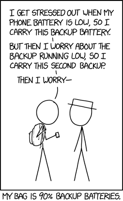
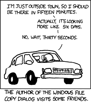
We don't really consider the effects that our user interfaces have on human behavior. Could it be that we are changing the way people think about time and space simply by showing them a bar indicator of battery state? (From: 2019-09-14) New research by Thomas Derek Robinson and Eric Arnould at City University (London) is reported in a paper (disgracefully pay-walled) with a title that gives no clue as to what it contains. Do not be deterred, Portable technology and multi-domain energy practices, has some interesting insights into how we are warping users' perceptions in unexpected ways. It seems that we are so dependent on our smart phones that how much battery they have colors everything we do. No longer do users see the distance between metro stations in terms of distance, or even time, but in how much battery they are going to use. So for example, a user might think that their work commute is a 25% battery drain. When I heard this I couldn't help but think that these guys must have very poor batteries or very compute-intensive tasks. However this rings true: One of the study’s respondents described the experience of watching their battery icon throughout the day: “Full would be ‘Yeah, ok great’, good to go for the day’; 50 per cent I’d be a bit ‘Oh God, I had better stop it from updating itself all the time in the background’ … then it would be at 30 per cent and I would be like: ‘Now I’m not having fun anymore’. So does: “During interviews respondents discussed how a full battery gauge made them feel positive and as though they could go anywhere or do anything. Anything less than half full, however, induced feelings of profound anxiety and discomfort” I wouldn't go so far as to say that I ever feel "profound anxiety and discomfort" regarding my device's battery life, but I do think I understand. Users are now so tuned into their battery levels that it controls not only how they plan their activities, but how they view themselves: Respondents who monitor their battery gauges and take measures to keep a high level of charge identify themselves as “control freaks”, “quite anal”, “planners” and “a bit OCD”. People who regularly allow their phone batteries to run out of charge were identified as “frightfully frustrating”, “disorganised” and “inconsiderate”. Have they no power banks? I guess the problem might be exactly what this first obligatory xkcd cartoon illustrates: Backup Batteries More cartoon fun at xkcd a webcomic of romance,sarcasm, math, and language It may reflect badly on you to run out of battery, but running of battery and backup battery and ... Are there other UI elements that have influenced "normal" life? A few I can think of include the swipe left or right gesture to mean like or dislike - not one I'd use being parity-error prone. I have seen people use the pinch to zoom gesture over a distance to indicate bigger or smaller. Somehow I don't think that the Windows bar indicator of time left to copy a file ever really influenced anyone - but it made a lot of enemies. A second obligatory xkcd cartoon makes the point: Estimation
Any other UI effects on psychology, culture or mental wellbeing gratefully received. More InformationPortable technology and multi-domain energy practices Related ArticlesYour Phone's Battery Leaks - Your Id That Is Change Blindness - A Concern For UI Silly Sliders - Compete To Create The Silliest Volume Control Keep It Simple And Stupid - Users Don't Read Manuals To be informed about new articles on I Programmer, sign up for our weekly newsletter, subscribe to the RSS feed and follow us on Twitter, Facebook or Linkedin.
Comments
or email your comment to: comments@i-programmer.info |
|||
| Last Updated ( Sunday, 19 January 2020 ) |


