| Getting Started with NetAdvantage Ignite UI jQuery Controls |
| Written by Ian Elliot | ||||
| Wednesday, 03 July 2013 | ||||
Page 2 of 3
OptionsIn jQuery UI and hence in Ignite UI all of the option parameters are passed as a single associative array. For example to specify that the currency symbol is "#" and the input box should be 200 wide you would use:
as the options parameter, i.e.
If a control has a method, i.e. a function that does something then the standard way to call this is to use:
where method name is the name of the function and the parameters that are passed to it are given as a comma separated list. For example all controls have an "option" method which solves the following problem - What if you want to change a parameter after the control has been initialized? The answer is you can make use of the option method which you call in the following way:
This sets the named property to the value using the call:
You can call other methods in the same way. ASP.NETWhat if you want to use the control from ASP.NET? The simple solution is to make use of the MVC helper classes to generate the client side JavaScript that does the job. How you make use of these depends on whether or not you use the razor syntax or not - but the calls are the same. For example in ASPX you would write
and in Razor you would write:
The code is the same only the manner of marking it out as code changes. You can also see the general idea behind the helper objects. In each case there is a method "setter" for each of the option parameters. Notice that the helper objects simply generate the same client side JavaScript as we manually created earlier. A Date pickerNow that you have the basic idea of how it all works let's take a look at a slightly more advanced example - one where style sheets matter. The date picker is built on top of the basic jQuery data picker. Add a new web page called Date to the project and add the same script tags to it - see later for the complete listing. The HTML control to augment might was well be another input box:
We will also use the jQuery ready event to run the script as before
The next step is to call the function that does the augmentation complete with some initial options:
And of course we need to close the "ready" function:
If you launch this web page you will find that it sort of works but it isn't impressive. It is just an input box that when you click on it shows a data entry template:
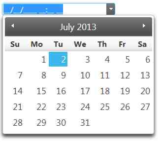
This is nice but we were promised so much more - where is the animated calendar? The answer is that we haven't loaded the correct style sheet. It comes as a surprise to some JavaScript programmers that lack of a style sheet can have such dramatic and behaviour based effects - but it can. In this case we need two style sheets. The second is needed for most NetAdvantage jQuery controls:
With these two added the change is amazing. Now you have a drop down button at the right and if you click it the calendar slides in from the left and out again when you have selected a date.
The complete listing for the page is:
|
||||
| Last Updated ( Tuesday, 08 September 2020 ) |