|
Page 1 of 3 We have already used some UI controls in previous chapters but now it is time to examine what the basic controls that make up a UI are and how they work and how you can change the way that they look.

Starting With an App
Third Edition
Is now available in paperback and ebook.
Available from Amazon.
- Getting Started With Android Studio 3
- The Activity And The UI
- Building The UI and a Calculator App
- Android Events
Extract: Using Lambdas
- Basic Controls
- Layout Containers
- The ConstraintLayout
Extract: Guidelines and Barriers
- UI Graphics A Deep Dive
Extract: Programming the UI ***NEW
- Menus & The Action Bar
- Menus, Context & Popup
- Resources
- Beginning Bitmap Graphics
Extract: Simple Animation
- Staying Alive! Lifecycle & State
- Spinners
- Pickers
- ListView And Adapters
If you are interested in creating custom template also see:
Custom Projects In Android Studio
The Basic Input Controls
Now that we have discovered how events work it is time to take a look at the most commonly used input controls.
The term control comes from the idea that the user "controls" your program using them. Widget or component are also terms that are used to mean the same thing. The Android community seems very sloppy about UI terminology.
The basic input controls are:
- Buttons
- Text Fields
- Checkboxes
- Radio Buttons
- Toggle Buttons
- Switches
If you have programmed using other UI frameworks many of these will be known to you and you can probably skip to just the ones that interest you.
TextView also has to be included in the full list of basic controls, but unlike the TextField it cannot be modified by the user i.e. it is an output control only.
Starting right at the beginning however let's revisit the Button but in a little more detail
Buttons Styles And Properties
There are two basic types of button - Button and ImageButton.
The ImageButton is much the same as the Button but it has a src property which can be set to an image which will be displayed as the button icon and it doesn't display any text.
The main properties that you work with in the case of a button are things like background, which can be set to a color or a graphic. You can spend a long time changing the way buttons look but in the main the only important property of a button is its onclick handler.
A button is in your UI to be clicked.
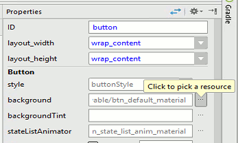
If you place one example of a Button on the design surface you can use the properties window to customize it.
There are two distinct ways you can change the way a control looks. You can set a style or modify a property.
Setting the style modifies a set of properties to given standard values. You can set a style and then set individual properties to modify it. Often when you first start work on a UI you will set individual properties only later to formulate a coherent style to be applied to the entire UI.
Set the Background of the Button to dark grey by clicking on the ellipsis at the right of the property:
The Resources window that appears gives you access to all of the resources that your program can make use of. Resources are a big part of programming in Android and we cover them in detail in later chapters. You could enter a color for the background directly by specifying the value of RGB and optionally Alpha. Using a resource however means that if you change the resource value in the future all of the UI components that make use of it change.
There are different types of resource you can select from and there are resources defined by the project, the Android system and any Themes you might be using. Some times you can't see these three categories because they are expanded into long lists.
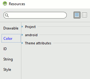
In this case you want to select a color so select the Color tab and then the android list.
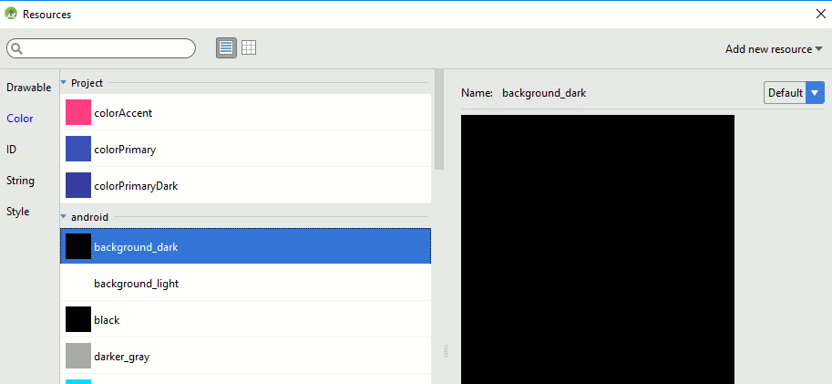
Scroll down and you will see a set of predefined colors that you can use. Find background_dark and select it.
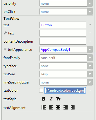
Of course you now cannot see the text in the Button. To modify its color scroll down in the Properties window until you can see TextView. The Button is a composite object and it has a TextView obejct inside of it that displays the Button's text. If you drop down the textAppearance menu you will see textColor. Simply select an alternative light color to use:
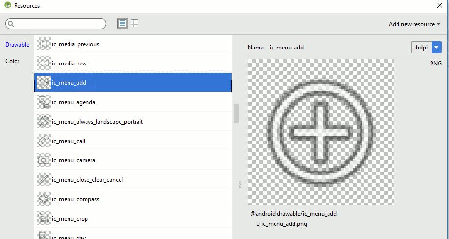
If you now place an ImageButton, located lower in the palette in Images & Media, on the design surface the resources window opens at once. This is to allow you to select a "drawable" for the ImageButton to display. Scroll down until you find ic_menu_add. When you select it this becomes the src property for the button:
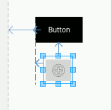
The result is the buttons shown in the image below:
You can spend a great deal of time exploring ways to make use of a button's properties to style it just as you want it to look.
|