| Insider's Guide To Udacity Android Developer Nanodegree Part 6 - Capstone Stage 1 |
| Sunday, 19 November 2017 | |||
Page 1 of 2 The Capstone, this is what it has all been leading up to.This is where you're set free to design your own project and utilize your own ideas, albeit always within the boundaries set by the specifications. These boundaries are placed for good reason, though.The rubric is there to make you think hard about every detail of your project and to foresee and anticipate every requirement that could lead to congestion or extraneous effort, protecting you from crying out it's "too late" when deep into the project. They take shape in a generic template which sets them in boilerplate text which you are expected to replace with your own comments in order to demonstrate the ability to communicate your ideas formally.They are grouped by :
After filling out the document you have to submit it and await feedback on it in order to complete Capstone's first stage.This is done for preventing and mitigating pain points you might run into along the way and also for replicating the process professional Android Developers go through. By the way, it's not easy to get the go ahead by the reviewer. In my case I had to revise twice before my plan got accepted.But that's the best part of this process. Rather than being negative, The feedback is insightful, pointing out the troubling parts that need amendment and making recommendations to help you be more specific and think about the conditions you've missed. This meticulous planning ahead is going to prove golden when you get to the actual implementation phase, Capstone stage 2. So my initial attempts were lacking in adequately describing a number of key constraints such as data persistence and UX corner cases. For example:
Taking those considerations into account, the annotated plan that earned me a pass to stage 2 was: Project: Smart Device Seeker native app
DescriptionContemplate the Smart Device Seeker web site www.smadeseek.com by also offering a native mobile experience through the app. The web site aims to become a database for smart devices as it allow users to search for their ideal smart device (phone, tablet, smartwatch) by going through specialized criteria, like the width of the device, the amount of megapixels the rear camera has, how many fps video can it shoot, etc. Intended UserAny consumer interested in buying or looking for more information on a smart device. Features
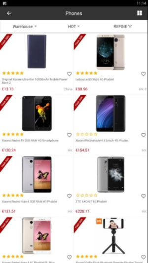
User Interface MocksFor drawing the Mocks I used Ninjamock which despite its Android specific templates as well as UI components the likes of labels, buttons, menus, toolbars, and so on, it had a few others missing, i.e. sliders and navigation views.Nevertheless, its luring temptation was in the free tier which allowed the hosting of a full blown, albeit single, project, but that was exactly what I was looking for at the moment. But first, research, research, research.
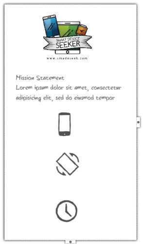
After throwing the established design ideas already applied to the Smadeseek website into the mix, I reached at the following final outcomes:
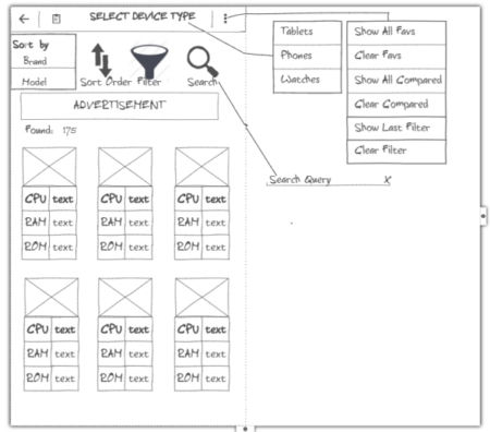
Screen 2 - Master
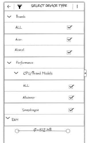
Screen 3 - Filter
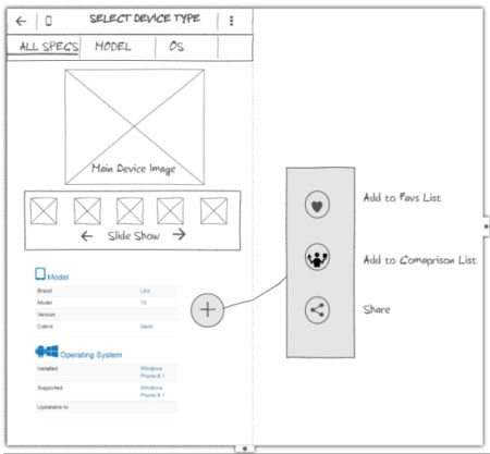
Screen 4 – Detail
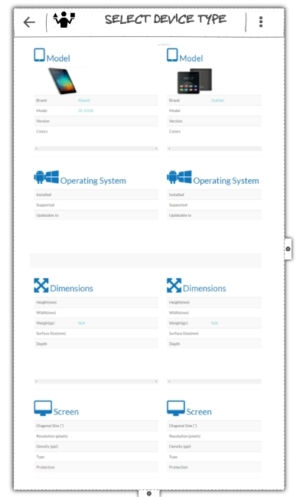
Screen 5 - Compare
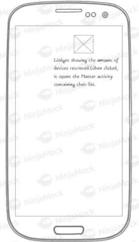
Screen 6 – Widget
Next I had to think of the key considerations and decompose that monolithic idea of an app into clearly defined tasks, which at this initial stage were not expected to be rigid but potentially amendable to a certain degree. |
|||
| Last Updated ( Monday, 20 November 2017 ) |
