| Android Fragmentation Visualized |
| Written by Janet Swift | |||
| Wednesday, 07 August 2013 | |||
|
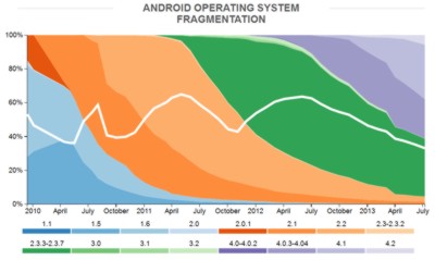
How many distinct Android devices do you imagine there actually are? Open Signal has recorded nearly 12,000 and has produced a graphic to map the situation. We tend to complain about Android fragmentation on the grounds that it makes developing for the platform more complicated - there are so many screen sizes to cater for, to name but one consideration. However, in presenting its findings for 2013 Open Signal points out the big advantage of there being so many different Androids: For consumers, extreme fragmentation means that they can get exactly the phone they want – big or small, cheap or expensive, with any number of different feature combinations. pointing out that: The availability of cheap Android phones (rarely running the most recent version) means that they have a much greater global reach than iOS, so app developers have a wider audience to build for. OpenSignal has gathered its data about Android devices, brands and screen sizes from users of its app which enables users to find the best available signal, find nearby Wi-Fi networks and keep track of usage. In order to make comparisons with 2012 its Device Fragmentation and Brand Fragmentation graphics are limited to 682,000 unique devices but the Screen Size one is based on information from 3.41 million users of the apps. I Programmer regularly reports on the trends in the use of the different versions of Android. OpenSignal has used the same data source, the Google's figures for Android Platform Versions, for its graphic of Android Operating System Fragmentation, but the use of color and the addition of a line to indicate the market share of the leading API level over time makes it instantly informative. Like all the graphics in the OpenSignal Report it is interactive so if you clicking on any graphics here you will be taken to the OpenSignal Site. (click to access interactive version)
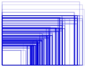
Catering for so multiple versions of the Android operating system presents a certain amount of difficulty for developers but, as already mentioned screen size is even more problematic. OpenSignal's graphic shows physical screen size rather than size in pixels since this is the aspect that makes it difficult for developers. The heavier the line the more popular the size. If you explore the interactive version you can discover which devices correspond to the sizes:
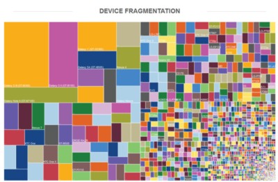
Device fragmentation is on the increase. For its 2012 survey 3,997 distinct devices were recorded while in 2013 11,868 were seen, despite OpenSignal limiting the sample size to the same total number of devices.
(click to access interactive version)
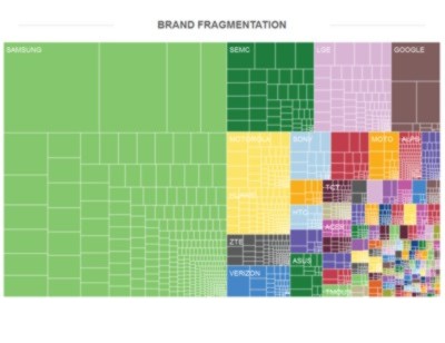
So which are the most popular devices? Although you won't be able to read the names on our page the largest rectangle (yellow) is the Galaxy S III (GT-19300) and the next largest (pink) is the Galaxy S II (GT-19100). Overall Samsung has 47.5% share of all devices with SEMC, LGE, Google, Motorola and Huawei also having sizeable chunks:
While fragmentation certainly poses a headache to developers who have to test and optimize on an ever-increasing number of devices, the success of the of the Android ecosystem cannot be separated from its fragmented, free-for-all, nature.
More InformationOpenSignal - Android Fragmentation Visualized Related ArticlesJelly Bean More Popular Than Gingerbread A Major Shift in the Android Landscape?
To be informed about new articles on I Programmer, install the I Programmer Toolbar, subscribe to the RSS feed, follow us on, Twitter, Facebook, Google+ or Linkedin, or sign up for our weekly newsletter.
Comments
or email your comment to: comments@i-programmer.info
|
|||
| Last Updated ( Wednesday, 07 August 2013 ) |


 (click to access interactive version)
 In its conclusions OpenSignal points out:
