| Android Studio 2.3 - In Need Of Direction |
| Written by Mike James |
| Friday, 03 March 2017 |
|
Android Studio 2.3 is out and it is an improvement. Even so its users probably would like it to have a better sense of direction and to be given the impression of a project that knows where it's going.
Android Studio is the best Android IDE and even if it wasn't it is the only official IDE. Being based on IntelliJ, it is big and rambling and it often feels as if Android is has only just moved into the building and is still trying to get round to unpacking and making the place its own. There is no doubt that Android Studio users like updates. The product isn't so good that you don't need improvements and where there are updates there is always hope that things will work in the next version. So it is with Instant Run. This saves time by only updating the parts of the runtime that have actually changed. It is a great idea but one that is clearly difficult to get right. The latest version has some big changes that make it more reliable by putting some of the intelligence needed to work out when a restart is needed into your hands. If you use the Run or Debug command then you get a complete restart. If you think that your changes are minor, than you can use the Apply Changes command and leave the system to work out what needs to be live updated. This is a good idea, and might lead to Instant Run not being disabled so much of the time. After all, you can give it a try and if it doesn't work you can click the Run or Debug icon. First it was in, then it was out and now its back in again. ConstraintLayout was the default in all templates in the beta of 2.2, but when it was released there was a new layout editor which was designed to work with the ConstraintLayout but no ConstraintLayout by default. Now in version 2.3 ConstraintLayout replaces RelativeLayout in all templates. What are we to make of this vacillation? The big problem was that ConstrainLayout was ambitious and still is. In use it was, and is, slow and subject to strange behaviors. Some of these were due to being misunderstood, but there was still enough real misbehavior for it not to be trustworthy enough for version 2.2, but now it is back and with some new features. The most interesting is constraint layout chains - which will distribute widgets evenly across a space. There are various ways you can use this new constraint - spread into the available space; fix both ends of the chain and spread out evenly; or pack them together. Also new are ratios, which let you set a ratio of height and width for a widget and allow it to adjust to the space available. Add to this the availability of the ConstraintSet class that allows you to set constraints at run time and you can see that things have moved on.
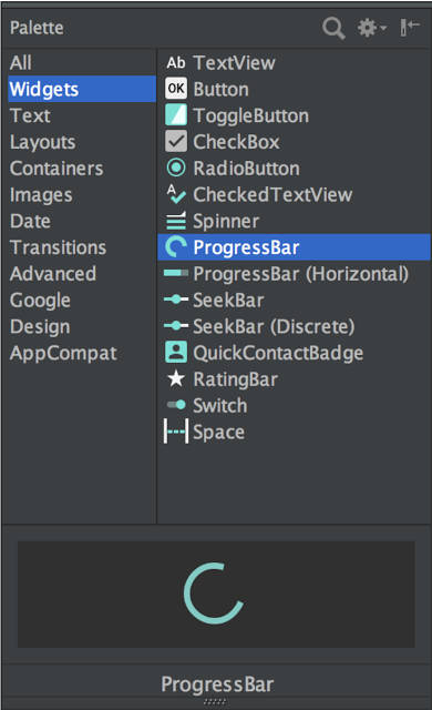
It may have been too early to make ConstraintLayout the default in 2.2, but is it ready for 2.3? ConstraintLayout is very complex because it is trying to solve a sophisticated problem - that of creating an intelligent layout that adjusts to the screen real estate available. This really does need AI, or perhaps a real intelligence, to do the job properly and in this sense ConstraintLayout may be a solution that creates a different problem. This said, the fact that the layout editor has been redesigned for the ConstraintLayout at the expense of the other layouts is a big reason for moving to the new layout. We more or less don't have much of a choice unless many of the features of the editor are restored as it develops. It is clear that ConstraintLayout has a the backing of a large fraction of the Android Studio team, but this isn't just about Android Studio - it is about the very nature of Android apps. If ConstraintLayout is adopted because it is the preference of the toolset, then it had better be high quality, reliable and efficient. It is too soon to bring in a verdict, but my initial use of the new ConstraintLayout and the editor isn't promising. For example, when you drop a widget on the design surface and then drag a constraint to say the top and left of the screen the widget is immediately moved to the top left-hand corner and you have to position it again. Your first positioning is a complete waste of time. I also encountered a few strange graphics glitches under WIndows 10. There are some smaller changes. You can now search, sort and filter in the Palette and you get a preview of the widget at the bottom of the Palette. This is good but there generally aren't that many widgets and you can find them fairly easily. Having a preview is also a little strange - after all once you have seen a button, it's a button and no surprises. Who needs a preview of a set of widgets that hardly ever change? It simply uses up screen real estate that previously showed more widget icons. In addition most of the previews are so reduced as to be useless.
You can also pick your favourite properties to appear on the front of the Properties windows. Given that the expanded properties window was a bit of a mess, this helps. An interesting addition is the ability to use the WebP compression format which is claimed to be 25% smaller than a PNG. Adopting WebP in a web page is risky, but in a closed environment it seems safe enough and you can expect your app to work. One feature that is really welcome is the Lint Baseline. You can now set a baseline in your unresolved Lint warnings and only issues that arise after this will be reported. Other new features include:
Android Studio 2.3 is an improvement in most respects, but the change to the ConstraintLayout is a bigger deal than just a slight modification to the IDE. It is now the default for all new projects and at the moment this doesn't bode well for new and converted Android apps. Instead of wasting time with a widget search and preview that seem to be completely unnecessary, let's hope that Android Studio starts to move in a more purposeful direction.
More InformationRelated ArticlesAndroid Studio 2.2 Now Available For All Android Studio 2.2 RC 2 Downplays New Layout Android Studio 2.2 Preview Big Changes! Android Adventures - Getting Started Creating A UI Android Adventures - Mastering Fragments
To be informed about new articles on I Programmer, sign up for our weekly newsletter, subscribe to the RSS feed and follow us on Twitter, Facebook or Linkedin.
Comments
or email your comment to: comments@i-programmer.info |
| Last Updated ( Friday, 03 March 2017 ) |


