| Charting trends for weight-watching |
| Written by Janet Swift | |||
| Friday, 15 January 2010 | |||
Page 1 of 2 If you are trying to lose weight then it's not the day to day fluctuations but the underlying trends that are important. 
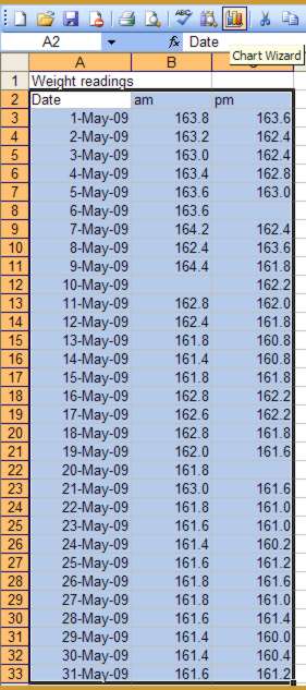
Excel makes it very easy to produce informative charts but is often dismissed as being incapable of producing serious graphs. This spreadsheet reveals that Excel has facilities that make it a capable tool for scientific and research purposes - although to make it useful and relevant the example here is for monitoring weight loss and the data consists of weight readings recorded morning and evening over one calendar month. You can collect your own data or download the file weightdata.xls. The XY Scatter chart differs from the other options available in Excel by being capable of handling two independent variables. In this example the date is assigned to the X axis and weight is on the Y axis. Excel makes it easy to create the weight chart we need as a starting point. Simply select the contents of A2:C33 and click the Chart Wizard Icon in the toolbar.
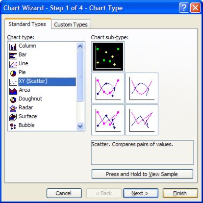
Choose XY Scatter in the list of Standard Types. The first sub-type is selected by default. This simply plots the points using markers and is what we require here so click Finish.
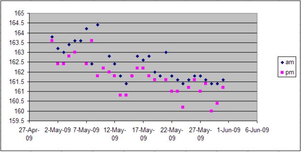
Notice that this type of graph is able to cope with missing values – it simply leaves out the point on the graph. This only poses a problem if you opt for lines joining the points together.
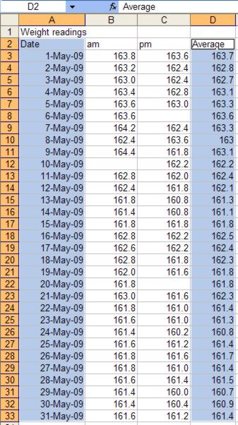
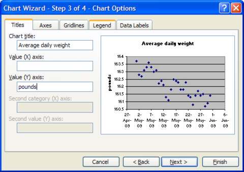
Inspecting the result graph it is difficult to detect the trend because of the way in which the two weight series – am and pm – interfere with one another. What is needed is a way of simplifying the information presented so that the variability in the data doesn’t obscure the overall pattern. The obvious solution is the chart the average daily weight. Type the label “Average” in cell D1 and then the formula =AVERAGE(B3,C3) in cell D2 and use the fill handle to copy this formula into D3 to D33. Before continuing delete the unwanted chart by click on it near its edge and once its handles appear press the Delete key. Average weight chartTo create a new XY chart you now need to select the data for both the X (date) and Y (average weight) axes at the same time. First highlight A2:A33, then holding down the Ctrl key select D2:D33.
To create the chart click the Chart Wizard icon in the toolbar, choose XY Scatter and the default sub-type then press the Next twice. In the Chart Wizard’s Step 3 dialog we first need to make changes in the Titles tab. Notice that Average is already present in the Chart tile box – add the words “daily weight” to this. Also type "pounds" into the Value (Y) axis box.
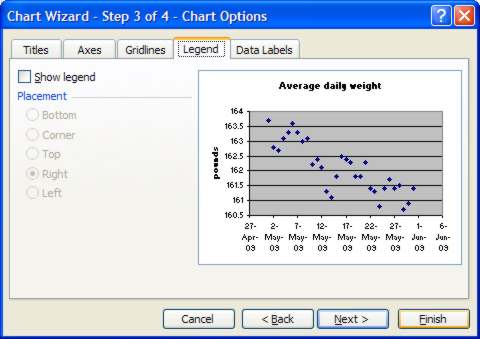
As there is only one series we don’t need to display the legend so click on the Legend tab and remove the tick against Show legend. Now click Finish.
|
|||
| Last Updated ( Friday, 16 April 2010 ) |