| Animated iOS User Interfaces |
| Written by Denys Telezhkin | |||
| Monday, 16 November 2015 | |||
|
A walkthrough of building and animating schematic designs for iOS user interfaces using a framework that allows a simple yet powerful way of drawing and changing shapes. Since the release of iOS 7 application designs for iOS have dramatically changed. With the termination of skeuomorphism came solid colors. Icons and buttons no longer try to recreate look and feel of real objects, but instead choose to be schematic. Shadows, gradients, complex controls are all gone. Simplicity, clarity, efficiency - these are the new goals for iOS 7, iOS 8 and iOS 9. We are seeing more and more interfaces that are very simplistic, and instead of using complex imagery they often use simple geometric forms. Circles. Rectangles. Triangles. How do we implement this kind of designs? We'll try to answer this question with a new framework from MSLDev, called Shapes that is available on GitHub. .
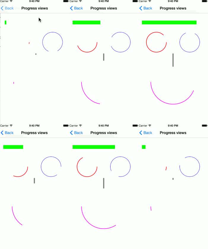
Introducing Shapes Shapes is a set of wrappers that allows a simple yet powerful way of drawing and changing shapes on iOS. CAShapeLayer and UIBezierPath are the two main keystones it is built on. CAShapeLayer is one of CALayer subclasses, that allows drawing cubic Bezier spline in its coordinate space. And UIBezierPath is a class, that defines geometric Bezier path. These two classes are very similar yet they serve completely different purposes. UIBezierPath is used for defining a path, and CAShapeLayer is responsible for drawing it. Both classes have very similar properties, but it's not so easy to use them together since one is using QuartzCore framework and CoreFoundation and the other one comes from UIKit world. With Shapes we are bridging the gap between these two. DTShapeView DTShapeView is a UIView, that is backed by CAShapeLayer instead of CALayer. To setup it's shape, simply create UIBezierPath, pass it to this class, and its properties will automatically be converted to underlying CAShapeLayer properties. Not only that, it also provides a set of properties, that allows using CoreGraphics properties and enums, such as CGLineCap and CGLineJoin, completely bypassing QuartzCore and CoreFoundation. Now, having geometrically shaped view is cool, but what can we do with it? The first thing that comes to mind is progress view. Progress views In a nutshell, what is a progress view? It's some kind of a geometric figure, most likely a bar, that is filling from start to the end. If you are familiar with CAShapeLayer, that should immediately ring a bell, because it has properties strokeStart and strokeEnd, that define exactly that. Meet DTProgressView, DTShapeView subclass, that builds on top of those. By default, DTProgressView fills entire view bounds, filling view from left to right. And all you need to do to create a progress view, is to drop it onto your view, set strokeColor and your progress view is ready!
Whenever your progress changes, simply call
And progress change will be animated. Of course, duration and animation function are configurable. But let's not stop there! DTProgressView is a DTShapeView subclass, which means that it allows any geometric shape, that can be defined by UIBezierPath. And you can go crazy and make something like this:
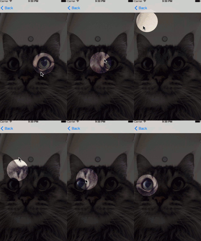
What if we want to cut one shape from another? Sometimes you need a tutorial in your app, and you want to dim some parts of the interface to shift user attention to some element in the UI. Sometimes you may be building a photo picker, that picks rounded photo of the user, and you want to hide everything else except this circle, that will be selected. This is where DTDimmingView comes in.
Dimmed views By default, DTDimmingView dims its entire bounds. So all you need to do, is create UIBezierPath, that will define which part of the view should be visible, and set it to visiblePath property.
OK, drawing shapes is fun, but how about interacting with them?
Shaped buttons DTShapeButton is a UIButton, that has a DTShapeView added as a subview. By default, this DTShapeView fills entire button frame. And since any DTShapeView property is animatable, changing its path can be used to animate changing the button's geometric shape. But we should be careful here because changing shape is not so simple as it might sound. Why is that?
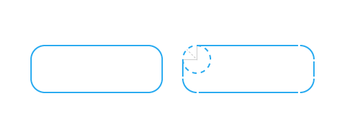
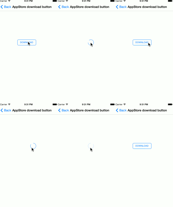
AppStore download button Let's take a look at AppStore download button. It has initial shape of a rounded rectangle. After user taps it, it animates to infinitely spinning circle. And you might think, ok, I will simply animate from rounded rectangle to circle, and that's it. But after trying to do so you will learn, that animation is drawing unnecessary angles and animates not exactly how you would expect it to. And after looking at the docs for CAShapeLayer, you will immediately understand why. If the two paths have a different number of control points or segments the results are undefined. Here's how UIBezierPath draws rounded rectangle: It has many more control points and segments than a circle does. When changing paths, CAShapeLayer tries to interpolate between these lines and, obviously, fails because number of lines and control points differs. You may encounter totally unexpected animations like swirling or partial drawing of views. This is not acceptable. One obvious solution would be to draw shapes with the same number of control points. At its core, a circle, can be drawn as a rounded square with corner radius of half of its side. And this approach works fine, but only on the iOS simulator, not on the actual device. This happens because of device optimizations, it seems as if iOS is automatically estimating how shapes could be drawn. And even if you created shape as a rounded rectangle, if it can be drawn as a simple circle, it will be drawn as a circle with a same number of control points as a circle. There are different solutions, that can help you here. Our approach is to have two buttons instead of one, one in a form of a rounded rectangle, and the other in a form of a circle. Button animation consists of two parts. In the first part we animate a rounded rectangle with a very small width. When first animation is completed, we hide the first button and show the second one. This makes the transition between the two buttons almost unnoticeable. Starting state:
Middle state:
Finished state:
And here's result in motion:
Voice memos record button Having two buttons is not a panacea, though. Sometimes you might go in a completely different direction. For example, if you want to build iOS 7 Voice Memos record button, having two buttons is no longer going to cut it. The solution here is a little different. Instead of changing the button shape itself, we chose to animate the mask of CAShapeLayer. This is possible, because CALayer mask can itself be a CAShapeLayer. To achieve implicit animations with it, we wrote DTAnimatableShapeLayer class. After that, animating button state change is a matter of simply decreasing or increasing mask around a button.
Conclusion Shapes is a powerful tool for drawing shapes and controls on iOS. And it became even more powerful with XCode 6 and Swift, because in Swift you can watch how a UIBezierPath builds itself, step by step, line by line. This is just a start for Shapes. You can find an example project on GitHub with everything discusssed here. Now see what you can build with it.
More InformationAnimating drawing of CGPath with CAShapeLayer
To be informed about new articles on I Programmer, sign up for our weekly newsletter, subscribe to the RSS feed and follow us on, Twitter, Facebook, Google+ or Linkedin.
Comments
or email your comment to: comments@i-programmer.info
|
|||
| Last Updated ( Monday, 16 November 2015 ) |

