| In Praise of Skeuomorphy |
| Written by Mike James |
| Thursday, 04 May 2017 |
|
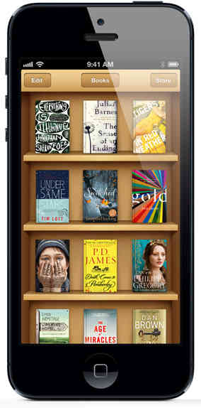
What is skeuomorphy? Why is it essential in any good UI and why is just about everyone abandoning its use after it being the key to UI design for so long? Yes, we could have had more readers if we could have avoided the word "skeuomorph" in the title! However, there is no easy and familiar word that could replace the idea of using a design element that no longer has a functional purpose. Just think of almost any classic Apple app, ebooks that look like real books and so on and you have the idea. But there is more to it than just a cool interface. Skeuomorphism has an important role to play in the UI, and it isn't just a matter of taste or style. The reason why skeuomorphism is in the news at the moment is that Steve Jobs liked it, but Apple design chief, Jony Ive, has made it clear that he dislikes it. As a result most Apple products have cleansed themselves of skeuomorphism. Where Apple goes generally the rest of the design world follows. Microsoft went "flat" first with "metro" and then with something they couldn't find a name for. Google went flat and and dropped skeuomorphism with Material Design, which is about as non-material as you can get.
Apple skeuomorphy at its best - or worst?
One of the problems of dumping skeuomorphs is that they have a role to play in making a UI easier to use. Back in the days when GUIs were just becoming available and we still did most things via the keyboard the jargon was "referential transparency". These days these words tend to mean something more specific in programming about the relationship between an expression and its value - but this is in a sense the same idea. At the command prompt you deleted a file using a filename and a command. If you didn't know what the command was - del, era, erase, delete, kill and so on - well you simply had to look it up. Also given a command there was no way it can easily suggest to you exactly what it does - do any of the above permanently remove the data from the face of the earth? In what sense is a file erased? Moving to a GUI we had files represented as pieces of paper and folders were, well folders, what did you expect? The idea was that by representing computer abstractions by pictures or things in the real world the user would understand better. In the same way the trashcan, wastebasket or rubbish bin was born as a skeuomorphic representation of the delete operation. The icon of a trashcan obviously stood for what it represented - a temporary folder which stored files and other folders that the user had thrown away. All the user had to do was drag and drop anything they no longer wanted into the trashcan. Some even animated a bulging effect to indicate how many bytes were waiting to be permanently deleted. How did you delete them finally - you simply emptied the trashcan. If you wanted to get something back you could look inside and take things out of the trashcan - just like the real thing but without the messy hands.
Suzan Kare's Original Mac Trashcan - you can buy a print of it at http://www.kareprints.com/
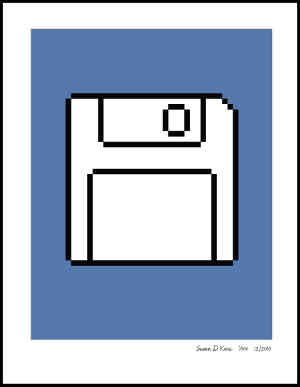
The idea of deleting files was and is well represented by the skeuomorphic trashcan. Some even got the idea so well that they would attempt to delete the computer icon by dragging it into the trash as a malicious or punishing act - it generally worked. The few who worried about how to put the trashcan in the trashcan were the ones who tended to go on to become programmers - probably functional programmers. This is an example of referential transparency. You see a trashcan on the screen and you instantly know what it is and how to use it. The fact that it really isn't a trashcan and that it represents some complex and sophisticated abstractions a million miles removed from physical rubbish isn't something anyone thinks about. You might think that this sort of limited skeuomorphism is beyond criticism and no one would want to get rid of it, but this isn't quite true. It is in the nature of skeuomorphy that it tends to sow the seeds of its own destruction. A skeuomorphism is only useful as a metaphor if it remains more familiar then the abstract concept it is standing in for. If the use of computers were to result in the paperless office (as if) then perhaps the new users would be unfamiliar with the concept of a wastebasket that you put paper files and folders into. "What's that funny icon that looks like drinking cup with a lid on it?" Perhaps they would wonder what the icons were, let alone be enlightened as to how to use things as the result of seeing them. There are lots of examples of skeuomorphisms that have exceeded their sell by date. Perhaps the most obvious is the use of the floppy disk icon as the universal symbol for "Save". but there are lots of others. Users of a certain age really don't know what the icon below actually is:
Suzan Kare's Original Floppy Save Icon - you can buy a print of it at http://www.kareprints.com/
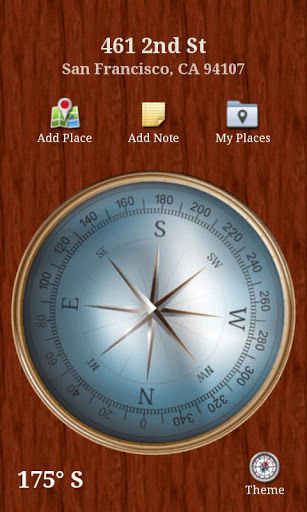
Perhaps the most obvious of skeuomorphisms on the larger scale is the use of tape to represent a sound or video recording. How many audio apps use cute rotating reels of tape to show that they are actually recording something? Yet there are users who have never used a reel-to-reel recorder or a cassette machine. In this case, however, there might be an excuse because the linear aspect of a tape matches the idea of a sequence of bytes with a pointer to the current position very well. It is arguable that even if you have never seen or used a tape recorder the representation of a sound file as a tape makes good sense because the tape makes the essential sequential property of the sound file visible to the user. The point is that we need representations of the abstract processes that go on inside programs as part of the user interface. In programming we often build programs using objects to represent internal abstractions. At the UI level these objects even manifest themselves as visual objects - button, textboxes and so on - that the user can interact with. If you don't use a skeuomorphism to represent, say, a button then you still have to invent a physical form for the abstract concept of a click or a touch and that physical form has to provide feedback to the user that is understandable. In other words, a button needs to do something when pressed and behaving like a real world physical button is not only the easiest thing to do it is also the right thing. Now we come to the next stage in the development of the software skeuomorphism - whimsy. When we first started to implement GUIs referential transparency was a guiding light, but it was hard work to make the connection with the real world objects we wanted to use. The first trashcans were very simple icons and they certainly didn't do animations - they hardly did color. Now we have graphics processors and so much spare computing power that we can implement skeuomorphism to an unnecessary level of detail. You can take an ebook and turn it into something that looks like a leather bound edition that can be page turned using accurate dynamics provided by a physics engine complete with accurate paper sounds and perhaps even the smell of a fine book. OK, perhaps not the smell, well not yet at least.
A Compass App For The Android - it doesn't have to look like this but you probably want it to.
This is whimsical skeuomorphism that aims to impress and enchant the user with its hyper-realistic renderings of the familiar or not so familiar. Perhaps the audio app not only has minimal tape reels rotating but shiny 3D rendered reels complete with flashing lights and .... This is so much more than is needed; it is almost a statement of how computationally rich we are - if you can, then do. The reaction against skeuomorphy is just that, a reaction. We move to flat buttons that only just manage to look like push buttons because it makes a statement. Our most admired interfaces are flat and black probably because the most recent ones before this were lumpy and white. The UI is about making a statement but - for software, skeuomorphy is essential because the software has no reality of its own. Our software borrows its reality via skeuomorphy. Perhaps one day we will think of something better than a button but it is more likely that we will simply find a deeper interaction where buttons are just silly - flat or with a drop shadow. More InformationRelated ArticlesAugmented Reality Is Magic (Video) Apple Goes Flat - Where's The Logic In That? To be informed about new articles on I Programmer, sign up for our weekly newsletter, subscribe to the RSS feed and follow us on Twitter, Facebook or Linkedin.
Comments
or email your comment to: comments@i-programmer.info
|
| Last Updated ( Thursday, 04 May 2017 ) |


