| NetAdvantage WPF/Silverlight Data Visualization |
| Friday, 11 June 2010 | |||
|
Infragistics has two new Data Visualization UI toolsets one for WPF and one for Silverlight.
Infragistics has two new Data Visualization UI toolsets one for WPF and one for Silverlight.
and
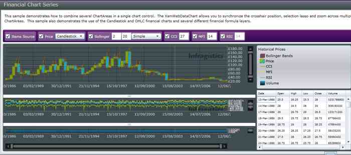
are both available as separate suites. As you might expect they are derived from the same code base with changes as necessary to accommodate differences between WPF and Silverlight. This means that you can move between Silverlight and WPF with minimum fuss and relearning. It also means that the controls are essentially the same in both suits and hence we only need to describe them once! Pivot Grid UI control Not everyone has the courage to get involved in online analytical processing (OLAP) of complex cross classified data, but if you do then an easy to use tool is a time and brain saver - especially if it puts the analysis back in the hands of the user. The Pivot Grid makes it possible for developers to present multi-dimensional data that end users can slice and dice to extract the meaning from the numbers. The presentation is in the form of an Excel like crosstab with drag and drop support for arranging fields within row and column groups. The data can be stored in SQL Server or any XMLA data store - SSAS, SAP or an ADOMD provider. The good news is that users can't cause errors in the dataset while playing with views. Data Chart A 2D chart optimized for high speed financial charting. It supports large datasets with millions of data points and real time updates. In addition, the data chart supports analysis options such as exponential fit and moving average trend lines. Users can pan and zoom charts too see more detail in specific areas.
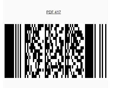
Barcode renders the most commonly used barcode symbologies in standard formats - including some 2D formats.
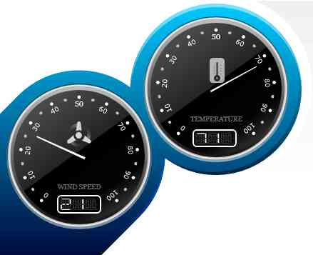
Map A geospatial chart supporting layers and navigation. Maps can be in shapefile format or OpenGIS extensions such as supported by SQL Server. A color model provides easy solutions to standard map color coding based on data. Gauge A good looking gauge is always welcome in a user interface - users understand them at once. The Gauge control includes radial gauges with multiple scales and the look and feel of an automotive dashboard or aircraft console. You can also opt for linear thermometer style gauge or a digital gauge. There are also hybrid options which give you the freedom to insert an LED display to other gauges. As well as display data gauges can be dragged by the user to enter values.
Bullet A variation on the gauge that is particularly useful for presenting performance data as part of a dashboard. You can set up good, better and best ranges to show users how they are doing and can track multiple measures. Timeline This can be used to create simple standard timeline style charts but it can also be used to add additional information and allow the user to interact with the resulting chart. The input data can be data/time related or simple sequences. Currently there is a CTP available for both versions: WPF and Silverlight More information from: Infragistics If you register with I Programmer in the month of July you will automatically be entered into a prize draw for a copy of Infragistics NetAdvantage DataVisualisation for WPF.If you are already registered with I Programmer and would like to be included in the draw simply send an email (subject:Enter me into the prize draw) to:
Related articles:
|
|||
| Last Updated ( Tuesday, 13 July 2010 ) |


