| Responsive Web Design - A Paradigm Shift |
| Written by David Conrad | |||
| Sunday, 23 September 2012 | |||
|
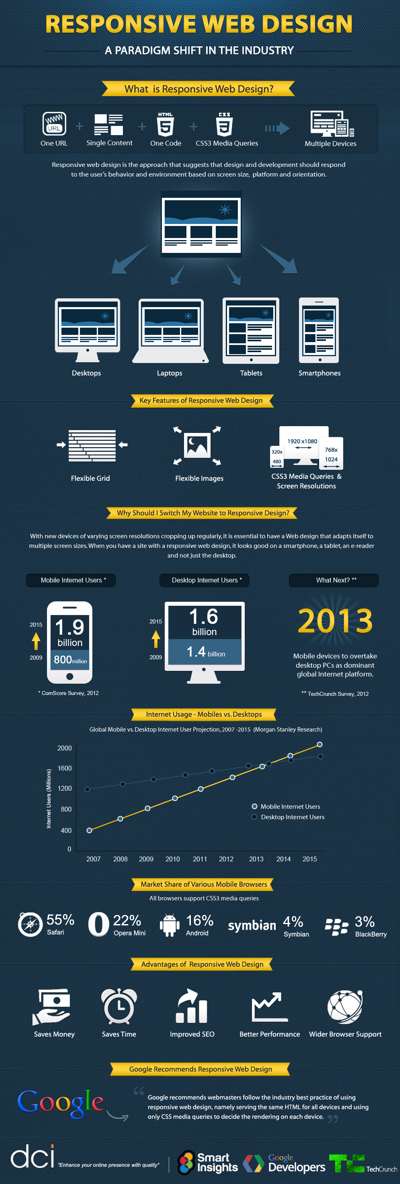
A web page or app has a big problem to solve- how to look good on the range of different screen sizes that are going to be used to view it. The new way of doing things is not to code up a version for each viewing format, but to use responsive web design. There has long been a division in opinion of how to create web pages - "expandy" or fixed. Should the layout grow and shrink to fit the current size of the web browser window or should it be fixed in size and force the user to scroll. This problem got a lot worse with the take up of mobile devices with their exceptionally small screens. At first there was absolutely no realistic way that a fixed size layout would fit and scrolling didn't solve the problem of being able to see any detail. The standard solution is to create a site for the desktop browser and another for the mobile user. This works but it is very costly in terms of implementation and maintenance - two sites are never better than one. An expandy style solution isn't a good alternative because this generally works by allowing the elements in the layout to flow into the available space. This sometimes works reasonably well but you have no accurate control over the layout - it is luck if it works well and bad luck if it works poorly. A modern solution to the problem is to make use of CSS media queries. In this approach you use the same HTML for the page but modify its layout using different CSS for different screen sizes. Which CSS to use is automatically selected according to the current client. This approach has the advantage that you design the layout for each size of screen you care to support. For a summary of the advantages see the infographic below: Click to enlarge Infographic by: Dot Com Infoway – Software and Mobile Application Development Company
The big problem still to solve is what to do with the changing screen real estate. Sometimes you can see that things should be moved around, images reduced in size and so on and it all works. Other times you have to come to the conclusion that what was one page on a large screen should be two or more pages on a smaller screen. This applies to apps as well as static pages. The problem is difficult to solve.
Related ArticlesThe Book of CSS3 (Book Review) Stunning CSS3 (Book Review)
Comments
or email your comment to: comments@i-programmer.info To be informed about new articles on I Programmer, install the I Programmer Toolbar, subscribe to the RSS feed, follow us on, Twitter, Facebook, Google+ or Linkedin, or sign up for our weekly newsletter.
|
|||
| Last Updated ( Sunday, 23 September 2012 ) |


