| Smart and Well-Structured MDN Redesign |
| Written by Sue Gee | |||
| Wednesday, 02 March 2022 | |||
|
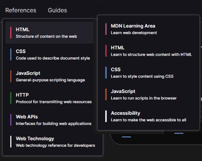
MDN is a key resource not only for web developers but for almost everyone who writes code. It now has a smart new redesign ahead of the launch of MDN Plus which still has the status of "Coming Soon". Follow this link to MDN Web Docs and you'll be greeted by the familiar message "Resource for Developers, by Developers" but with a new look: In the blog post announcing the redesign, Hermina writes: "In mid-2021 we started to think about modernizing MDN’s design, to create a clean and inviting website that makes navigating our 44,000 articles as easy as possible. We wanted to create a more holistic experience for our users, with an emphasis on improved navigability and a universal look and feel across all our pages." The front page, has two color-coded drop downs for References and Guides. There are also introductory paragraphs to three features articles - all chosen from References. Any one of these will give you a good idea of how Web Docs has been improved. On any "inside page" there is a consistent layout with the topic in a central panel. It's a single frame that is as long as required for the content. To the right you'll find IN THIS ARTICLE - a list of its sections that you can use to jump to each one. Each article ends with a See also section that has links to relevant material in other articles. The panel to the left of the topic is to "larger" RELATED TOPICS and again you can use it to navigate to other content. Hermina writes: We’re especially proud of some subtle improvements and conveniences. For example, in-page navigation is always in view to show you where you are in the page as you scroll. As before you'll also find plenty of hyperlinks within the text of an article and there are loads of lists with each element being a link to more detail. This is hyperlinking as it was meant to work and the way the content is now structured is impressive. One last point to note - while articles have a white background by default there's a toggle to switch to dark theme on every page. Last week we reported that Mozilla's new subscription service augmenting MDN Web Docs might launch next week. This news had an unofficial status as it came from a web developer closely involved with Firefox. Hermina's post doesn't mention a date for the launch of MDN Plus, but it does cast doubt on the idea that is imminent as she writes: In the coming months, we’ll be expanding MDN to include a premium subscription service based on the feedback we received from web developers who want to customize their MDN experience.
Finally MDN has a new logo - which was chosen from a set of eight possibles by the community, with 10,000 votes cast in just three days. The winning logo is described as, an M monogram using underscore to convey the process of writing code:
More InformationRelated ArticlesMDN Web Docs Has New Platform and New Funding MDN Web Docs Call For Participation Mozilla's Plan For Easier Web Development Mozilla Layoffs Include MDN Team MDN Is 15 - How Did It Reach Top Of The Docs? To be informed about new articles on I Programmer, sign up for our weekly newsletter, subscribe to the RSS feed and follow us on Twitter, Facebook or Linkedin.
Comments
or email your comment to: comments@i-programmer.info |
|||
| Last Updated ( Wednesday, 02 March 2022 ) |


