| GitHub Mobile App Available |
| Written by Nikos Vaggalis | |||
| Thursday, 19 March 2020 | |||
|
After four months in beta, GitHub for Mobile is finally generally available, with fully-native experience on both iOS and Android. We put it through its paces to show what you can do with it. GitHub for Mobile was the major new product promising to bring collaboration tools to the small screen announced by Nat Friedman during his keynote at last year's GitHub Universe. The idea of the app is to give you the flexibility to move work forward and stay in touch with your team, wherever you are, with the ability to review code and merge changes from anywhere. While its arrival is exciting news, you have to understand the use case of the app. According to the official announcement: There’s a lot you can do on GitHub that doesn’t require a complex development environment, like sharing feedback on a design discussion and reviewing a few lines of code.Now we are making these tasks easy for you to perform, no matter where you work, with a beautifully native experience. So don't expect a fully blown client that can do everything your desktop version can. In his blog post, Ryan Nystrom tells us that with GitHub mobile, you can:
These are very useful functions, however the most useful has to be that with the mobile app you get the heads up on your pending notifications. Here's a quick rundown of its features, starting with your profile screen.
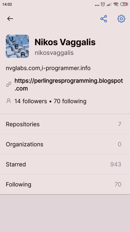
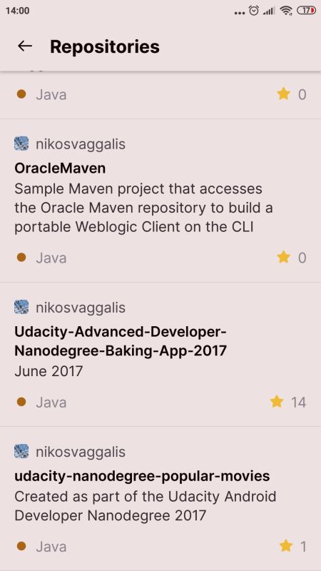
In a snap you see your basic information: Number of Repositories, Organizations joined, number of Starred repositories and number of projects your are Following. Each row is tap-able,meaning that if you tap on one you reach a subsequent screen with more details;for example Repositories:
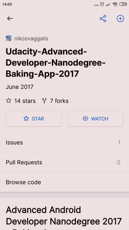
Then tapping on a repo, for instance my repo created when I was doing the Android developer Nanodegree, I am transferred to the relavant screen.
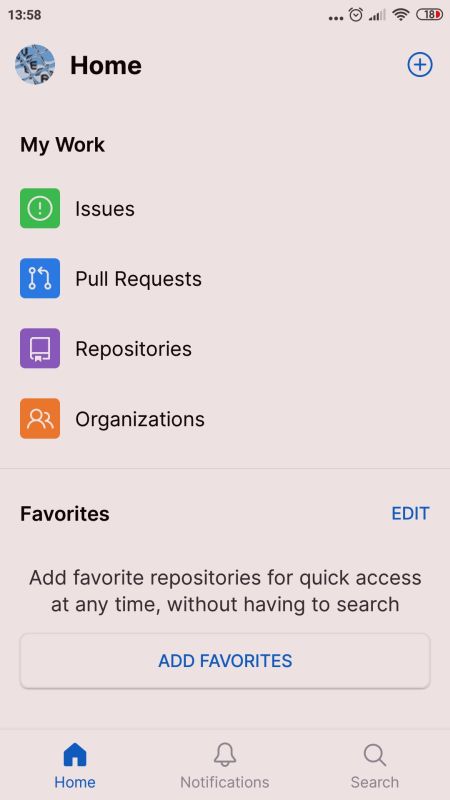
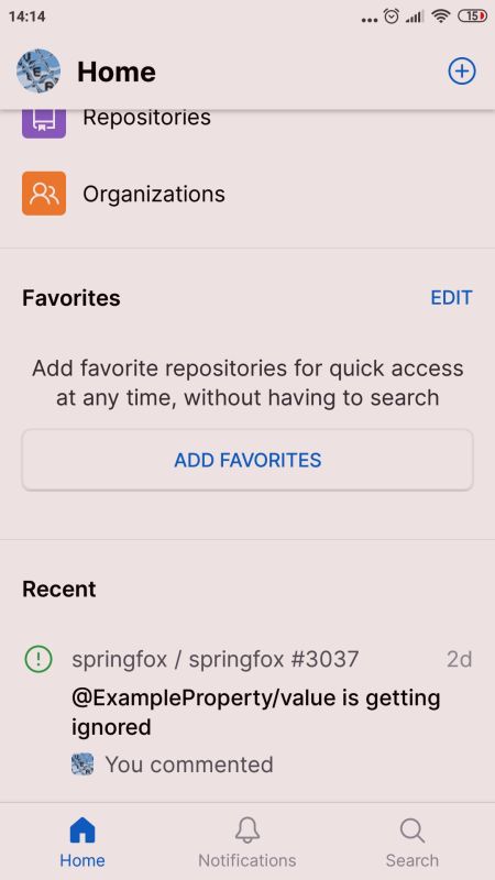
At a glance I can see its Description, Issues and Pull requests. It also lets me browse the code in a way that I've found easier than the desktop counterpart. Although I can also see the number of stars and forks the repo has accumulated, I can't see more details in order to get an in-depth sense of its popularity. What if I want to delve deeper into those stats? Fear not, as there's another recently released app, called GitTrends, that serves that very purpose and gives insights into all aspects of your repo's popularity. My review of it is in the pipeline. Back on the Home screen, the screen where developers are expected to spend most time, you are presented with icons for Issues, Pull requests, Repositories and Organizations.
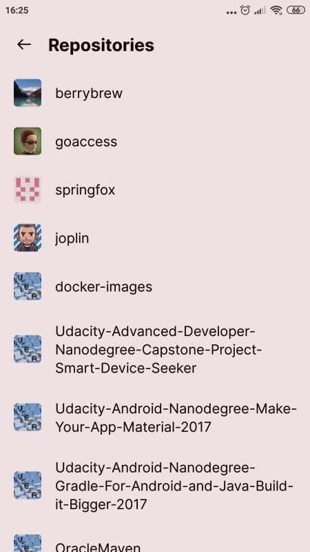
Opening the Repositories screen I immediately noticed a discrepancy between it and the Repositories screen from my profile page. At firtst I was a bit baffled as to why I was seeing repositories on it such as springfox, goaccess, joplin and berrybrew which I'm not affiliated with. Then I realized these are all repos that at some time in the past I had opened issues. So I guess that the distinction is that the profile page repo list is those I own or am affiliated with, whereas the Home sreen's includes those I've interacted with.
On the Issues screen and under Created there's only one of the issues I've raised. That's because the underlying query goes something like: "is:open is:issue author:nikosvaggalis archived:false" restricting the list to open issues.
I found a comment I'd added to an issue on Sprinfox's repo on the Home's Recent tab.
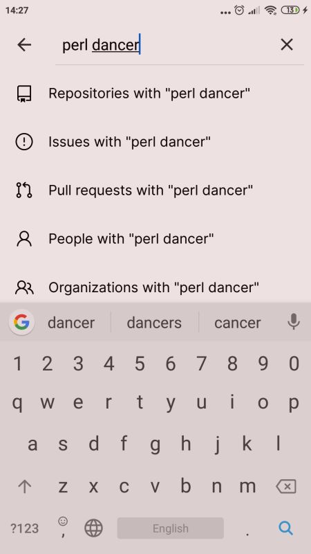
Home's Notifications tab lets you see see all notifications raised under the Repos you are Watching, while Search lets you look for look for Repositories, Issues, Pull requests ,People and Organizations that match your search term.
All fine, but I've got the feeling that all the extra functionality acts as wrapper around the core utility which is working with the Issues and Pull requests. Still, the app is intuitive, as a native app it is designed to be responsive and adapts to every screen size be it on your mobile phone or tablet, it provides significant functionality and allows you to monitor and communicate at a glance. It could benefit from a bit of polishing here and there, as well as better descriptions and help on the various tabs and features, but as a whole it's a quite well versed offering. More InformationGitHub for mobile is now available Related ArticlesSourcegraph Powers Up Your Code Repository To be informed about new articles on I Programmer, sign up for our weekly newsletter, subscribe to the RSS feed and follow us on Twitter, Facebook or Linkedin.
{laodposition comment} |
|||
| Last Updated ( Thursday, 19 March 2020 ) |

