| Susan Kare Archive At MOMA |
| Written by David Conrad | |||
| Sunday, 08 March 2015 | |||
|
Susan Kare is the artist responsible for many of the classic Mac icons that are universally recognized. Now her impact as a pioneering and influential computer iconographer has been recognized by the Museum of Modern Art in New York.
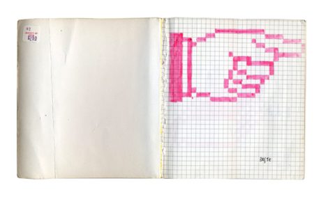
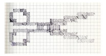
Susan Kare designed all of her early icons on graph paper, with one square representing each pixel. Now this archive of sketches has been acquired by MoMA, jointly with San Francisco's Museum of Modern Art, and has gone on show as part of a new exhibition, This is for Everyone: Design Experiments For The Common Good.
The exhibition takes its title from the four-word tweet “This Is for Everyone" used by Tim Berners-Lee, inventor of the World Wide Web, for the 2012 London Summer Olympics opening ceremony. It showcases MOMA's recent acquisitions which also includes the @ symbol, the Google Maps Pin and the Creative Commons logo. Icons are something that computer users now take for granted without stopping to think about the problem of their design. What makes the work of Susan Kare all the more remarkable is that her original icons looked good even with the restrictions of color (monochrome) and file size (8-bit). Working within tight constraints was something she had become used to in creating Apple's distinctive Chicago font, a type face in which every letter fits within a space of 9 by 7 dots. As the person who designed visual elements for Apple's innovative GUI Susan Kare faced the even bigger problem starting almost from scratch. According to Steve SIlberman in his introduction to the book Susan Kare Icons: Kare gave the Mac OS a visual lexicon that was universally inviting and intuitive. Instead of thinking of each image as a tiny illustration—say, a simplified representation of a particular trash can—she aimed to design icons that served as instantly comprehensible traffic signs. Kare mined ideas from everywhere: the history of Asian art, the geeky gadgets and toys that festooned her fellow designers’ cubicles, and the glyphs that Depression-era hobos chalked on walls to point the way to a sympathetic household. The symbol on every Apple command key—a stylized castle seen from above—was commonly used at Swedish campgrounds to denote an interesting sightseeing destination. The outcome is icons that communicate their functions immediately and memorably.
Explaining the process of origination using the graph-paper sheets now on display in MOMA, Silberman writes: She began by sketching arrows, paintbrushes, and pointing hands in a notebook because the application for designing icons on screen hadn’t been coded yet. These casual prototypes of the new, user-friendly face of computing were initially drawn with a pencil on graph paper, each square representing a pixel.
The This is for Everyone exhibition is open at MOMA in New York until January 2016. You can also buy the 160-page art book, Susan Kare Icons and a selection of her iconic prints in various size from www.kareprints.com.
More InformationIs This for Everyone? New Design Acquisitions at MoMA Exhibition: This is for Everyone: Design Experiments For The Common Good Related Articles
To be informed about new articles on I Programmer, install the I Programmer Toolbar, subscribe to the RSS feed, follow us on, Twitter, Facebook, Google+ or Linkedin, or sign up for our weekly newsletter.
Comments
or email your comment to: comments@i-programmer.info |
|||
| Last Updated ( Sunday, 08 March 2015 ) |


