| Visual Studio 11 Goes Color - Slightly |
| Written by David Conrad |
| Thursday, 10 May 2012 |
|
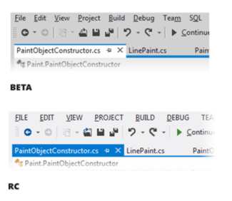
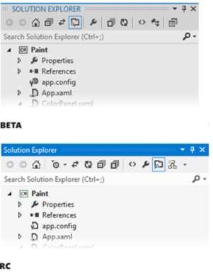
Microsoft appears to have listened to criticisms of the "grey goop" appearance of the Visual Studio 11 Beta. The Release Candidate features more "visual energy", aka color. After the terrible reception given recently to the grey goop beta of VS 11, Microsoft has listened to the complaints and revamped the UI in the release candidate - to include a little color. Developers are not necessarily good designers and a sense of style and taste is not a prerequisite for coding, but we know what we like. When the beta of VS 11 hit the monitors, most developers came to the conclusion that they didn't want their lives dominated by a grey, dull, depressing vision of a UI. In the attempt to provide as much space for content as possible, icons had lost all their color and everything looked drab and boring. Only the complaints were colorful. Now Microsoft seems to have taken notice and all credit to them for realizing that designing a UI is more than just a matter of a design fad. A good UI has not only to be logical but it has to signal to the user important events and make clear what possible actions are. According to the Visual Studio blog the focus for the new UI centered on three aspects:
In case you are wondering, "visual energy" seems to mean "color". Gone are the grey and difficult-to-make-out icons. They have been replaced by more colorful ones but it has to be said we are still not looking at anything over the top. It still looks as if the design department was being charged according to the degree of color saturation:
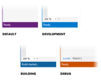
It all makes you think that if the improved colorful version had been released first then the reaction might have been not as good as the sigh of relief that there is at least some color. You can read a fuller design justification on the VS blog but you get the general idea. One really good idea is in fact so good that you wonder why the design department didn't think of it sooner - oh, I suppose they were busy trying to drain all the color down from earlier versions. Why not color the status bar to show the current state:
There are lots of other changes that try to make the design brighter and clearer and you can read about them on the VS blog in more detail. The overall impression is not of a riot of color, more a slight pushing back of the grey.
The initial comments seem favorable, apart from the use of CAPS in menus - which my guess is an oversight not a design feature. Perhaps it is all a matter of what you are used to and the contrast between what you have and what you get. Still Microsoft listened and for this we must be grateful. I don't know why but a quote from The Hitchhikers Guide to the Galaxy just seems to pop into my head: "And the wheel," said the Captain, "What about this wheel thingy? It sounds a terribly interesting project." From Wikiquote
More InformationRelated ArticlesVS 11 Grey Goop - Few Happy Without Color
Comments
or email your comment to: comments@i-programmer.info
To be informed about new articles on I Programmer, subscribe to the RSS feed, follow us on Google+, Twitter, Linkedin or Facebook or sign up for our weekly newsletter.

{loadposition moreNEWSlist |
| Last Updated ( Thursday, 10 May 2012 ) |