| Keep It Simple And Stupid - Users Don't Read Manuals |
| Written by Mike James | |||
| Sunday, 16 September 2018 | |||
|
This year's Ig Nobel prize winners include a piece of research that has something to say about our efforts to create full-function software - don't do it. If you don't know about the Ig Nobel prizes you can look the details up on Wikipedia and watch this occasionally amusing video of the recent ceremony - the 28th Ig Nobel prizes:
The relevant part of this year's Ig Nobels is for a paper entitled: Life Is Too Short to RTFM: How Users Relate to Documentation and Excess Features in Consumer Products by Alethea L Blackler, Rafael Gomez, Vesna Popovic and M Helen Thompson. It was published in 2016 in Interacting with Computers and, in case you don't know, RTFM means Read The Field Manual or perhaps Read The Friendly Manual - unless you know otherwise that is...
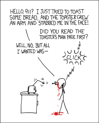
More cartoon fun at xkcd a webcomic of romance,sarcasm, math, and language We all know that users tend not to read the manual. OK, being more accurate, users never read the manual no matter how hard someone has worked on it, and the only reason we actually produce manuals is so that we can deflect any questions and criticisms with comments like "it's in the manual". Manuals are not so much documents of mass instruction, more a place that the buck can be lodged until we have time to deal with it. I'm sorry Dave I can't open the air lock door... but you could if you had RTFM. Of course, not reading the documentation becomes an increasing problem as we stuff more features into our software. The Unix credo of "do one things and do it really well" is long forgotten in most software - feature stuffing is the name of the game, but we all know that most users don't use most features. Just like the case with documentation, we feature stuff so that we can point to a list of features - RTS - Read The Spec - and crow how our code is feature-full, feature-complete or just featuresome. So do we want evidence to back up these prejudices? You bet we do. "This paper addresses two common problems - that users of various products and interfaces encounter over-featured interfaces and product documentation. Over-featured interfaces are seen as a problem as they can confuse and over-complicate everyday interactions. Researchers also often claim that users do not read product documentation, although they are often exhorted to ‘RTFM’ (read the field manual). We conducted two sets of studies with users which looked at the issues of both manuals and excess features with common domestic and personal products."
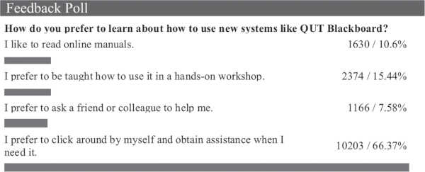
And is there a sexist angle on all of this? You bet there is: "We found that manuals are not read by the majority of people, and most do not use all the features of the products that they own and use regularly. Men are more likely to do both than women, and younger people are less likely to use manuals than middle-aged and older ones." Ageist too! What about the clever clods? "More educated people are also less likely to read manuals." So what happens when we tell them about our feature lists and to RTFM? They burst into tears of course: Over-featuring and being forced to consult manuals also appears to cause negative emotional experiences. Implications of these findings are discussed. Is it the quality of our manuals? Probably, but there used to be a philosophy of making the connection between the UI widgets and what they did as obvious as possible. Usually this was by skeumorphism - making the abstract look like the concrete, but this seems to have died a death since the rise of the flat noir UI. Everything is flat and buttonless and the gloom means that nothing stands out, or if it does it's just too much. So we need to have things explained to us and given we won't read the manual - I mean you might write manuals, but do you read them? - the only solution is to simplify. "Results from our studies do indeed suggest that life is too short to RTFM. We suggest a re-think in the way that features are selected for products, based much more on actual user needs and values. We also suggest that the provision of help and assistance needs a more flexible, responsive and 21st century solution than the traditional manual. Users it seems have already decided that the manual is old hat. We need to catch up." I'm sorry Dave I can't open the air lock door... but you can. Take hold of the red handle and turn it a quarter turn to the left, then press the red button next to the small wheel....
More InformationRelated ArticlesApple Goes Flat - Where's The Logic In That? Button Feedback With An Electric Arc Silly Sliders - Compete To Create The Silliest Volume Control To be informed about new articles on I Programmer, sign up for our weekly newsletter, subscribe to the RSS feed and follow us on Twitter, Facebook or Linkedin.
Comments
or email your comment to: comments@i-programmer.info |
|||
| Last Updated ( Sunday, 16 September 2018 ) |


