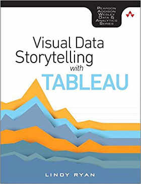
| Visual Data Storytelling with Tableau |
Author: Lindy Ryan This is a book that is more about the author's thoughts on why and how you can present information in a way that will get your audience's attention than it is about Tableau. The book opens with a discussion about storytelling in a digital era, followed by a chapter on the power of visual data stories. Both chapters focus on things such as how to put human interest into your data visualizations, what colors to use, the differences between data storytelling and data visualization - the soft human side of the equation. Tableau enters the picture at chapter three, where Ryan looks at how to use Tableau, why to use it, and the different products that make up the Tableau family. This chapter also looks at basic data prep, and the essentials of the Tableau interface. Context is the next topic to be covered. This chapter again concentrates on the soft side of data visualization, with topics including how to structure stories and audience analysis. A chapter on choosing the right visual is next. This discusses the various types of chart Tableau offers, what they do and how to use them. It's followed by a chapter on curating visuals for your audience, looking at the use of color and color effects. Chapter 7 is a bit more technical, looking at preparing data via the data interpreter, cleaning survey data in Excel, pivoting data and creating data extracts. Next comes a chapter on storyboarding frame by frame that looks at the use of dashboards and how to make meta data meaningful. A chapter on advanced charts looks at timelines, likert visualizations, lollypop charts and word clouds discusses how to create the different options, but doesn't discuss any statistical aspects of how to display the data. The book closes with an overview of how to put together a visual data story that recaps the ideas outlined earlier in the book. Tableau is a reasonably straightforward product, so the chances are anyone who's a developer would be able to use it without needing any hand holding. However, there's more to putting together a good presentation than knowing how to use the software, as anyone who's slept through marketing presentations will know only too well. I found this book rather too heavy on the messages about communicating insights, with little on the technical and statistical aspects of displaying data in a meaningful way.
However, most of us will have encountered data scientists who are brilliant at data analysis, but hopeless at making that data accessible and understandable, and maybe some of the soft skills described in this book might help with that shortcoming. So all in all, if you're a competent computer user or data scientist who'd like to know more about how to put together an interesting presentation, it might be worth reading. Don't buy it expecting anything deep about Tableau, though.
To be informed about new articles on I Programmer, sign up for our weekly newsletter, subscribe to the RSS feed and follow us on Twitter, Facebook or Linkedin.
|


