| FlexGrid - A Lightweight Data Grid |
| Written by Ian Elliot | ||||||
| Wednesday, 18 April 2012 | ||||||
Page 2 of 2
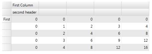
The only slightly non-obvious, until you have seen it, is where are the header or "fixed" rows and columns. Often the header rows and columns are assigned an index of zero in the main table but FlexGrid is more logical and allows the data area to be zero based. The fixed rows and columns displayed in a grid are implemented as two separate grid panels. This might seem complicated at first but, in addition to restoring the zero-based indexing in the data part of the grid, you also get the ability to have multiple fixed rows and columns. For example, to add a simple text label to the first column all you have to do is:
You can see that the ColumnHeaders collection can be indexed in the same way as the main grid. The RowHeaders collection does the same job for the rows:
Notice that the column headers are rows and the row headers are columns - think about it! You can also add additional rows and columns to the fixed rows and columns. For example:
this adds a new row to the ColumnHeader collection. Now you can write:
There are a great many more basic grid operations that we could look at, but you now have the basic anatomy of the grid - i.e. you know where the rows, columns and cells are and you know about the fixed rows and columns. Clear Style
It is worth mentioning that there are properties that give you direct access to properties that would otherwise be deeper in the object hierarchy. This is a feature of ComponentOne controls called Clear Style and it is a simple but very useful idea. For example, suppose you wanted to change the background property of the ColumnHeader rows. Then you normally would use something like:
Not difficult, but you could use the Clear Style approach and set the ColumnHeaderBackground property of the main control:
In this case there isn't much saving in typing, but you can see the general idea. Clear Style provides properties on the control object that set properties on one or more sub-objects within the control. For example:
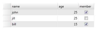
sets the brush used for odd numbered rows in the grid. What could be easier! The bound gridAlthough it is interesting to find out how the grid works in its simplest state, not to see it used with data binding would be to miss out on meeting it in its natural state. So before we leave the subject, it is worth looking at the simplest case of a databound grid. All you have to do in theory is set the grid's ItemSource property and, as long as the object it is set to supports IEnumerable, everything should just work. To see this in action we first create a suitable object type to hold the data:
Then we create a collection of these objects:
At the end of this code block, MyList contains three Person objects suitably initialised. All we have to do to make the DataGrid display this collection is:
As long as AutoGenerateColumns is set to true, the grid will be created for you and the properties of the Person data structure will be used to label the columns.
You can now work with the table as in the case of the unbound example. You can refer to columns and cells using either a numerical index or the by the property names displayed at the top of each column. For example:
The grid also supports user editing and the data binding is two-way so the data source is updated. In most cases it is better to use a PagedCollectionView as the data source simply because it wraps the original data with some methods that allow you to process it, sort, group and filter and as it name suggest it supports paging for large datasets (simply set the pagesize property). However this just gives you more flexibility in how you handle the data. The FlexGrid is lightweight, easy to use and provides a logical connection between data and grid. More InformationRelated ArticlesUsing the WPF .NET 4.0 DataGrid

Comments
or email your comment to: comments@i-programmer.info
To be informed about new articles on I Programmer, subscribe to the RSS feed, follow us on Google+, Twitter, Linkedin or Facebook or sign up for our weekly newsletter. 
|
||||||
| Last Updated ( Thursday, 19 April 2012 ) |