| Android Programming In Java - Guidelines And Barriers |
| Written by Mike James |
| Monday, 04 December 2017 |
|
Barriers are a mysterious addition to the ConstraintLayout but in practice they are easy to use and useful - once you know what they are all about. This extract from Android Programming In Java: Starting with an App 3rd Ed (I/O Press) covers beta features of the ConstraintLayout that are missing unless you take steps to activate them. The current documentation for Android Studio suggests that the Layout Editor supports Barriers and Groups, but if you use the default version of ConstraintLayout they do not appear in the context menu. If you want to make use of these features you have to ensure that your project is using 1.1.0 or later. This is currently in beta, but could well reach a final version before the next version of Android Studio. To make use of it you need to edit the build.gradle file to read: dependencies {
implementation fileTree(dir: 'libs', include: ['*.jar'])
implementation 'com.android.support:appcompat-v7:26.1.0'
implementation 'com.android.support.constraint:
constraint-layout:1.1.0-beta3'
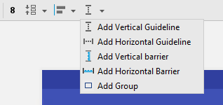
Only the last line needs changing, i.e. from 1.0.2 to 1.1.0-beta3. You will need to resync the project and then you will see Groups and Barriers in the right-click context menu. Assuming you have made this update you will be able to follow this tutorial. GuidelinesOne of the positioning tool you have at your disposal is the guideline and this leads on to the barrier so it is a good place to start. You can now drag-and-drop a horizontal or vertical guideline on the design surface and use it to position other components. The most important thing about guidelines is that they don’t exist as a View object, or anything else in the final layout. A guideline is an object in the Layout Editor and any constraints that you set using it are converted to positioning that makes no reference to the guideline when the app is run. To add a guideline all you have to do is use the Guidelines tool:
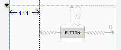
Once the guideline has been added, you can drag it to the desired location and then position components relative to it just as if it was a component in its own right. You can set any constraint that you can use with a component, including bias. Notice that if you move a guideline any components of the UI that are constrained to is will also move – this can be very useful. You can delete a guideline by selecting it and pressing delete. At the moment the big problem with guidelines is that, while the Layout Editor displays the location as you drag, there isn’t an easy way to enter a value to position it exactly:
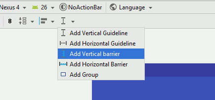
You can enter an exact position if you expand the Attributes you can enter an exact value in the guide_begin attribute which you will find under the Constraints set. While guidelines are another positioning tool, and you can never have too many, there is nothing you can do with a guideline that you can’t do without one. Also, given that guidelines are positioned absolutely on the screen, they don’t provide any facilities for adjusting the layout as the screen size changes. However they do lead on to barriers. BarriersNotice that this is only available in ConstraintLayout 1.1.0 or later – see the start of the chapter for more information. Barriers solve many ConstraintLayout problems that would otherwise be difficult to tackle, but they are not something you are likely to use every day. A Barrier is a smart guideline. You place a Barrier on the design surface and then drag-and-drop any number of components onto it – most easily within the Component Tree. This works in the same way as the Group component in that the Barrier isn’t a container of any sort, but simply keeps a list of components that it is going to work with. The Barrier also has a direction and positions itself to align with the component in its list that is the most extreme in that direction. That is, if the Barrier is set to right it positions itself on the right edge of the component in its list that is furthest to the right. If you think of the group of components that the Barrier has in its list as being surrounded by a box that just contains them, a bounding box, then another way of thinking of this is that the Barrier will position itself on one of the edges of the bounding box – the right-hand edge in our example. Like a Guideline you can position other components relative to it by setting constraints to it. You can see that this allows you to position components so that they are to the far right, left, top or bottom of a group. For example, use the Add Vertical barrier menu option to place a Vertical Barrier on the design surface. At this stage you won't be able to see it because its default direction is left and it takes up position as far to the left as possible.
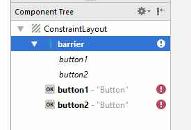
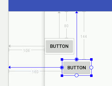
Next place two Buttons on the design surface and, using the Component Tree, drag-and-drop them onto the barrier:
The default Barrier direction is left and so it will now position itself to be on the left-hand edge of the Button that is furthest to the left. You can see the Barrier as a gray shaded strip in the diagram below:
If you move the two Buttons you will notice that the Barrier always anchors itself to the leftmost edge in the group. You can change this behavior to another edge by selecting the Barrier in the Component Tree and then using the Attributes window to change barrierDirection to right say: With this change the Barrier positions itself on the rightmost edge of the group. Now if you place a third Button on the design surface and constrain it to be to the right of the Barrier, then it will always stay to the right of the rightmost edge of the components in the Barrier’s list: If you move the two Button’s around you will soon get the idea that this Barrier is a way of placing components to the right of the rightmost component of the group whichever one this is. Without a Barrier object you would have to put the Button’s into a Frame and then position the other components relative to the Frame. This would work but it creates a nested layout. The Barrier approach keeps the ConstraintLayout flat. The Barrier is useful when ever you have a group of components that change their size due to user input or data or locale or whatever. You can use a Barrier to divide up the screen area into something large enough to accommodate the group and then the rest of the components can position themselves in what is left over. Summary
 |
| Last Updated ( Monday, 04 December 2017 ) |

