| Is The Start Button Coming Back To Windows 8? |
| Written by Mike James |
| Friday, 26 April 2013 |
|
There are very strong indications that Microsoft is planning to put the Start button back into Windows 8. Should we jump for joy? The answer is that it all depends on exactly what you mean by "Start" button. From a programmer's point of view Windows 8 is a disaster. It might be the nicest version of Windows so far. You might think that it is cool, well designed and WinRT apps are great. You can have as positive a view as you like of the platform but... It isn't looking good as a future bet. WinRT apps don't seem to have a big future, despite Microsoft having damaged the desktop to generate a market for them. The fact of the matter is that it is difficult to justify investing in a WinRT app when you could be working on an iOS or Android app, or even a web app. There might be an argument that WinRT is an empty marketplace and there are plenty of niches waiting to be filled so money can still be made, but you can see that it isn't the crowded, vibrant, market like those that surround iOS and Android. The biggest problem with WinRT is that it is the way of the future. Or so Microsoft tell us. If WinRT is the way of the future then the desktop is the way of the past. Users are forced to confront the reality of WinRT, even if they are working on a multi-monitor desktop power house without touch. The system boots into the start screen and opens a single windowing environment without asking you if that's what you want. If you do move off to the desk top to run a few applications with tens of windows open so that you can cut-and-paste, monitor background tasks and see different views, then to start a new application you are thrown back to the start screen again. The point is that the start screen is forced on the user, even if it makes no sense to use it. The idea that what is right for a tablet touch device is also right for the desktop is a crazy idea and, even if you have learned to live with it, you have to admit that it's not designed for what you want to do. Since Windows 8 appeared I have mostly given up on creating Windows desktop apps and more or less given up on using C#, which in my opinion is the best object-oriented language available. The reason is that, in addition to the obvious decline in desktop systems due to the rise of mobile, Microsoft has badly damaged the desktop by forcing WinRT on the end user. Just as I now am mostly using .NET and C# for legacy projects, so many end users are changing to tablets and Macs for the same reasons - the Windows desktop is the past and Windows 8 makes it unfit for purpose. Of all the changes in Windows the one with the biggest impact for the desktop power user - and what else is a programmer - is the loss of the start button. Why? The answer is that the start button isn't just a way to get to an unordered collection of applications. It provides a hierarchical organization of those applications. On a mobile device with maybe 50 apps you can just present them all in a flat collection, but if have hundreds of big and small desktop apps and utilities flat is not good enough.
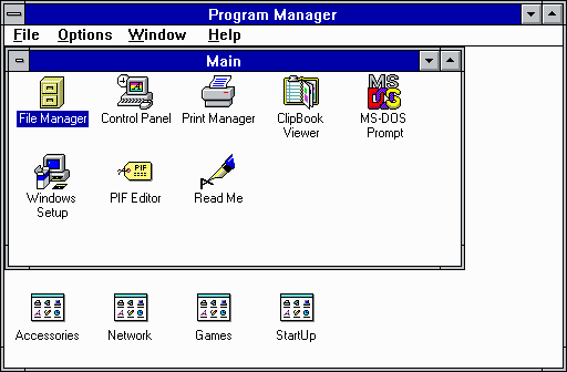
Windows 3 Program Manager
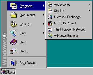
Back in the days of Windows 3 there were two hierarchical systems - the filing system and the Program Manager. The filing system showed a hierarchical nested set of folders and it still does. The Program Manager showed a hierarchically organized set of application icons which had no relationship to how or where the applications were stored. Then in Windows 95 the Program Manager evolved into the start button. When you clicked the start button what popped out was still a hierarchical structure with folders containing application shortcuts.
Windows 95 Start Menu
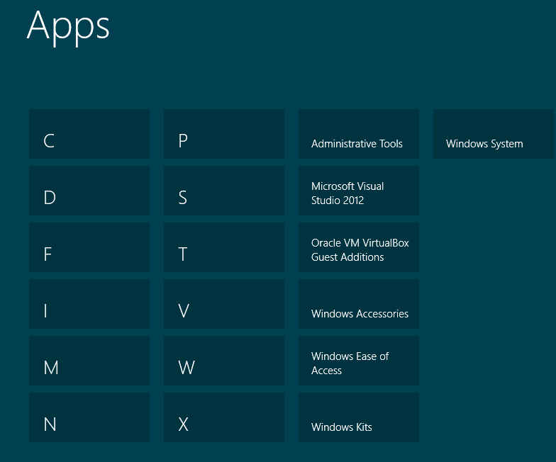
This was a real innovation - so much so that Microsoft bought the Rolling Stones song "Start Me Up" for some $15 million, to use at the launch. It was design with a purpose. Of course now everything has to be deconstructed and re-imagined just for the sake of saying that we have something new. The start screen is a flat disorganized mess and unless someone puts a hierarchical structure into it in the form of application folders it is virtually unusable. There is an argument that says that search is a replacement for hierarchical organization. When it comes to the end user and files this is probably true. How many users do you know who save files and have no idea where they are stored? This is why a good search facility is often claimed to be better because it allows the user to find the files they have "lost" and it means they don't have to navigate hierarchical directories to keep everything logical. Search might well be a good way to "organize" files, but applications usually bring their own organization to the program tree. Under Windows 7, I automatically get a Visual Studio 2012 folder in the Start menu and there are folders nested within this. Any programs I use often get pinned to the Start bar or are made more accessible by a desktop icon, for example. The Start screen throws this hierarchical organization away because that's not what it is about. The Start Screen has one level of grouping and it's a testament to the belief that the average user is too dumb to understand a hierarchy.
The best the Start screen can do a single level of grouping.
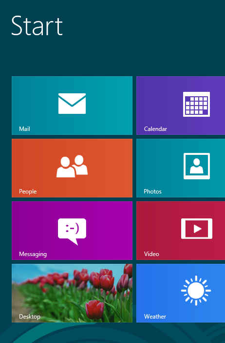
The Start screen also has another purpose. It is supposed to be a collection of live tiles where applications show you their current state and more recent information. It isn't primarily an app launcher. Its primary function is to make up for the fact that WinRT doesn't support overlapping windows - it is the only place you can see an overview of multiple applications. However, when you move away from the live tiles, things start to look less impressive. When you get to the desktop application icons they are presented as a huge cloud of tiny insects that you have to hunt through to find the one you want. This is no way to manage information. So Microsoft took the Start button away from the desktop so that we would have to visit the Start screen often and see pretty live tiles that would inspire us to use and create more WinRT apps. Now the rumour, based on leaks of the forthcoming Windows 8.1 upgrade, is that the Start button is back on the desktop, but it seems not to be the Start button we know and love.
What Microsoft seem to be proposing is to put a button on the Desktop that takes you directly to the Start screen. That's like still being told to go to hell, only faster. This isn't better it's just a token that preserves Microsoft's dignity while seeming to bend in the direction that users want it go in. Of course, Microsoft might give us back a true hierarchical Start button. It might not change anything at all, or it might create a fudge that satisfies no-one. To find out we have to wait for the upgrade, but my money would be on the fudge that brings a Start screen button to the desktop. The really sad thing is how many people, including programmers, have commented to me that if Microsoft was to bring the Start button back, the proper hierarchical Start button, and make WinRT more an optional extra then they would install Windows 8 tomorrow, and they might even start developing WinRT apps. Perhaps more importantly they might start developing new Windows Desktop apps.
Windows 8 is shaping up to be a bigger flop than Vista ever was and this time users and programmers don't have to wait for it to be fixed - there are other places to go.
The future of the desktop environment really does depend on Microsoft waking up and seeing that it can't impose its will on users and developers because this time around there are alternatives.
Related ArticlesWindows 8 - The Desktop Destroyer Windows 8 Hastens Decline of PC Windows 8 Fails to Gain Ground
To be informed about new articles on I Programmer, install the I Programmer Toolbar, subscribe to the RSS feed, follow us on, Twitter, Facebook, Google+ or Linkedin, or sign up for our weekly newsletter.
Comments
or email your comment to: comments@i-programmer.info
|
| Last Updated ( Friday, 26 April 2013 ) |


