| Google Style Guide for Android Apps |
| Written by Lucy Black | |||
| Monday, 16 January 2012 | |||
|
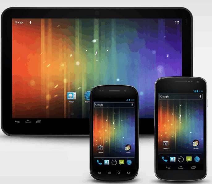
Android Design is a new website launched by Google to help developers get a more consistent and portable user interface across devices. Google has finally produced a style guide for Android applications - something that it has been visibly lacking as demonstrated by the unstylishness of many of its apps.
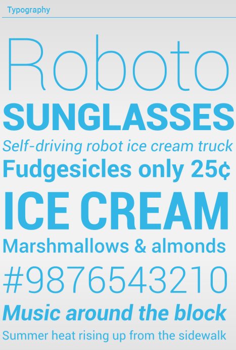
The style guide has arrived in the form of a website, Android Design, an integral part of the Android Developer site, which has been created specifically to help developers in the creation of applications for Android 4 (Ice Cream Sandwich). The site relies on visuals - one of the Design Principles it advocates is "Pictures are faster than words". Which is a sort of qualitative version of the quantitative "A picture is worth a 1000 words". In its Style section you'll find information on the three system themes for Ice Cream Sandwich: Holo Light; Holo Dark and Holo Lick with dark action bars; and after Typography, Color and Iconography you'll find tips on Writing Style.
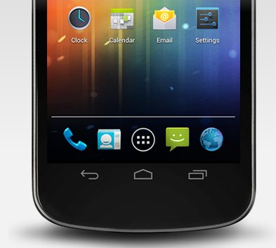
The Patterns section is where you'll find the information needed to design apps that behave in a consistent, predictable fashion - it has sections on gestures, app structure, navigation, Action Bar, multi-panel layouts etc. This is followed by Building Blocks, a section where there is an inventory of ready-to-use elements: tabs, lists, buttons, dialogs and so on.
In places the style guide is currently a bit thin but there is promise of more in-depth content to come - and compared with the previous lack of style guidance it's a welcome and important resource. More Information:
Comments
or email your comment to: comments@i-programmer.info
To be informed about new articles on I Programmer, subscribe to the RSS feed, follow us on Google+, Twitter, Linkedin or Facebook or sign up for our weekly newsletter.

|
|||
| Last Updated ( Monday, 16 January 2012 ) |