| Fear And Loathing In The App Store 2 - Apple Rejects App For Being Too Simple |
| Written by Lucy Black | |||
| Thursday, 13 February 2014 | |||
|
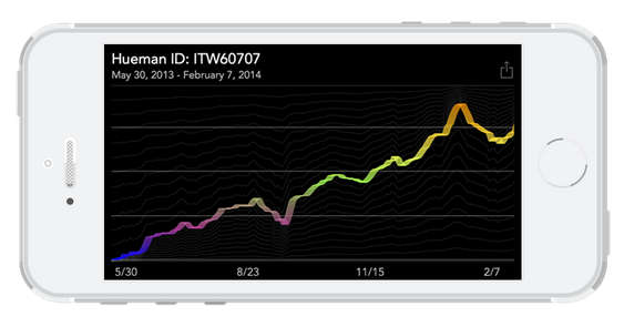
Perhaps it is just the time of year, or perhaps it is a news trend but Apple have proved once again that the App Store isn't quite paradise. The latest reason for rejection is being too simple. Your first reaction must be to think "yes, a good thing". Far too many weekend programmers get an app accepted after spending virtually no time at all on learning their craft or designing their program. Take Flappy Bird for example - the world would be a much better place without such simple code clogging up the works. I can see the point. However, it is all a matter of who decides what is simple and what is not. As argued in Fear And Loathing In The App Store - Apple Drops Bitcoin App we have accepted the authoritarian app store in return for untold wealth and riches beyond compare. Many indie programmers are happy with the idea, but still have nightmares that their prize creation will be rejected or perhaps worse thrown out of the marketplace for no reason at all. The last piece of news to make you think about the situation comes from the oddly named Hueman Collective: "The Hueman Collective got together over a long weekend, made up of developers, designers, musicians and filmmakers. Our goal was simply to get together to make something that weekend; anything." The app they created was a happiness tracker. You simply entered your personal happiness today compared to yesterday. The app only needed a few seconds per day and eventually allowed users to see how their happiness was fluctuating over time. Not a complex idea and the app was implemented as two simple web views - the submission screen and the graph. It needed to be a mobile app rather than a web app because it stored data on the phone and there were plans to add more features that made use of iOS.
Apple's rejection provided a very clear reason for why the app wasn't worthy: "We found that your app only provides a very limited set of features. It only functions as a once a day mood tracker. While we value simplicity, we consider simplicity to be uncomplicated - not limited in features and functionality." The rest of the rejection seems to be a recommendation for feature bloat as a solution to the problem. You also need to remember that the App Store has its fill of apps that you might want to call "simple" such as flashlight apps and various joke apps. Could it be that the fact that this was submitted as a free app biased the decision? This isn't the first app to be rejected because it was classified as "too simple" but in this case there seems to be a valid use case. You can side with Apple and say that this app is too simple to be worthwhile, but it is not simplicity that governs the value of an app - it is how much users actually want something like it and the only proof of this lies in the market. When we set others up as judge and jury of our creations we had better be sure of their credentials and motivations.
More InformationApple, Have a Little Huemanity Related ArticlesFear and Loathing In The App Store
Epic Games CEO Finally Notices That UWP Apps Are A Walled Garden
To be informed about new articles on I Programmer, install the I Programmer Toolbar, subscribe to the RSS feed, follow us on, Twitter, Facebook, Google+ or Linkedin, or sign up for our weekly newsletter.
Comments
or email your comment to: comments@i-programmer.info
|
|||
| Last Updated ( Wednesday, 20 January 2016 ) |


