| Android Studio 2.2 Now Available For All |
| Written by Mike James | |||
| Wednesday, 21 September 2016 | |||
|
After months of previews, betas and Release Candidates Android Studio 2.1 is now generally available and we will all move to the new version as a matter of course. But for those who adopted the early previews it might seem like a step backwards. The final version in the stable channel comes within 3 weeks of RC 2 entering the Canary channel for those who wanted to get a head start. This is usually a good way to be up to speed with updated software, but in this case being an early adopter has been a frustrating experience. This is something Google is being rather reticent about.
The Android Blog simply comments on the new release: Packed with enhancements, this release has three major themes: speed, smarts, and Android platform support. Develop faster with features such as the new Layout Editor, which makes creating an app user interface quick and intuitive. Develop smarter with our new APK analyzer, enhanced Layout Inspector, expanded code analysis, IntelliJ’s 2016.1.3 features and much more. Lastly, as the official IDE for Android app development, Android Studio 2.2 includes support for all the latest developer features in Android 7.0 Nougat, like code completion to help you add Android platform features like Multi-Window support, Quick Settings API, or the redesigned Notifications, and of course, the built-in Android Emulator to test them all out. The big issue with Studio 2.2 is the Constraint Layout. As we discovered with the release candidate this is no longer the default layout as it was in the beta and this leaves Android programmers a little confused - do we flock to the constraint layout? Use it only for new projects? Convert everything we have to the new layout? Or just ignore it and give it time to mature? The blog doesn't really give clear guidance simply stating: "In this release, we evolved the Android Frameworks and the IDE together to create the Constraint Layout. This powerful new layout manager helps you design large and complex layouts in a flat and streamlined hierarchy. The During the beta I was worried by how slow and buggy the Constraint Layout was. It was so bad that it was unusable even if you were only trying to find out how to use it. Overall I wasn't too surprised when it was bumped from being the default layout in favour of the long time default the relative layout.
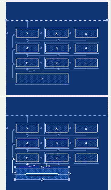
Constraint Layout In Blueprint Mode The final version of the Constraint Layout is a lot better than the beta would suggest. It is fast enough to be usable on reasonably complicated layouts and it doesn't get into a mess as often as it did. The automatic tools that deduce layout constraints and the conversion of existing layout to constraint layouts work, but they don't always give you what you want. In most cases it is better to work with the layout manually and use human intelligence to select constraints which better suit the layout. The overall rationale for the constraint layout is that because it is more sophisticated you can use it to flatten layouts that are nested hierarchies of other layouts. For example, a popular layout idiom is to use a horizontal layout nested within a vertical layout to produce a flexible table with different numbers of items in each row say. The problem is that nested layouts take longer to render and so one of the options if you convert an existing layout is to flatten it. A good idea, but one of the reasons that nested layouts are so popular is that they provide a structured organization that is simply missing from a flat layout. Perhaps a better approach would be to improve the rendering algorithm so that nested layout were as fast as a flat layout. Of course this might be more difficult than inventing the constraint layout. The problem is that currently Android programmers have too many options when it comes to creating layouts and no clear advice on best practice. The new editor in 2.2 is a step forward if you are using the constraint layout but a step back if you are using anything else - including the default relative layout which now doesn't provide positioning feedback. My guess is that most beginners are simply going to ignore the constraint layout and stick with the default relative layout. I am certainly not the only early adopter who may be having to revise work they have done on the basis of the beta. Tom Buchalka, the instructor on Udemy's Android courses has been an enthusiastic proponent of Constraint Layouts and is using the extensively in his new Master Android 7 App Development. Then there is the question of the dual view blueprint and design modes. Is it about efficiency or something else? Having two views on display reduces the editor's screen real estate tot he point where you can't really see what is going on. The solution is to select one - but which one? The blueprint mode is reduces and gives you the bare layout and the design mode renders the controls as they would appear on a real device. Which is best for what jobs? It all looks pretty but I doubt it actually increases productivity. The remaining new features in Android Studio 2.2 are mostly incremental improvements.
Finally there are three new features that are either in beta or experimental. The build cache should be another step to improving build times. The Espresso Test Recorder will create tests simply by observing how your UI is used and finally the new GPU debugger can capture and replay OpenGL commands. Take a look at the video for more details:
All very good but the final paragraph in the launch blog contains a line that might strike fear into the heart: For our next release, look for even more; we want to work hard to address feedback and keep driving up quality and stability on existing features to make you productive. The next release? Could we have some stability - make it a bug fix and speedup release rather than new feature release.
More InformationMaster Android 7 App Development - this link includes a promotional discount of 90% courtesy of Udemy
Related ArticlesAndroid Studio 2.2 RC 2 Downplays New Layout Android Studio 2.2 Preview Big Changes! Android Adventures - Getting Started Creating A UI Android Adventures - Mastering Fragments
To be informed about new articles on I Programmer, sign up for our weekly newsletter, subscribe to the RSS feed and follow us on, Twitter, Facebook, Google+ or Linkedin.
Comments
or email your comment to: comments@i-programmer.info
|
|||
| Last Updated ( Wednesday, 21 September 2016 ) |


