| Android Studio 2.2 RC 2 Downplays New Layout |
| Written by Mike James |
| Friday, 09 September 2016 |
|
One of the big new features of Android Studio 2.2 announced at this years Google I/O was the new Constraint Layout. It was heavily featured in the early previews. But since Release Candidate 1 it has been relegated to a back seat. The Android programming community greeted the new Layout with a great deal of optimism - possibly because it looked so good. The idea was to replace the Relative Layout by something more modern which could cope with the changing sizes of Android screens. The layout editor was completely updated to present a cleaner and more exciting UI that made creating and working with designs easier. Many people, including me, have written about how the Constraint Layout works, but what they haven't reported in any detail is the fact that it had lots of bugs and ran very slowly. This wasn't a cover up, just the fact that sub-optimum performance is what you expect from a beta and we were all working with a preview which was yet to get to a beta. In short, it is only right to give early previews the benefit of the doubt. There is also the fact that the Constraint Layout was the default layout and hence even if it had problems it was the one we were all being encouraged to use and treat as the standard layout unless there was a really good reason. However, as we moved closer to the release candidate things didn't really improve until the final beta, when most things seemed to work even if not fast enough to produce a good experience. Things generally get faster in going from the final beta to a release candidate. The big surprise when the first release candidate appeared was that now the default layout was switched back to the Relative Layout. To use the Constraint Layout you have to make a conscious decision to select it and have to load an additional library. While there are comments on bugs in the Layout Editor in the release notes, there is no mention of this change.
Constraint Layout looks fun!
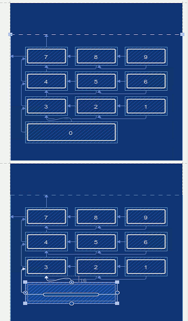
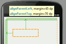
In the absence of any hard evidence, since there is no mention of of the switch back to Relative Layout being the default, it seems reasonable to speculate that the Constraint Layout has fallen out of favor because it was too difficult to make work fast and reliably in the time remaining. Overall I think that this is a good thing because I can't say that the Constraint Layout was a favourite of mine - but this opinion might be based on its sluggish and occasionally unpredictable behaviour. It seemed over complex and not really an improvement on the Relative Layout. There is a pervasive myth that it is possible to create a layout algorithm that is truly reactive and capable of fitting itself to any screen size. The Constraint Layout, by its very nature, was intended to allow layout constraints to be specified in such a way that a UI would adjust to whatever screen real estate was available. Of course this just isn't going to work. There comes a point when the screen is too small or too big and, no matter how you specify constraints, the result looks silly or unusable. To find good layouts for screens of different sizes you have no choice but to employ some intelligence. The Constraint Layout could only ever hope to be a better Relative Layout, and in my opinion it wasn't and isn't. Now we come to the bad news. Before 2.2 the Layout Editor gave the user feedback on where controls were being placed as they were moved around in a Relative Layout. In the new version this feedback has gone. You get guide and alignment lines, but no measure of distance from the edge or from other controls. What is worse, there is nothing on display in the default properties window. If you expand the properties window to include all properties you do see measurements but they are not live - they are not updated as you move the control. You only see the measurements when you drop the control on the design surface. You can type in measurements, but even in this case you have to expand the property window to show all of the properties which is confusing.
Feedback in the previous editor There might be a simple switch that can be selected that restores the editor to its previous instant feedback mode. There might be a plan to make the Constraint Layout the default before the final release, but if so this breaks the whole idea of a Release Candidate which isn't supposed to change before the release. Does all this matter? Well it does leave Android programmers a bit in the dark as to what is best practice. The new Udemy course on Android Nougat has embraced the use of the Constraint Layout as the way to teach complete beginners, but now that it is no longer the default this doesn't seem such a good idea. I updated my draft of Android Adventures to use the Constraint Layout, but currently I'm in the process of undoing the changes and going back to the simpler Relative Layout, which to me seems faster and more efficient. Sorry if I misled anyone! Of course, Google could come back and make me redo it all and backtrack to the Constraint Layout! Meanwhile it is difficult to give guidance to its programmers about what is going on. Look for updates when we get to the final release or when Google divulges anything that explains the situation.
More InformationRelated ArticlesAndroid Studio 2.2 Preview Big Changes! Android Adventures - Getting Started Creating A UI Android Adventures - Mastering Fragments
To be informed about new articles on I Programmer, sign up for our weekly newsletter, subscribe to the RSS feed and follow us on, Twitter, Facebook, Google+ or Linkedin.
Comments
or email your comment to: comments@i-programmer.info |
| Last Updated ( Friday, 09 September 2016 ) |


