| Dynamic Analysis Of Top 500 Android Apps |
| Written by Lucy Black | |||
| Sunday, 15 June 2014 | |||
|
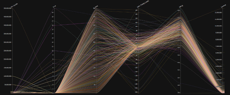
Data presentation is difficult when you have a lot of data, but often the only way you can understand anything is to have a lot of data. Clever dynamic presentation allows the exploration of the top 500 Android apps by revenue - and there is a lot to learn. Winnie Tong took the data from Droid meter and using the JavaScript library d3.js built a visualization that initially looks horribly complicated - but don't be fooled. You can interact with the visualization to investigate the data in ways that would be impossible otherwise.
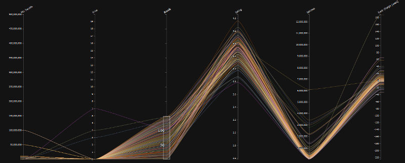
You can reorder the axes by dragging, invert them by tapping and remove them by dragging to the edge. More importantly, you can restrict the region on display by dragging on any axis as well as filtering by app category or keyword. The result is that you can see the characteristics of the filtered set. For example, if you restrict your attention to the top 150 best earners and rearrange the axes a little then you can see that the majority are free and that the ones that charge have a lot fewer installs.
Don't just look at the static examples above. Make sure you visit the site and try the dynamic display. Even if you are not interested in Android rankings or how to set up your app to do better, the presentation is worth seeing. Also as this is a repository on GitHub you can fork Winnie Tong's code to create your own dynamic display.
More InformationRelated ArticlesKitKat Increases Its Share Of The Pie Android Dominates In Tablet Market Google Play Introduces New Analytics
To be informed about new articles on I Programmer, install the I Programmer Toolbar, subscribe to the RSS feed, follow us on, Twitter, Facebook, Google+ or Linkedin, or sign up for our weekly newsletter.
Comments
or email your comment to: comments@i-programmer.info |
|||
| Last Updated ( Sunday, 15 June 2014 ) |


