| Visualizing 40,000 Code Submissions |
| Written by Mike James |
| Tuesday, 15 October 2013 |
|
It was, and is, the promise of the MOOC that having such large numbers of students would allow big data to guide how to improve learning. Now we have some numbers and some impressive diagrams that show just how variable programming can be.
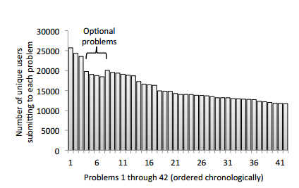
One of the first Massive Open Online Courses - MOOC - was Coursera's Machine Learning course run by Andrew Ng in Feb 2011. It was where we first started to get some idea of the big numbers involved. Of the 120,000 initial signups only 35,839 submitted at least one assignment and only 10,405 completed all 8 assignments. This may sound a terrible dropout rate, but as a former student of the course I can testify to the amount of work involved in completing even one of the assignments. It is just a consequence of signing up being easy and completing being hard. Now we have some data on how the course progressed and on the nature of the solutions to the assignments. Although there were only 8 assignments each was composed of multiple questions:
You can see that after an initial drop, the attrition rate for fairly constant. An analysis of the code submissions using a set of unit tests revealed a surprising degree of variability. For example, a simple task to construct 5x5 identity matrix resulted in 218 distinct unit test vectors. In a sense this means that there are 217 different ways to wrongly construct an identity matrix. If you think this sounds amazing consider the 2992 distinct unit test output produced by the task to regularize logistic regression. Further analysis revealed that the majority of students either got it right or made one of a small number of errors - then there were lots of very individual ways to get it wrong. In practical terms, what this means is that you can cover most of the classes errors by dealing with just 50 different ways of getting it wrong. Moving on from functional testing the issue of how many different ways are there of writing a program is the next interesting topic. This was done by comparing Abstract Syntax Tree (AST) representations of each program. The big shock here is that there were far more ASTs produced than you might imagine. The diagram below is plotted using the tree edit distance between ASTs which gives a good measure of how similar programs are. In the diagram each node is an AST sized to show how many submissions it corresponds to and plotted according to edit distance from other nodes. The colors correspond to unit test outcomes further result is that ASTs that are within 10 edits are functionally similar as measured by the unit test.
click for larger image So what to do with these results? You can see that there are clusters and the idea is to make use of the clusters to determine typical approaches to the problem and hence suitable remedial action. If you would like to contribute to the statistics the Machine Learning course has just started again. In addition to it being a great course that will teach you much of the basics of practical ML its publicity include the line: "In a few weeks, we will also announce a one-time pilot program which may help some students do well in the course---stay tuned! " I wonder what that could be about... More InformationSyntactic and Functional Variability of a Million Code Submissions in a Machine Learning MOOC, Related ArticlesAdmissions Open For Online CS Masters Degree Raspberry Pi To Star In Class?
To be informed about new articles on I Programmer, install the I Programmer Toolbar, subscribe to the RSS feed, follow us on, Twitter, Facebook, Google+ or Linkedin, or sign up for our weekly newsletter.
Comments
or email your comment to: comments@i-programmer.info
|
| Last Updated ( Tuesday, 15 October 2013 ) |


